Hopefully this will be a quick introduction to help you get used to how to use Tableau. The application is very handy for quickly visualizing trends in data, connecting to a variety of data sources, and mapping cities/regions and their associated data.
If you’d like to discuss your use of Tableau, ask for help or share neat tidbits, please use the Tableau discussion on Canvas!
Getting Tableau
First thing is first; get Tableau Desktop by following the steps outlined in the Tableau discussion on Canvas. By following this route, you will get a license good to let you use the program through early June. If you go the ‘academic route‘, you can get a Tableau license for as long as you are a student (renewed in year increments). You can have multiple keys active for your installation (check under Help > Manage Product Keys…).
Loading data
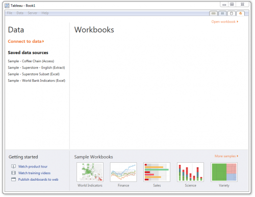
Once you have installed Tableau, you’ll be greeted with a splash screen like the below.
Click the orange ‘Connect to Data,’ and then click ‘Microsoft Excel‘ in the top-left. It should immediate drop you into the default Tableau documents folder, but if not, the path is a variant of ‘Documents/My Tableau Repository/Datasources.’ Open the ‘Sample – Superstore Subset (Excel).xlsx‘ file.
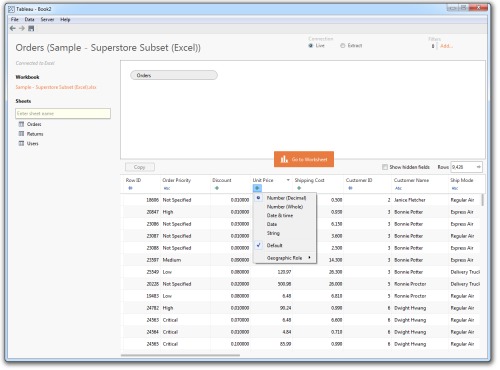
Once the file is loaded, drag the ‘Orders‘ sheet to the light box with the ‘Drag sheets here‘ orange text. This will determine the data that Tableau will pull into the workbook. By clicking on header symbols, you can change the type of the data represented by the column (number, string, geographic representation). Right-clicking on the header brings up the option to rename the fields. At the top of the window, there are two options for ‘Connection’: Live and Extract. A live connection will continuously update from the data source, so if the Excel sheet changes, so will the resulting data in the Tableau worksheet. Extract will make a static copy of the data.
Once you are satisfied with how the data looks, hit the orange ‘Go to Worksheet’ button to enter the worksheet. Let’s take a little time to understand the interface.
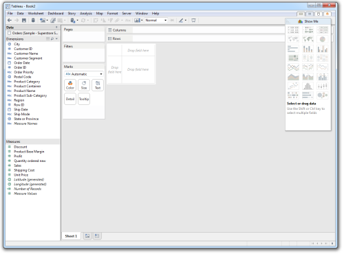
Much like in spreadsheet programs, we have the ability to make multiple sheets. This is especially critical in Tableau when exploring data, because you can make multiple views in the data and keep track of your exploration history.
Data is sorted into measures and dimensions. Dimensions help to narrow down the scope of the data, while measures are the values being compared. If Tableau has guessed the type of a particular field incorrectly, you can simply drag the field into the other container.
The interface in the middle is where the magic happens. You can drag dimensions and measures to the ‘Columns‘ and ‘Rows‘ gutters, where it will plot the data in the order given. You can also drag data fields to the Marks container, and change the color, size, and the type of the mark based on a particular data dimension. We’ll see how this works soon.
The last thing to note is the ‘Show Me‘ tab on the right-side of the window. This is a quick way to change encoding types. When multiple measures and dimensions are highlighted (via ctrl/⌘ click) in the Data pane, the Show Me tab will suggest visualizations based on the number of dimensions and measures selected.
Making a Quick Visualization
Since this is a commerce dataset, let’s try to figure out what products that we’re selling are doing well from a sales standpoint, and try to figure out how profitability depends on the type of product and the sales region.
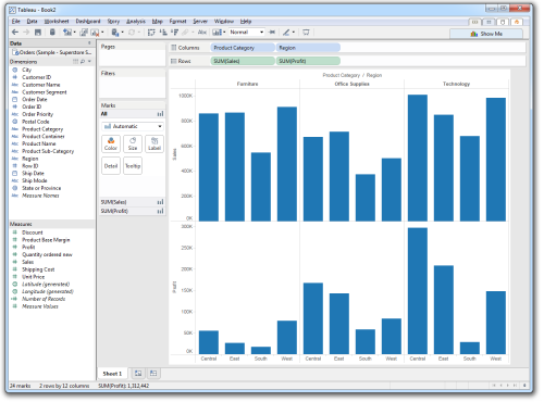
To do so, let’s drag Sales and Profit from the Measures pane into the Columns gutter. Let’s bring in Product Category and Region from the Dimensions pane into the Rows gutter. The worksheet now looks like this:
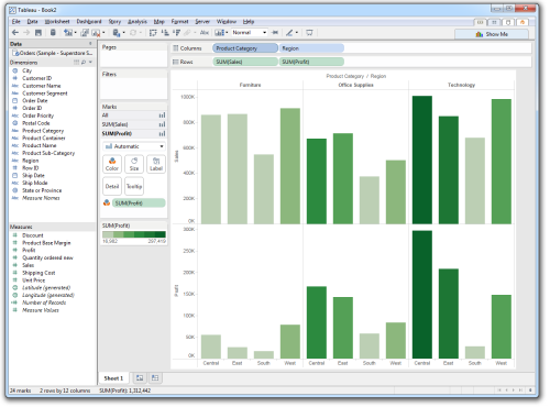
It’s a good start, but nothing really popping out yet. Let’s redundantly map profit to color. Drag Profit from the Measures pane to the Color square. Once you do that, all the bars will be colored based on their profit margin. Knowing what we know about color, let’s break the color ramp into steps instead of being continuous. Right-click the color ramp now on the bottom-left, and click the bolded ‘Edit Colors…‘. You can change the color palette, but what we want to do is make the color ramp stepped. Check the check box and select 6 steps. The worksheet now looks like the below:
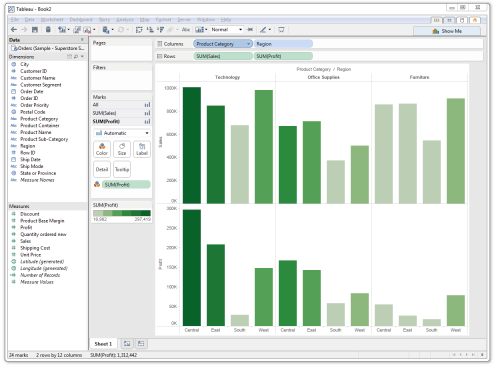
Let’s sort our dimensions based on profit. Right-click the Product Category field in the Columns gutter, and click ‘Sort…‘. In the sort dialog, select ‘Descending,’ and click Okay. The product categories are now sorted in terms of their profitability from left to right.
It’s starting to become clear that although furniture sales are high, they suffer from a profitability standpoint. As an exercise to get you more comfortable with Tableau: see if you can determine why. (hint: furniture are heavier items to ship!)
Mapping data in Tableau
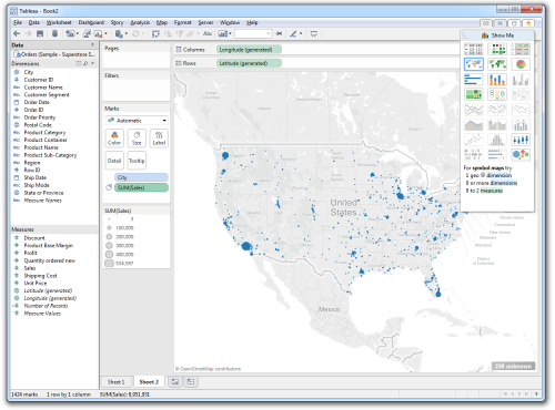
Let’s now make a quick map. Make a new sheet by clicking on the New Sheet icon in the sheet tray at the bottom of the window. Ctrl- or ⌘-click the following data fields: City and Sales. In the ‘Show Me’ tab, click the Symbol Map (the map with tiny circles). The worksheet will think for awhile, then generate the following map:
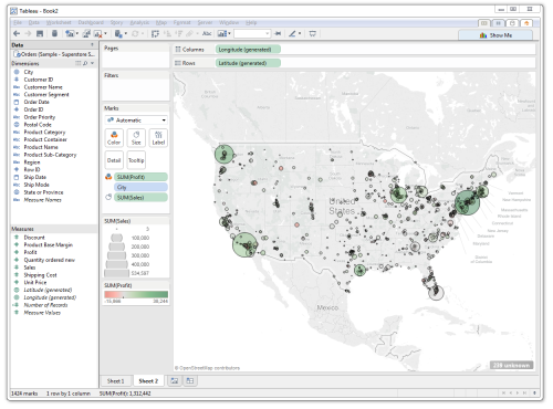
Let’s make this easier to understand. Boost the size of the marks by clicking on the ‘Size‘ square and pull the slider up to about halfway. Add profit information by dragging the Profit fields into the ‘Color‘ square. Edit the colors by clicking the ‘Color‘ square, decreasing the opacity (it’s misslabeled as ‘Transparency‘) to 35%, and adding borders by selecting black under the Border dropdown. The map looks like this:
We can filter the data shown on the map to just be furniture. Drag the Product Category field into the Filters container, then select ‘Furniture’. If you want to easily switch between product categories, right-click the Product Category field within the Filters container and select ‘Show Quick Filter.’ A quick filter window appears in the top-right.
Other Handy Tricks
Making hierarchies — You can identify hierarchies in Tableau by dragging measures on top of one another. In the example above, you can make a hierarchy by dragging Product Sub-Category onto Product Category and naming it “Products.” You can then drag Product Name into that hierarchy. Now, whenever you use the Product field, you can choose the level of granularity to show, and enable drill-down on any visualization you make.
Getting the raw data for the current view (crosstab) — When you get a view on your data that you like, you might want to get the data values back out. Right-click the sheet’s tab at the bottom of the window, and select ‘Duplicate as Crosstab.‘ This will make another sheet with tabular data. You can copy this data and paste directly in a spreadsheet program.
Getting the visualization to size ‘right’ — You can coax the visualization to fill the current window size by selecting ‘Entire View‘ from the size dropdown, in the middle of the toolbar. Usually this dropdown says ‘Normal‘ by default.
Clearing your work/resetting the sheet — You can reset the current view on the sheet by clicking the icon in the toolbar that looks like a chart with a red X in the bottom-right corner. You can also use the adjoining dropdown to clear any sorts, filters, and additional context.
Further Resources
Video tutorials: Tableau’s video training & tutorials are fairly comprehensive, but aren’t quite time-efficient for learning the software. Unfortunately, a lot of information is hidden within these videos. This document largely covers the same material of the ‘Getting Started‘ video (in less depth). If you’re interested in learning more, I’d suggest the Visual Analytics > Analyzing, Grouping, and Sets videos, as well as the Calculations and Statistics > Trend Lines, Residuals, and Forecasting video.
Quickstart: For a quick jump into particular features of Tableau, I’d suggest going to the Quickstart portion of the Tableau manual. Find a topic of interest, and information and directions are presented as a single-page PDF to get you quickly oriented. If you need more in-depth help, the videos usually pick up the slack (though the small idiosyncrasies of how to effectively use the program are sprinked around all the videos and aren’t well-organized).
