Grading for Assignment 1

by Chih-Ching Chang on February 1, 2017

I almost finish grading Assignment 1 (except for the assignments from those who enrolled into the course late). If you are not sure why you get the specific grade, please check this post for the reason and this post for the grading standard details. The rough grade distribution can be seen by clicking “Grade” in the sidebar in canvas and click “Show All Details” at the bottom. There will be 3 scores (highest, lowest, and average) and 1 box plot showing up.

For this assignment, the current distribution is like the following (it won’t change a lot since we only have 2~3 people’s assignments not graded and we actually only have 2 different scores for the first week) :

We are “lenient” for the first assignments since the roster changed frequently. I will be a bit more strict for the future assignments.

Grading (again)

by Mike Gleicher on February 1, 2017

OK. Let me try this again, since questions are coming in. And this time I see another complication which makes this confusing: canvas requires us to enter grades in a numerical scale – even though we don’t use a numerical scale in class.

So, for small assignments that are on time, the “grades you can get” are:

  • didn’t turn anything in
  • no check – (turned something in, but not complete)
  • check

However, if you did a really good job, I (or whoever grades it) wants to be able to say “great job! keep up the good work.” In first grade, my teacher used to put little star stickers on things (not always gold, but you get the point).

But, we don’t have assignments on papers, so I can’t put star stickers on. We are using Canvas, and it makes me assign numbers, … I made up an arbitrary scale that maps these words to numbers. It’s rather arbitrary.

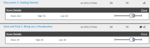
So, when I want to tell you “great job! keep up the work!” what I have to type into canvas is “5” – it’s not nearly as satisfying as getting that little star sticker. Worse – Canvas insists on these scales being quantitative/rational (we’ll actually discuss this in class when we get to data abstraction). So Canvas may tell you 70%, even though I was trying to give you a star!

An aside, I was going to make the divisor 37, so you’d be getting 135%, which probably feels a lot better than 71% even though you know its the same score (there’s psychology literature on that), but Canvas didn’t want to let me do that. now that we’re becoming more experienced with Canvas, we’ll try again.

And the problem is even worse… In that same number (that canvas is going to treat at a rational scale), I need to encode a bunch of other information: was the assignment late, was the assignment something to flag for another person to look at, was the assignment a particularly good example that we might want to use it in class, … So, there’s this combinatorial explosion of possible grades that means I need to make the scale “big” (have lots of values so I can code everything) – so Canvas makes the divisor big, so the percentage score looks low …

And actually, it gets even worse… Canvas rewards me for using the same scale for all assignments. So a simple assignment where it’s hard for a student to excel needs to use the same scale. Something where we’re just checking “yes you did it” it’s hard for us to say “wow, that’s amazing” (since there’s no opportunity for you to do something amazing, and/or no fair way for us to assess amazing from just excellent). So those numbers we reserve for “give this student a gold star and make a note to show it off” won’t get used on these assignments.

So again, if Canvas tells you something like “71%” or “50” remember that I am trying to put a little gold star sticker on your paper and say “great job! keep up the good work.” If I put a sticker on your computer screen it might make a mess.

This is actually a good point for visualization: we’re learning about scale type mismatch, conveying non-quantitative data, the emotional connection to data, … I’d say we can use it for a redesign exercise, but sadly, we’ll mainly learn the lesson of “sometimes you’re stuck with what you’re stuck with by practical concerns.”

Now, after that, you can read what the codes we assign mean… in the Grading post.

On the Challenger Disaster

by Mike Gleicher on January 31, 2017

OK, A student called my bluff…

Tufte points out that the charts were faxed ahead of the teleconference where the decision to launch was made.

Does this change anything in terms of the points I wanted to make?

In fact, I got a lot of other details of the story wrong. I was remembering details from a podcast I listened to almost 3 years ago (I was driving through the Burgandy region of France returning from a trip – that I remember clearly). Fortunately, the podcast (and the transcript) are still there (links below since WordPress turns them into fancy things).

But… No, these details don’t change the message of my story in class:

  1. The problem with a historical argument is we don’t know what other factors would or wouldn’t have made the difference (to use another example from class: my grant may have been funded even if I didn’t have the infographic, in fact, maybe the reviewers would have liked the proposal better!). For the Challenger, this is a big deal because…
  2. Problems in the decision reasoning process can drown out good work in the data analysis and presentation parts. I think this is the real Challenger story.
  3. Tufte’s example is good for showing certain aspects of visualization design (i.e., rockets are not as effective for making the point as scattered points)
  4. Even his good example (the scatterplot) falls prey to some “reasoning with data” flaws (pattern finding in small data, handling outliers, significance of correlations in the small, correlation vs. causality, …)

This is actually really relevant to tomorrow’s discussion on critique.

I am critiquing the visualization. I am using these two visualizations as a tool to understand visualization, and am evaluating them. I do need to know the context (what were the goals, who was the audience, etc.) in order to critique well. My job is not to critique the decision making process (although, arguably, that was Tufte’s job on the Presidential Commission). I can speculate about how a more effective visualization may or may not have helped, but with a historical example it’s hard since there are other factors involved.

Failure Is Your Friend: Full Transcript

Failure Is Your Friend: A New Freakonomics Radio Podcast


Canvas and Assignment 1

by Mike Gleicher on January 30, 2017

Now that we’re 2 weeks into the semester, and the class roster has hopefully stabilized:

Please remember that putting a picture and bio into your Canvas profile is part of Assignment 1. It really does help with discussions.

Reading 4: Evaluation

by Mike Gleicher on January 30, 2017

Due Date: please read before class on Monday, February 6th. And note, that while this is a lot of reading, there is also some reading for the Design School in a Day that you’ll need to do before doing this week’s Seek and Find. (discussion assignment)

The box directory for these readings is on Box in the folder, Reading 4.

A big theme in Visualization (and this class) is “How Do We Know a Visualization is Good?”

This is particularly important, because we’ve already seen that there are many visualizations we can make, many tasks we might want to address, many audiences we might want to reach, many goals we might have, …

So once again, here is a reading designed to give you a variety of perspectives on how we might decide if a visualization is good. The emphasis here is less on specific methods (we’ll talk about some of those later in the semester), and more on getting a range of perspectives.

  1. Chapter 4 of Munzner (link; Munzner_Ch4_Analysis Four Levels for Validation.pdf, 28 pages).
    The main ideas here I like a lot. They come from an earlier paper, that I think was an important milestone in the field.  The chapter is similar enough to the paper that reading the paper is a little redundant (if you want to see it, check here). If you’re interested in visualization as an academic field you should be familiar with the paper.
  2. Edward Tufte. The Fundamental Principles of Analytical Design. in Beautiful Evidence (link; Tufte_4-BeautEvid-5-FundamentalPrinciples.pdf, 17 pages)
    Of course, we can’t talk about “what is good” without consulting Tufte for his strong opinions. (not that he isn’t going to make his opinions clear). In hindsight, this Tufte chapter is actually much better in the “how” to make a good visualization, and trying to distill the general principles, than many of the others we’ve read. But its Tufte, so its still full of his opinions on “what is good.”
    Since we accidentally gave it to you to read for last week (and some people cannot get enough of Tufte), Please also read: “Graphical Integrity” (Chapter 2 of “The Visual Display of Quantitative Information”; Tufte_1-VDQI-2-GraphicalIntegrity.pdf; 25 pages). link here
  3. Bateman, S., Mandryk, R.L., Gutwin, C., Genest, A.M., McDine, D., Brooks, C. 2010. Useful Junk? The Effects of Visual Embellishment on Comprehension and Memorability of Charts. In ACM Conference on Human Factors in Computing Systems (CHI 2010), Atlanta, GA, USA. 2573-2582. Best paper award. DOI 10.1145/1753326.1753716. (get paper at the project page here; 10 pages)
    This is a pretty provacative paper. You can pick apart the details (and many have), but I think the main ideas are important. There is a ton written about this paper (those of the Tufte religon view this as blasphemy). Stephen Few has a very coherent discussion of it here. In some sense, I’d say it’s as useful than the original paper – but I would really suggest you look at the original first. While more level-headed than most, Few still has an Tufte-ist agenda.Reading the Few article is not optional – in some ways, its more interesting than the original.
  4. You should read at least one of the papers by Michelle Borkin and colleagues on the memorability of visualization. Again, these papers are very provocative, and provoked some people to be downright mean in attacking it. You don’t need to worry about the details – just try to get the essence. The project website has lots of good information.
    • Michelle Borkin et. al. What Makes a Visualization Memorable? [pdf] InfoVis 2013 (10 pages).
      This is another radical thought of “maybe Tufte-ism isn’t all there is – and we can measure it.” Again, we can quibble with the details, but they really re getting at something real here.
    • Michelle Borkin et. al. Beyond Memorability: Visualization Recognition and Recall. InfoVis 2015. (pdf; 10 pages)

  5. Chris North, “Visualization Viewpoints: Toward Measuring Visualization Insight”, IEEE Computer Graphics & Applications, 26(3): 6-9, May/June 2006. [pdf] (doi; 4 pages)
    I think this is an important paper (well, it’s a magazine article that is a lightweight version of a paper) because it gets at the challenge of evaluation at the higher levels. Reading the original paper (which details their experiment) isn’t necessary for getting this point – but it does show of how hard these kinds of experiments are.

A fair question in all this, is to ask “what can we get out of evaluation.” This will be a central theme in our discussion. I’m not going require you to read any of the writings on it, but here are some optional things you might look at:

  • Lam, H., Bertini, E., Isenberg, P., Plaisant, C., & Carpendale, S. (2011). Empirical Studies in Information Visualization: Seven Scenarios. IEEE Transactions on Visualization and Computer Graphics, 18(9), 1520–1536. http://doi.org/10.1109/TVCG.2011.279

  • Correll, M., Alexander, E., Albers Szafir, D., Sarikaya, A., Gleicher, M. (2014). Navigating Reductionism and Holism in Evaluation. In Proceedings of the Fifth Workshop on Beyond Time and Errors Novel Evaluation Methods for Visualization – BELIV ’14 (pp. 23–26). New York, New York, USA: ACM Press. (http://graphics.cs.wisc.edu/Papers/2014/CAASG14)
    What happens when I let my students rant.

  • Gleicher, M. (2012). Why ask why? In Proceedings of the 2012 BELIV Workshop on Beyond Time and Errors – Novel Evaluation Methods for Visualization – BELIV ’12 (pp. 1–3). New York, New York, USA: ACM Press. (link)
    Me ranting about how evaluation shouldn’t be an end unto itself. The workshop talk was much better than what I wrote.

Fixed Reading

by Mike Gleicher on January 30, 2017

In the readings for tomorrow, there was an incorrect link. I fixed it.

The Tufte reading should be:

Chapter 2 “Visual Statistical Thinking” from Tufte’s Visual Explanations (pages 26-53) . The perspective here is historical – what can happen when Visualizations work or fail. A scan of the chapter is here.

If you read Chapter 2 of his 1st book (“Graphical Integrity”) that will be a reading for next week, so it won’t go to waste. The link is now here.

Video from Lecture 1

by Mike Gleicher on January 29, 2017

On Friday, several people mentioned that they missed the 20 minute video I made for the first lecture. I was hesitant to post it, but figured I would make it available.

The 20 minute “What is Vis” video that I made for the first lecture is now available online:

https://mediaspace.wisc.edu/media/t/0_nr5e6s8o

This is just me talking over slides – but you can watch it at 2x speed, so maybe it’s not so bad. This is my first try at making a video like this.

I am curious what people think of these simple videos as a replacement for lectures (so we can use class time for more interesting things, like design exercises and critiques).

The Week in Vis: Week 3 Jan 30-Feb 3

by Mike Gleicher on January 27, 2017

Hopefully, you’ll get in the habit of expecting this every Friday…

This past week, we’ve hopefully worked out all the enrollment issues and have a stabilized class roster. Hopefully, people have worked out the issues with getting Canvas to work.

If you haven’t done the assignments for the first two weeks, please do them. Assignment 1, Assignment 2, Seek and Find 1, Seek and Find 2, Reading 1, and Reading 2 are all behind us – but useful for you to do.

Looking forward, this week:

  • Reading 3 (please do before class on 1/30) gives some perspectives on why we are doing visualization. There is also a reading on critique (please read that before class on 2/1).
  • Assignment 3 (initial posting due 1/30) goes along with Reading 3. Enough people seem to get the idea of these discussions.
  • Seek and Find 3 (due 2/3) – hopefully, by now you know the drill.

In class…

  • Monday (1/30) – A lecture / discussion about some of the reasons why we do visualization and why it works.
  • Wednesday (2/1) – We’ll discuss critiquing, and practice doing it.
  • Thursday (2/2) – While it’s not part of class, there is a  (Faculty Candidate) talk “Declarative Interaction Design for Data Visualization” by Arvind Satyanarayan at 4:00pm in CS 1240. This work won the best paper award at this year’s infovis conference (it is quite good).
  • Friday (2/3) – No Class. To maintain the spirit of the informal Friday gatherings, I’ll have an office hour instead – so feel free to drop by to talk about class, Visualization and graphics more generally, or anything else you want to talk about.

Late Policy in the first weeks…

by Mike Gleicher on January 27, 2017

We totally understand that with enrollment hassles, waiting list uncertainty, technical hassles (figuring out the web page and Canvas), that the timing of the first few assignments is off for many people.

So, we will be “lenient” with the first few weeks of assignments. (and appreciative of those of you who have been keeping up)

I still want everyone to do the the 2 weeks first assignments. If Canvas shuts you out, send them by email to Chih-Ching. You can’t do much discussion, but at least write your “initial postings.”

The third week’s readings and discussion will make more sense if you’ve done the first two. Hopefully, everyone will be “on track” by the third week.

I am hoping that all those start-up hassles are behind us and we can move along with a regular pace. (OK, Assignment 3 still isn’t posted – but that should get fixed this morning).

Seek and Find 3: Whatcha gonna do with that vis?

by Mike Gleicher on January 27, 2017

This third seek and find is similar to the second – the question is just a little bit more focused.

Due: Friday, February 3rd. The assignment will remain open for discussion late submissions until Friday February 10th.

Turning it in: There will be a discussion on Canvas . Having 64 people all posting to the same discussion gets a little unweildy – we’ll try a different solution next week.

Assessment: We will give you a score on the 70 point scale (see grading). A good assignment will include a valid picture and link, and a brief answer to the question.

What you need to do.

If you need the general seek and find directions, see Seek and Find 1.

Like last time, you can pick just about any visualization you like – providing you can figure out what the visualization is supposed to help someone do. But this time, rather than trying to figure out what the designer was trying to do, your job is to think about what the viewer is supposed to do with the visualization. In your posting, describe the tasks that you think the visualization should support (what will the viewer want to do with the visualization – i.e., what are the tasks). At this point, we don’t necessarily need to assess whether the visualization is doing a good job at helping people with the task, but let’s focus on identifying the tasks. (you can comment on effectiveness as well, but the real point here is to think about task).

You may be aware that we haven’t discussed tasks in class yet – we’ll get to it in a week or two! This is intentional. I want you to try to think about tasks before learning about how to think about tasks so that you can appreciate why we need to build up a vocabulary.

Include a picture of the visualization, a link to it in context (if there is one), and a brief description of the tasks you think the viewer would want to do with the visualization.