DC2 Example Designs
Here are two very simple sample designs for DC2: Design Challenge 2. These designs are intentionally simple to serve as a baseline. They apply very standard designs to the data.
You need to come up with designs that are “substantially different” than these. You should be able to do things that are much better. The feature of these was their simplicity.
In both cases, I created Python implementations. They are really simple – in both cases the whole thing is only about 80 lines – which includes all the setup stuff. They could actually be shorter (I computed extra stuff that I didn’t need to). They probably qualify as tools, since they are pretty robust for different data sets. (they work on all the examples data – see DC2 Sample Data). And they have actually been useful in analyzing class data.
When you critique these, try to focus on the problems of the design – not the artifacts of the implementation. Remember, these were done really quickly.
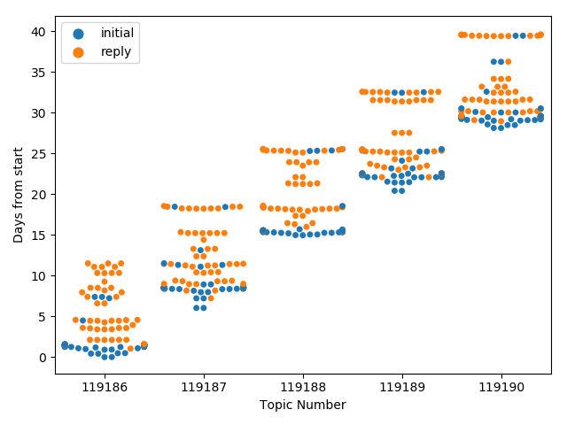
Design One: Swarmplots
The idea of this design is to use a standard plot type – I call it a “Bee Swarm”, but it has other common names such as a “Swarm Plot.” If you’re not familiar with these plots, see the documentation in the Seaborn library (which is what I actually used), or just search for “bee swarm plot” on the web.
The design: We’ll use a position encoding for the time of each message, create a mark/dot for each message, and use the other position axis to avoid overlaps – which will effectively give a sense of the density of messages at a time (on the primary axis). We will use color for an additional binary variable (in the plots here, its whether or not the message is an initial posting, or if its in response to another message).
There is a slight catch in how to use the time information. If we are trying to compare topics, they may have started at different times (for example, in CS765 the topics start each week). Unfortunately, the start of the topic is not data we have – so the code approximates the start as the first message (either in each topic, or over all the topics).
Because this uses the Seaborn implementation of swarmplots, some of the limitations with that implementation come out. For example, if too many points are all at the same time, they start to pile on top of each other at the edges.
Here is an example of the 2017 5 discussions, 5 groups data set. In this image we use one starting point, so the weekly structure is clear, but it’s hard to compare weeks. You can see how things pile up at the edges at the times with lots of points. If it’s not obvious from the chart, in 2017, there were 3 due dates per assignment: one for an initial posting, one for a second posting, and then the “cutoff” for when discussions ended.
Design 2: Tree Diagrams
The idea of this design is to draw a standard “Tree” for each discussion (as a node link diagram). Of course, since I’m a computer scientist, my tree is upside-down (root at the top).
The design: It’s a node link diagram. The top row are nodes without parents. Trees are drawn with the most naive algorithm I could think of: for any node, the space below it is divided evenly amongst its children. It doesn’t look ahead (so if a child has lots of children, it gets the same amount of space of a child who has no children). There is stuff in the code to put labels on the circles, but generally its too small to read. Nodes are colored by topic (if there are multiple topics). There is limited interaction where if you hover over a node, a tooltip should show the message ID and user. However, because I cannot embed SVGs into WordPress, that doesn’t work on this page.
This is a really simple implementation – but it works and gives a sense of what a node-link diagram might be capable of (or not).
Yes, there is a problem where if things get too small, they pile on top of each other.
Here’s a small simple tree (SVG with interaction)
Here is a picture of a relatively big tree (SVG with interaction)
The 2017 1×5 data (1 group, 5 topics) (as an SVG with interaction)
The 2017 5×5 data (as an SVG with interaction)