Sample Assignments

The following are some historic examples of assignments, intended to give you some context for the grading scheme. Note that none of these are very long, but they all show different degrees of connection to the readings (and in the case of the Seek and Find examples, to the visualizations). We do not take formatting or (minor) spelling/grammar errors into account when grading.

Since grades for assignments are assigned based on overall quality across multiple answers, these examples are only provided to show expectations.

Seek and Find

Prompt: Choose a visualization that provides a comparison. Describe how it fits into the comparison framework from the “considerations of comparison” paper (scalability challenge, scalability strategy, comparative design).

Score: 88

Grader comments: Addresses the prompt sufficiently, mentions the reading, and describes the vis, but doesn’t comment or expand on any of these.
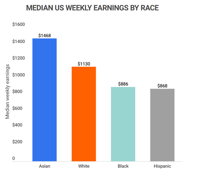
A colored bar chart showing median US weekly earnings by race.

The bar chart comparing median U.S. weekly earnings by race aligns well with the comparison framework. It facilitates a comparison task by allowing viewers to assess and rank income differences across racial groups. The design employs a shared axis to reduce cognitive effort and addresses category scalability by sorting and consistently aligning the bars. These design choices make racial income inequality immediately visible and easy to interpret, effectively supporting the “three threes” framework which is task type, design strategy, and scalability challenge.

Score: 91

Grader comments: Shows thought on how one would use the visualization, integrating the reading. A series of line charts showing brain wave patterns in different stages of sleep.
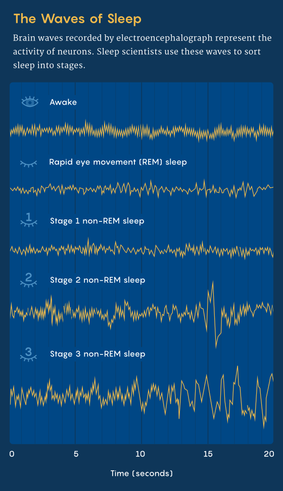
To compare what the different brain waves look like across different stages of sleep.

  1. There are components of all three scalability challenges here. But ultimately, the relationships between the brain waves are too complex to directly compare. It would be difficult to resolve the patterns into a few defining numbers due to the observed variation.
  2. I think they chose to “scan sequentially” by way of stacking the wave types vertically so that a viewer naturally observes each wave individually from the top to the bottom.
  3. Juxtaposition is used here along the y-axis. If these waves were overlaid on both coordinate systems, it’s likely the pattern of each individual wave would be difficult to see.

Content Survey A

Prompt: Give an example of how you might exploit “pop out” phenomena in a visualization design.

Score: 92

Grader comments: This one is actually a little long for what we usually ask for, but the specific example and comparison to alternative tasks is well-formed.

One “pop out” phenomena is large color differences, like the example of one red object in a field of blue objects. This affect can be used to enhance numerous other visualizations IF the designer has a very specific story to tell or data element to highlight. For example, in a bar chart or scatter plot of data showing some metric for each state in the US, highlighting Wisconsin red while the rest are a uniform blue would made that bar or point stand out. If the story being told here resolves around showing that Wisconsin is or isn’t an outlier, that color difference will prevent the reader from having to serially scan or use some other method to identify which data element corresponds to Wisconsin.

Score: 85

Grader comments: Reasonable answer, but nonspecific.

The meaning of “pop out” is being different from others. For example, if I want to show a outlier in a scatterplot, I might add labeling or use red color to indicate that ourlier.

Score: 91

Grader comments: Concise but clear.

The classic example is color. If you want to show a lot of data, but highlight a particular element (e.g. where does Wisconsin fall in this large list of states) then you can make that single element a different color.

Content Survey B

Prompt: Give a scenario of where Non-Linear Dimensionality reduction (e.g., T-SNE or UMAP) is appropriate. What about the tasks and data make it appropriate?

Score: 92

Grader comments: Covers multiple tasks and perspectives, providing a nuanced yet well-defined answer.

Non-linear dimensionality reduction is ideal for exploring high-dimensional image datasets, such as categorizing handwritten digits. It is appropriate when the task is identifying local neighborhoods or distinct clusters that linear methods like PCA might merge or distort. However, this is only appropriate if we rigorously tune hyperparameters like perplexity. These algorithms excel at showing us local structure, but the global distances between clusters can often be meaningless.

Score: 85

Grader comments: This answer is relevant to the prompt, but it does not address it fully (note tasks are not mentioned).

A good scenario for non linear dimensionality reduction is comparing many airports based on many features at once. For example, each airport could have features such as average delay, number of airlines, number of destinations, flight volume, weather impact, and cancellation rate. This makes a high dimensional data set.