
Design Warmup 1: Re-Design (Terrible Vis)
For this Design Warmup, you will critique and redesign (by sketching) some visualizations from an online article. Read the whole assignment first. The goal is to give you practice at critiquing.
Important: for this design exercise you should sketch. This means drawing things by hand. You should not write programs to make visualizations. If you want to draw using a tablet or drawing program, that’s OK - but the spirit of the assignment is for you to sketch on paper (and submit a picture of what you’ve drawn).
You will turn this assignment in on Canvas at: Design Warmup 1: Ask Questions, Sketch Answers (due Fri, Sep 25). Note: Canvas will let you submit multiple times, but you must start over. I recommend you prepare your answers offline and upload them. This includes “scanning” your hand-drawn sketches.
For scanning your sketches: do the best you can to make a digital version. A picture taken using your phone is OK, but if possible, use a scanning app that rectifies (straightens the page, adjusts levels, …). Apple Notes does this, as does the phone version of Adobe Acrobat. We will not be grading your ability to scan (or your artistic talent) - but the better the scan quality, the easier it will be for us to appreciate what you have done.
Do not turn in .heic files! If your iPhone makes these by default, please convert them.
The goal in this assignment is to sketch: you need to convey your design ideas well enough that we can understand what you are trying to show. We don’t expect precise depictions of the data.
Part 1: Truly Terrible Visualizations
A lot of the visualizations we see are good, so it’s hard to improve them. If I try to make a bad visualization, it often seems contrived. Finding a bad example in the wild is not common. But then I found this one.
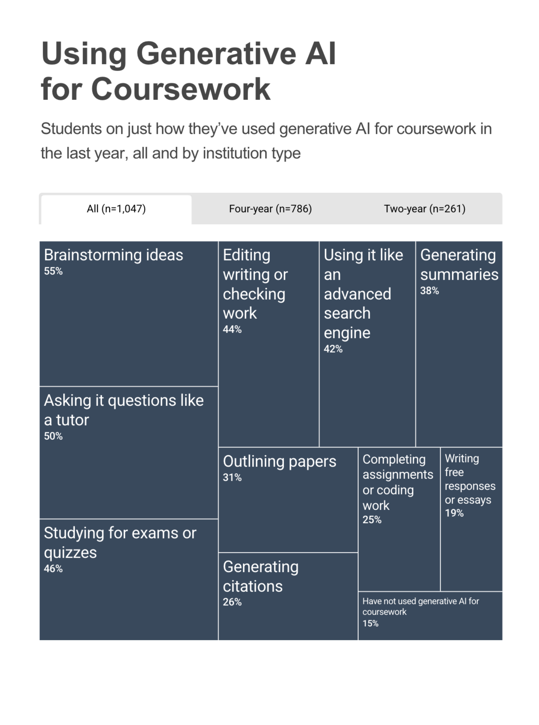
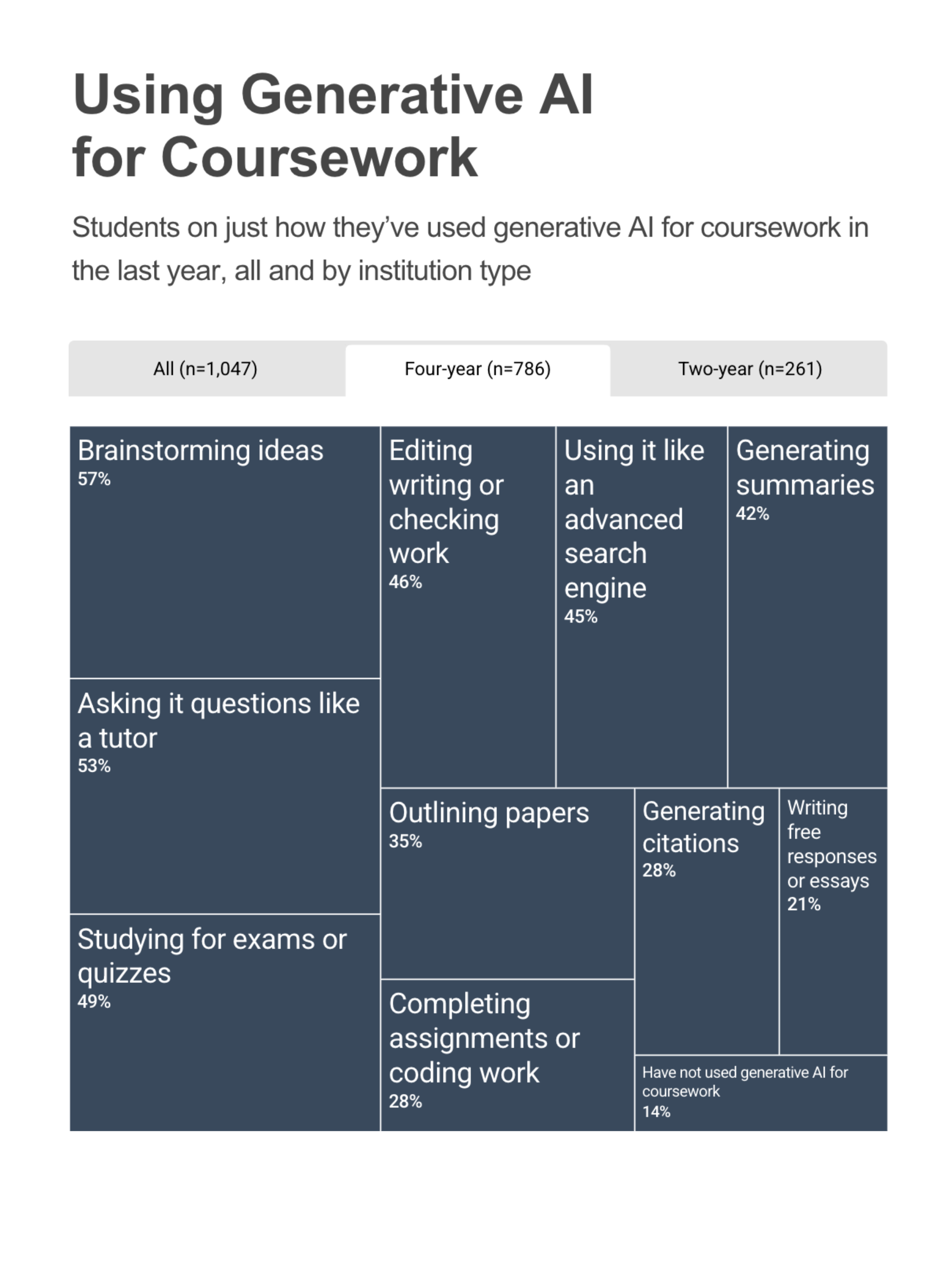
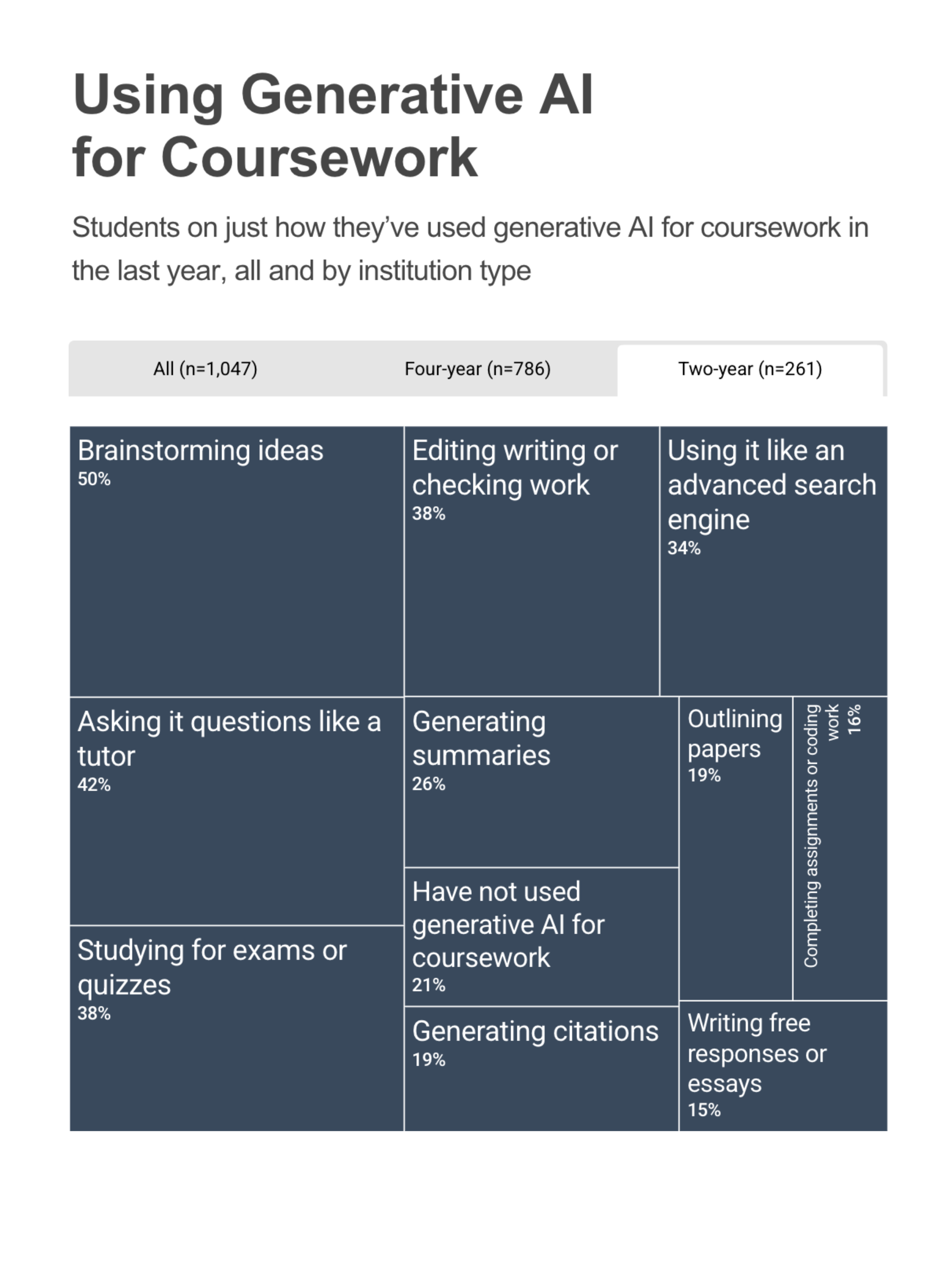
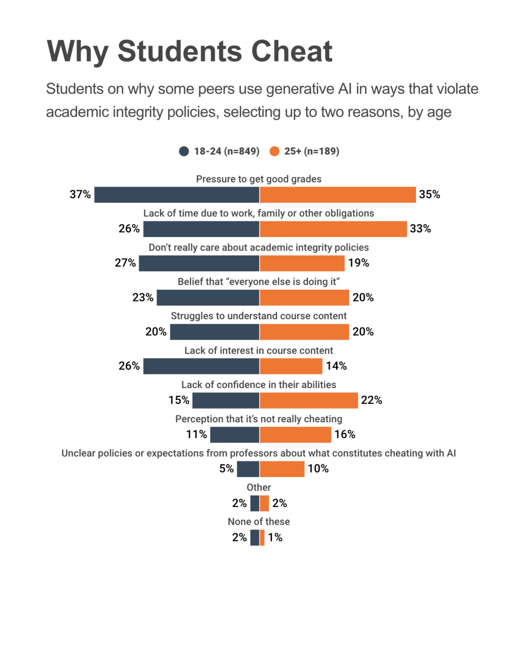
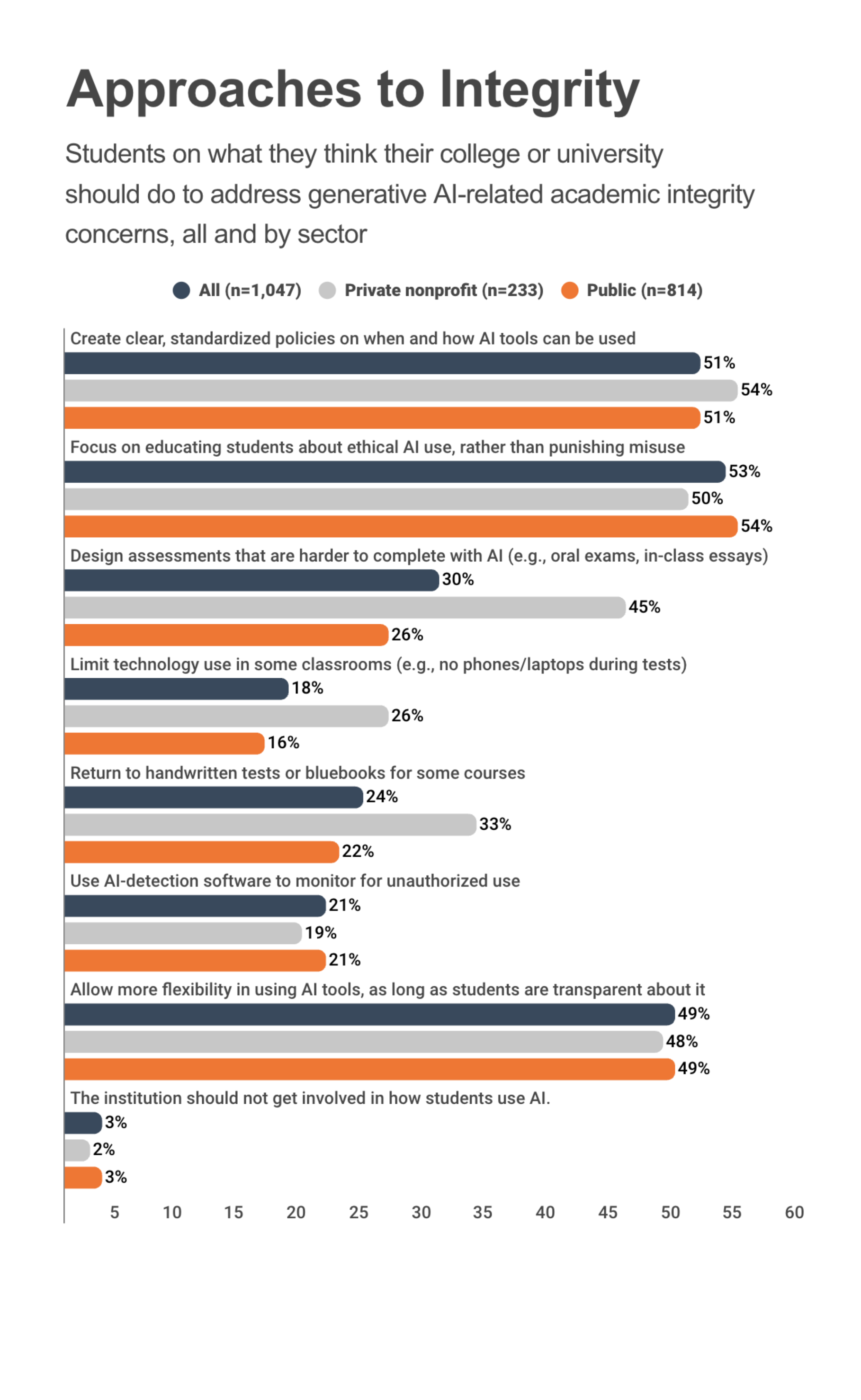
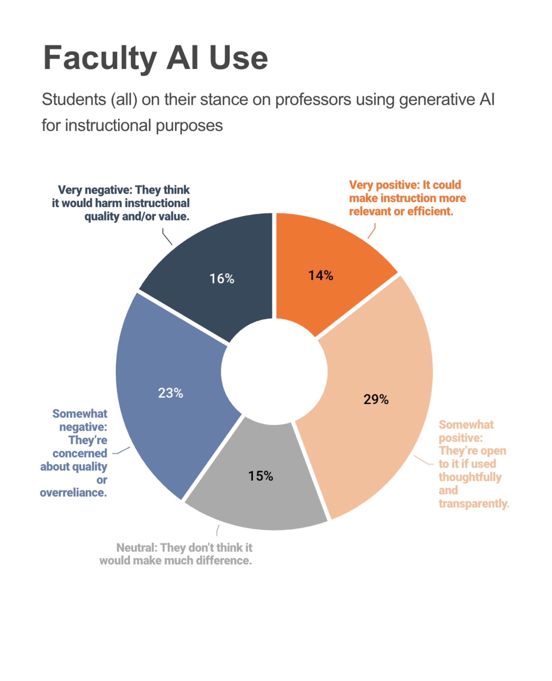
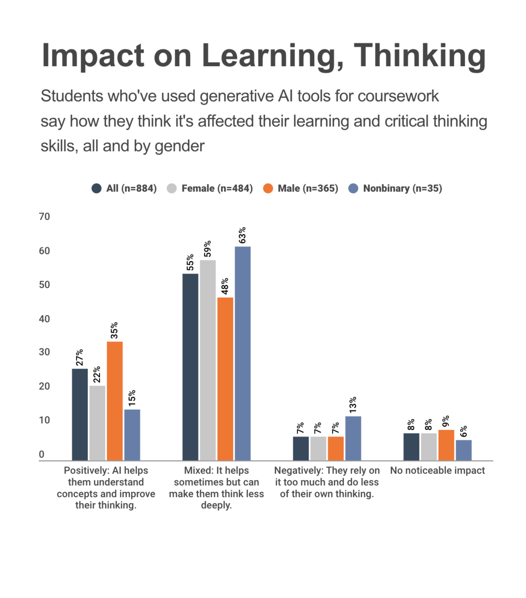
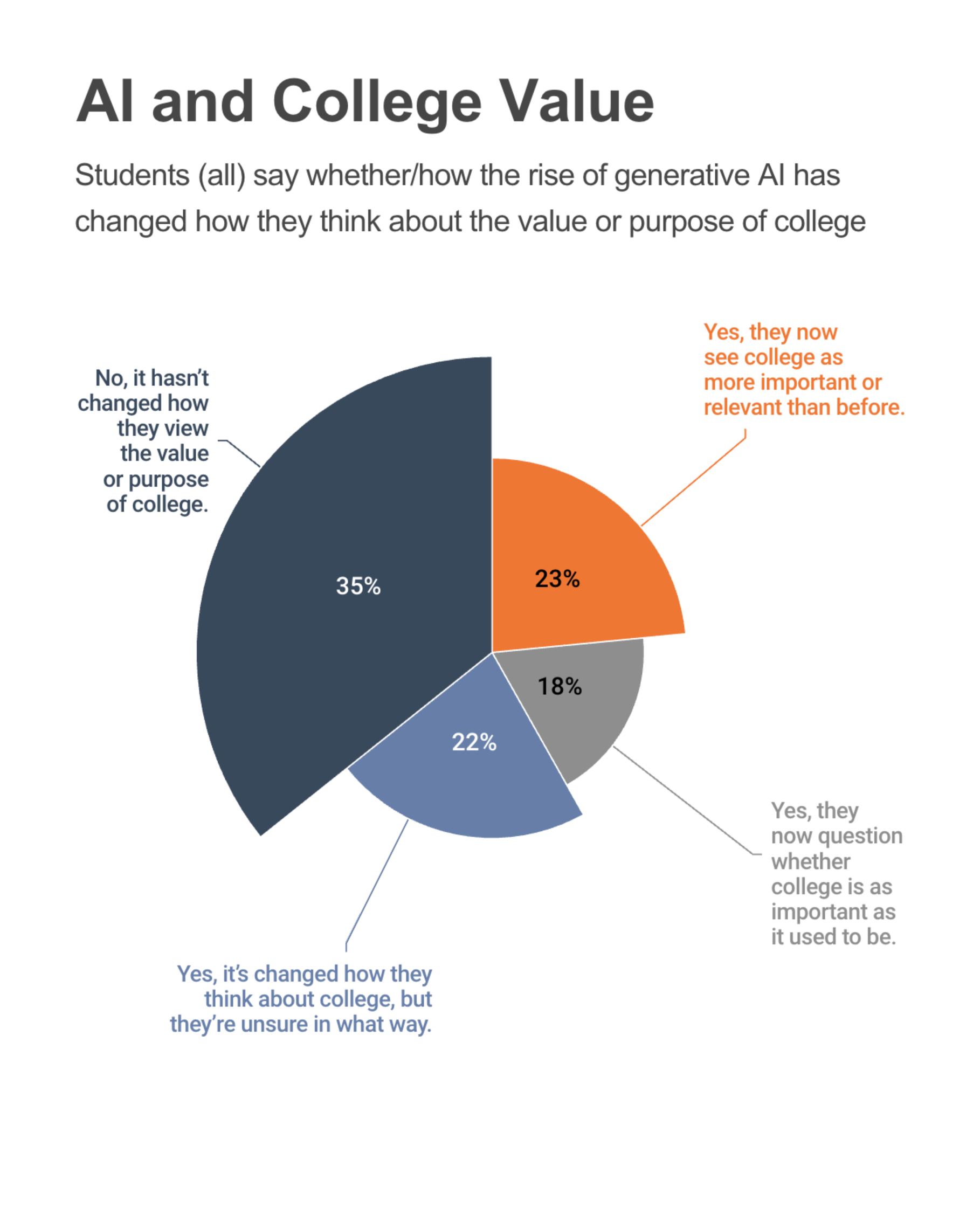
The article Survey: College Students’ Views on AI (Inside Higher Ed, Aug. 29, 2025) has 7 charts. And they are terrible in terms of design. They have lots of fancy interactive bells and whistles, which makes it worse (someone put effort into making good versions of ineffective charts!).
I wish I was making this up - but these are from an actual article in an actual online news source. I recommend going to the website to experience them. Watch the animated reveals! Look at the fancy tooltips that include the numbers and the color legend! Pay no attention to the fact that the tooltips are redundant (they just repeat text and numbers that are already there).
There are 7 visualizations in the article. And the first one (the treemap) has 3 tabs (but I count it as 3 visualizations).
You don’t have to fix all 7…
For each visualization you are “assigned”:
- Critique the visualization in terms of its effectiveness. Try to show places where violations of basic principles lead to ineffectiveness. Also, show places where choices lead to ineffectiveness.
- Redesign the visualization. Sketch a different design. It must be a static image (no interaction).
- Provide a comparative critique. Give at least 1 task that your visualization is more likely to be effective at, and an argument why you think it would be more effective (than the one from the article).
You must do #1. Pick 3 others. You should look at the “live” visualizations on the page, but I provide a PNG of the visualization and a CSV of the data. (These were extracted by Claude).
- Using Generative AI for Coursework (CSV) (PNG tab 1) (PNG tab 2) (PNG tab 3). Note: this one visualization has 3 tabs - your redesign must be static.
- Why Students Cheat (CSV) (PNG)
- Approaches to Integrity (CSV) (PNG)
- Faculty AI Use (CSV) (PNG)
- Impact on Learning, Thinking (CSV) (PNG)
- Preparing for an AI future (note: the visual leaves off a lot of the data in the text) (CSV) (PNG)
- AI and College Value (CSV) (PNG)

The Canvas survey Design Warmup 1: Ask Questions, Sketch Answers (due Fri, Sep 25) has 15 questions. For the first visualization you have to critique/redesign, you turn in (1) your critique, (2) your redesign (scanned image), and (3) your comparison. For the other three, you need to specify which visualization (2-7) and then answer the same three questions.
For your critique: it is possible to make a good critique point in a sentence (consider using the stylized form), but you can say more if you feel like you need to. Having 2-3 points is probably good. I recommend (but do not require) at least trying the stylized form.
If you feel like you don’t know enough principles to connect with yet (it is early in the semester), that’s OK. Use your intuitions and common sense. What might you want to see that isn’t made easy to see? Part of the idea of the exercise is to make you want to learn more principles to use.
For your redesign: sketch. Don’t worry about getting the data exact. It just needs to be good enough to convey your design ideas. If you feel like you need to annotate/explain what your design is, that’s OK. We want to get a sense of your design idea - we are not testing your artistic skill.
Your design should be plausible - and your comparison should explain why you thought it was a good idea to try (i.e. expected it to be better). Although, if after making it you realize it isn’t better, that’s OK (but say so).