
Module 4 Grading Examples
We promised to provide some examples of Module 4 grading early in the Module 5 process (to give you time to appreciate expectations). Here are some examples with some example “assessment”. We also took a few from last year (to get some negative examples).
Because we grade assignments, not individual visualizations, grades make a little less sense.
The grade is given over the whole assignment. We count the number of “identified things” - we’ll point out things that are Bad, Ugly, Good, Splendid (not necessarily all of them) and count how many of each to determine a grade. So with the examples, we’ll give some things we would pick out from the assignments.
I added a “Slight-Ugly” category for things that aren’t good, but maybe aren’t so bad that I would call them ugly.
Also, in some of these cases, the creators may have said things in their rationales that would explain what looks like poor decisions. Here, we are just assessing the visualizations by themselves.
The examples from this year are from a set of volunteers who turned things in early. There is a correlation between turning things in early and doing good work, so it isn’t surprising that we had good examples. We point out problems - but overall the ones we show (from this year) are all good. We pulled some from a similar assignment from last year to give some more negative examples.
Examples
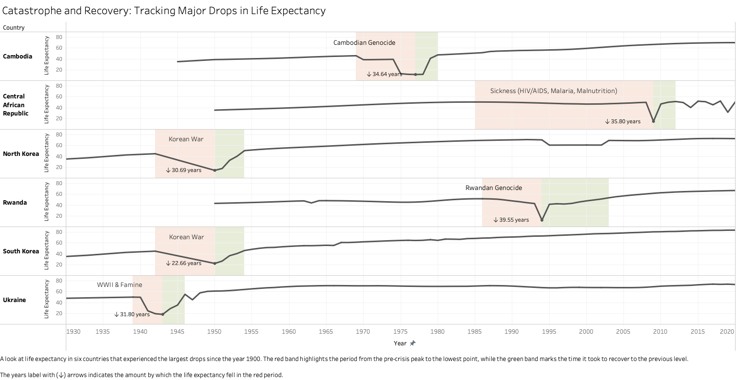
This one is a CD (compound design) and is is quite splendid (A+):
- Splendid use of annotations to point out things of interest
- Splendid use of selection to focus on a few interesting examples, selection strategy explained in the caption
- Splendid use of details to focus attention (the red/green to highlight the drops and recovery)
- Splendid storytelling - all of these pieces tell an obvious and compelling story of the events that caused life expectancy setbacks.
- Good caption - provides the details, even if the visualization is self-explanatory
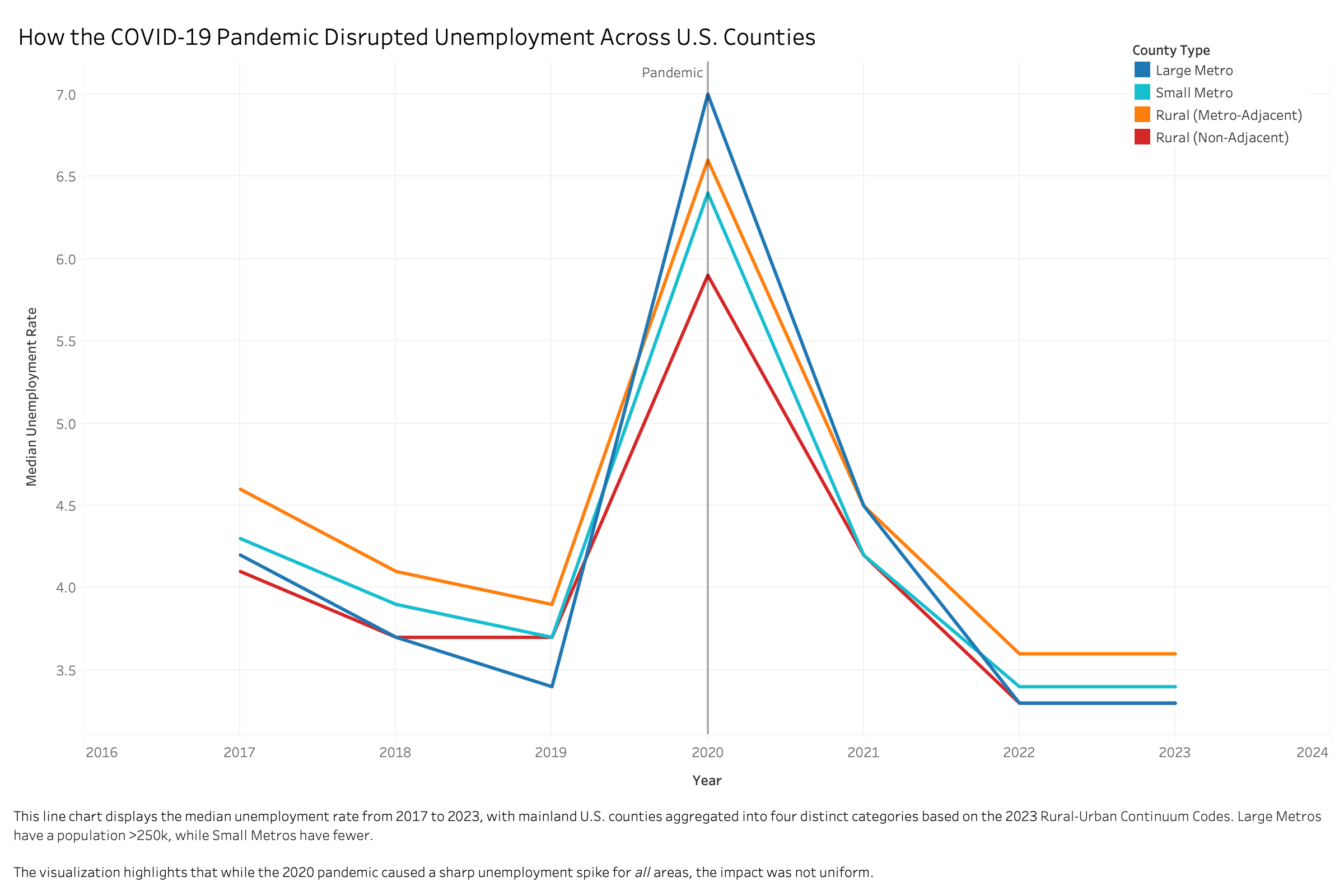
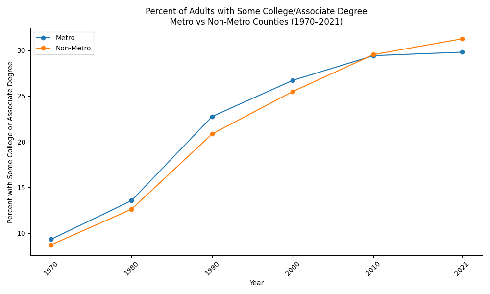
This one is a DD (default design) - it is good an has many good elements, but there isn’t much that is exceptional. The good elements that rise it above average (to an A level):
- Good use of an annotation to tell a story
- Good choice of colors to group things together
- Good use of selection (categories) to provide a story without overwhelm
- Good use of a caption to bring out the story.
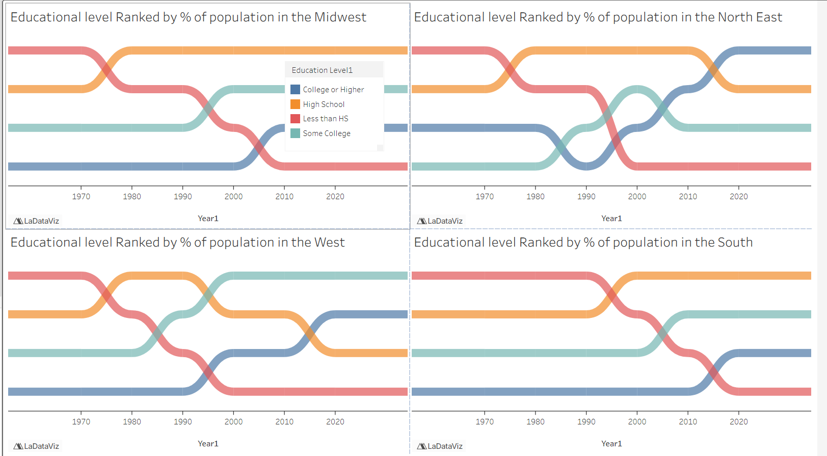
This looks like it may be a ND non-standard design, but it might also be viewed as a creative adaptation of multiple line charts (using the data transformation of rank as the Y). The curved paths are cool looking.
However, some of the smaller details make it harder to “get the story” because it doesn’t necessarily support comparison easily. For class, we’d still call this a solid A level design (because of its ambition, creativity and aesthetics). But it is an example of how ambitious designs often require getting a lot of details correct.
- Splendid creative choice and aesthetic
- Splendid choice of data transformation (rank) to bring out a story
- Slight-Ugly - not choosing an ordinal color encoding for the education levels makes it less clear how the orders shifted
- Slight-Ugly - the legend is unordered and in an unexpected place
- Slight Ugly - the layout and spacing doesn’t enhance the comparison between the different regions (or guide the reader away from trying to make the comparison)
- Slight-Ugly - lack of an overall title or caption makes it unclear what the big takeaway is
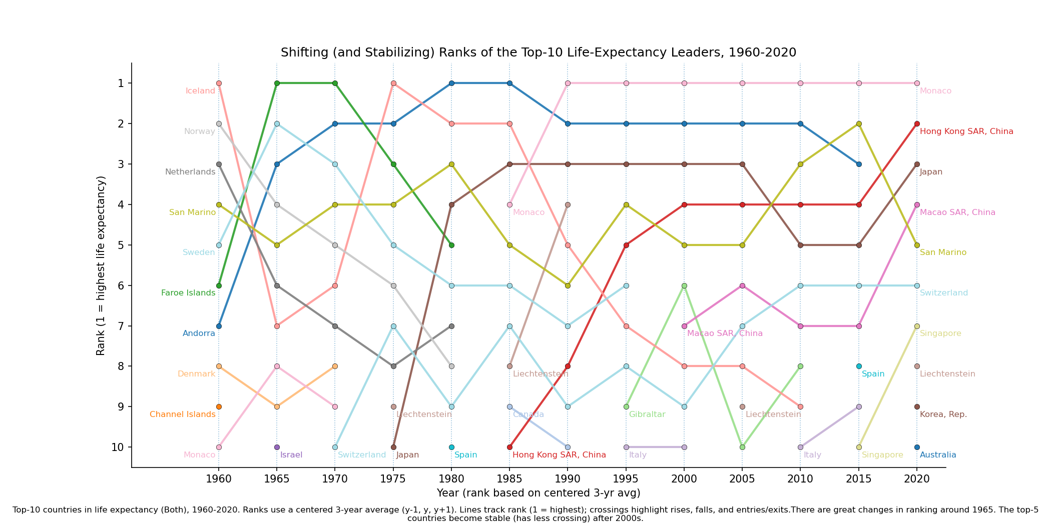
As with the previous one, this is a rank chart which is either ND or an SD with a creative data transformation (rank). This design is an A level design for its ambition, but it is actually a bit hard to read. The use of colors (for so many colors), and the fact that a “key feature” is when a line begin/ends (a country enters/exits the top 10) is hard to catch and makes things disjointed.
- Splendid caption. Explains details and some takeaways.
- Splendid use of data transformation to bring out a story.
- Slight-Ugly - the use of the “hard edged” data transformation means there is a big cliff - being in the top 10 is great, small shifts within it might be less significant. The design exagerates small details that may not be so important.
- Slight-Ugly - the use of color to encode such a large set is difficult (we haven’t discussed color yet in class). There are enough similar colors (different shades of blue). Some of the colors are unfortunately low contrast, which makes them hard to follow.
- Slight-Ugly - it is hard to follow the areas of large crossings (even though moving from 2nd to 5th place is staying within the “great” category). This is made slightly worse by the lack of color.
This is a DD (default design). There really isn’t much wrong with it, there just aren’t many positive choices made to have a story come out. We are overlooking the fact that its 2021 (not decades) because we said that was OK when dealing with the data we had.
- Ugly - No caption to help guide reader towards a takeaway. (which would be helpful because the takeaway isn’t obvious).
- Good - Appropriate use of a line chart with dots to emphasize the sparse sampling
- Missed Opportunity - there is an interesting story in the relationship between the lines, but it is subtle given the overall bigger increases
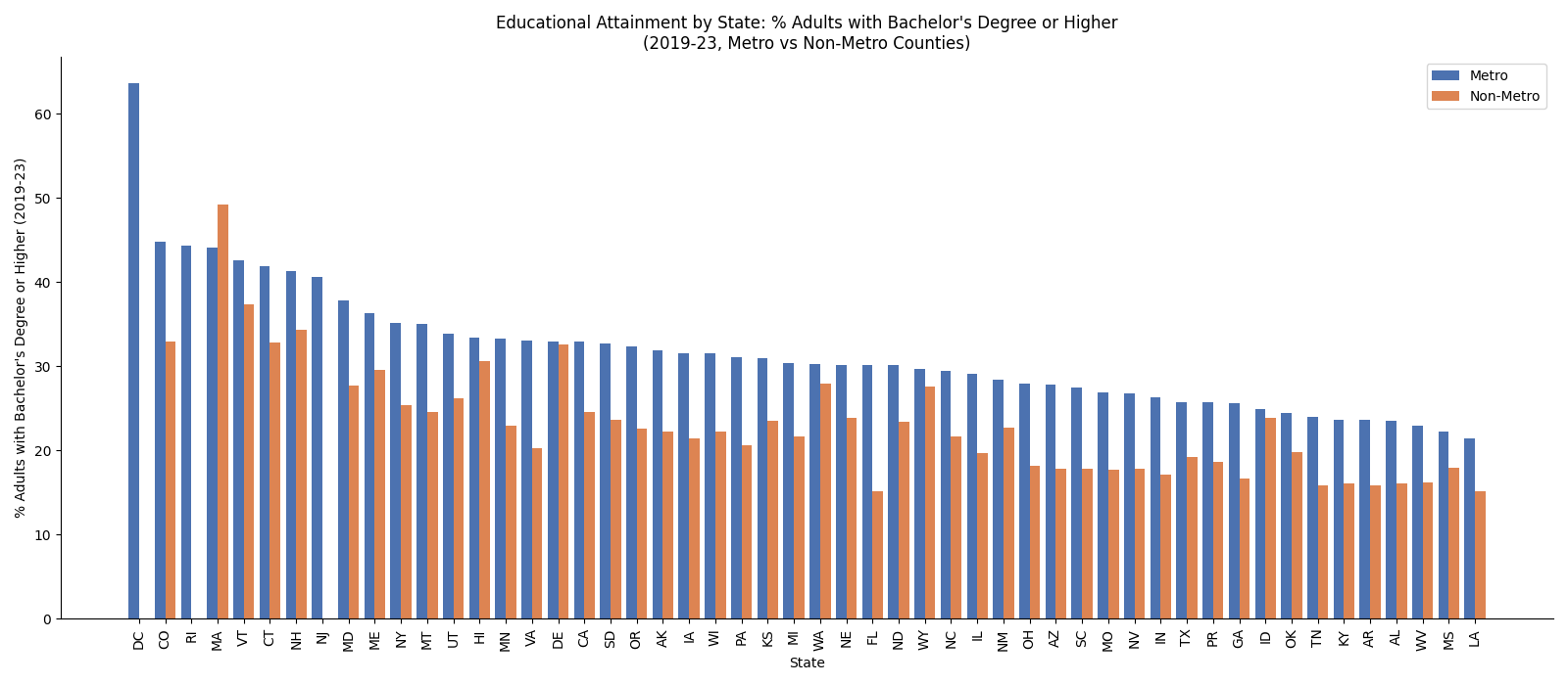
We would call this either an AD (adapted design) or a SD (standard design). The ordered bar chart is OK since it shows the pattern. The interleaved (orange) bars show the correlation (or lack thereof). This is a reasonable design - but the story doesn’t jump out (to me) - the non-metro areas are just relatively constant. There are some outliers.
- Ugly - missing a caption that could help bring out the story
- Ugly - with lots of bars, there needs to be a more obvious story that emerges
- Good - using the ordering as a way to make a high-density bar chart show something useful
- Good - using interleaving (with the ordered bars) is an OK strategy for showing correlations, but it is a bit too subtle here without guidance.
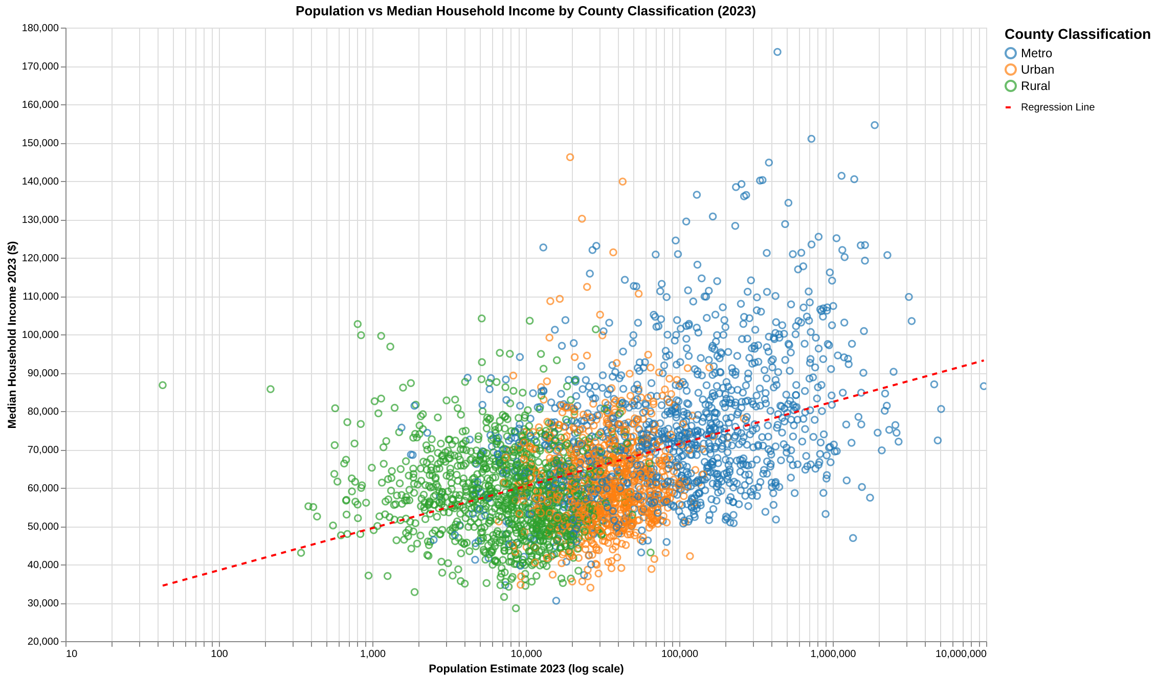
This is a DD (a scatterplot to show correlation), but it excels through some well-thought out details (and possibly fails in those details as well).
- Splendid use of strategies for dealing with scale issues (providing the trend line, hollow circles to turn overdraw into visual density).
- Good details in choosing scales (note the log scale and appropriate truncation).
- Ugly use of colors where green and blue are similar enough that they don’t help with the overdraw mix.
- Good use of colors to create the orange “sandwich” that shows the regions of the plot with some contrast.
- Semi-Ugly lack of caption - the story might be self-apprarent, but isn’t so obvious that this stands well without a caption. Also, providing the details of the trend line would be helpful.
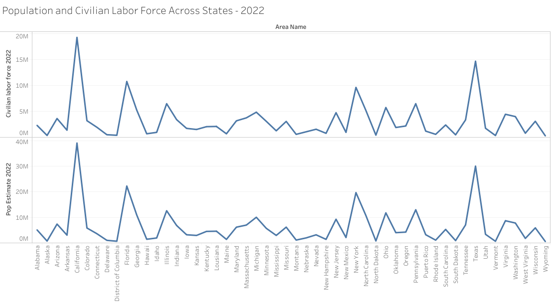
This one is from last year. It is a CD (compound design). While there are many bad details, note how it doesn’t tell much of a story: the two lines look very similar. It’s hard to draw anything from the two being put together.
- Bad: incorrect encoding - using a line chart here?
- Bad/Ugly: California is bigger - the other statistic just seems to follow with the population size
- Ugly: No clear story - maybe the story is that the labor force is about half for all states? That would be very difficult to see.
- Ugly: No Caption - if the story doesn’t come out, then a caption is pretty much required to help it come out.
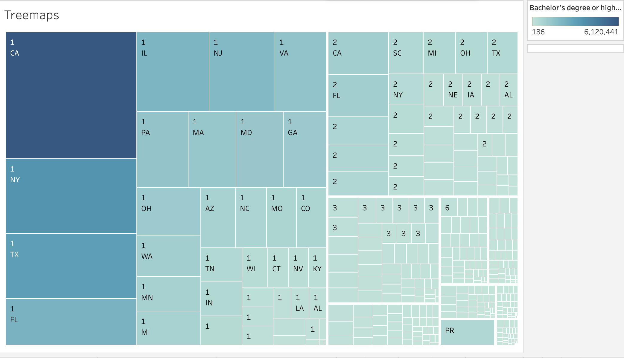
A Treemap from last year. It is a SD (standard design). This is quite terrible - I am not even sure what it is supposed to mean? California is bigger, for multiple things?
- Bad: lack of labels, caption and legends mean there is no way to interpret what this is
- Bad: meaningless title
- Bad: multiple Californias are really confusing without explanation
- Ugly: California is bigger - but is there more?