
Design Exercise 3-2: Explore
In this exercise, you will make visualizations using the data sets provided at A Tale of Two Data Sets. These visualizations are meant to be “exploratory” - we are asking you to create visualizations that might expose interesting stories (so you can make more focused visualizations that tell the specific stories in the future).
General Information
This assignment asks you to make visualizations with the two data sets provided at A Tale of Two Data Sets. You may use whatever tools you like to make the visualizations.
You may use any tools you like for creating the visualizations. You may write programs to process and transform the data. You may write programs to make visualizations.
We recommend that you at least try Tableau (see the Tableau Access for CS765 Fall 2025 page that discusses getting Tableau for class).
See the discussion of AI tools for this assignment at Design Exercise 3-1: Make Pictures (A World on AI Tools). GenAI tools can do an OK job at parts of this assignment - please use them to help you create your own designs, rather than having them create designs for you.
Caveats with County Data
(this might be obvious to those of you who have lived in the US for a while…)
Most states divide themselves into counties (Louisiana calls them “parishes”). However, different states choose to divide themselves differently. Some states have lots of counties, some have a smaller number of counties. Some of the splits happened in different historical eras.
Across the country counties vary greatly - in size and population.
Also, the population of the US is not spread evenly… lots of people live in a small number of densely populated places. And there are lots of rural areas that have very few people.
Here is an example of trying to tell this story in a visualization:
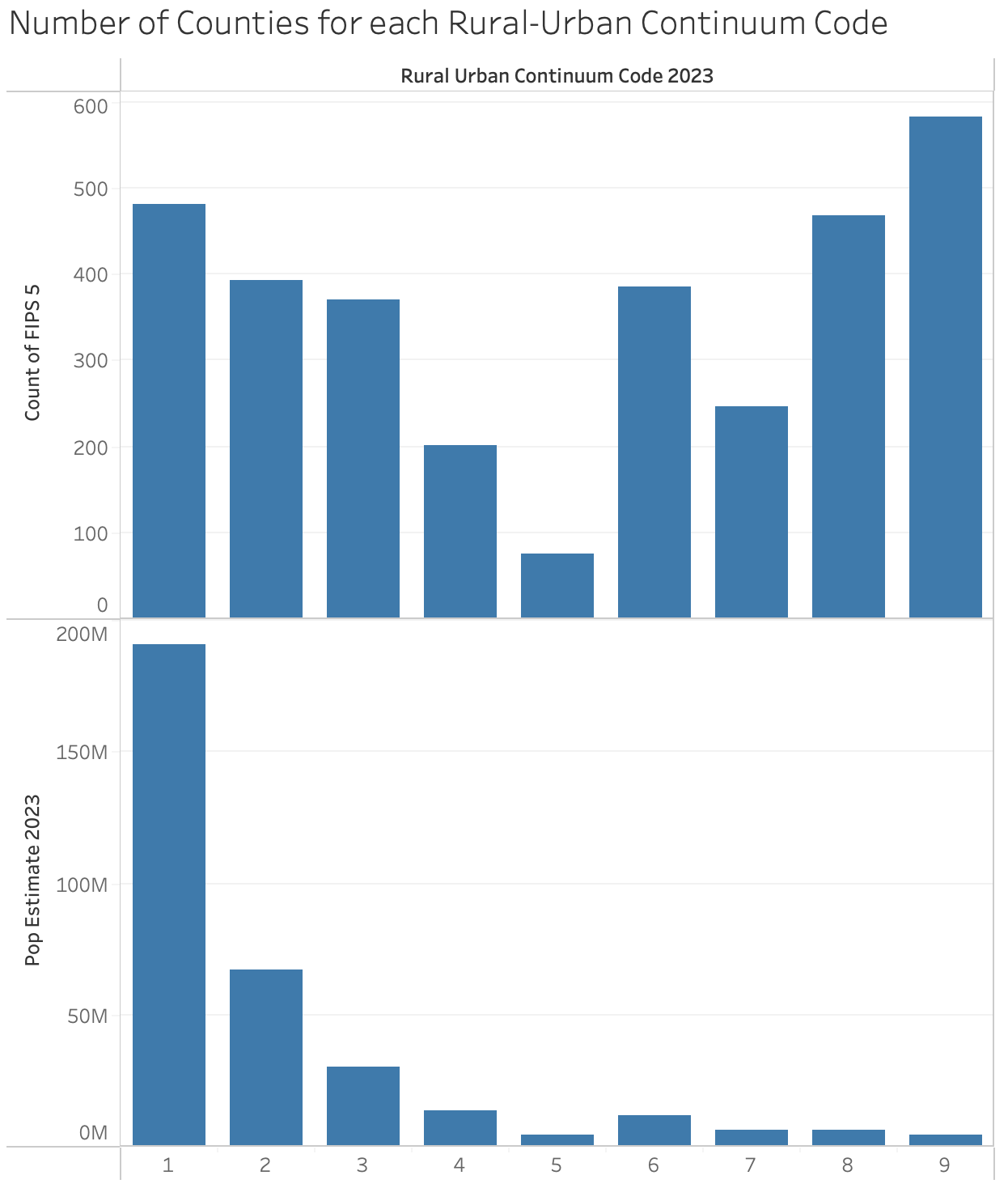
Number of counties at at rural-urban continuum code, and the number of people that live in them. While there are more of the most rural (code 9) counties, this accounts for a small amount of the population.
When you are doing “analysis” be careful: a large number of counties account for a small amount of the population. If you make a finding based on the number of counties, it might not be representative of the population, and it will over-emphasize certain states. You might show “most counties X”, but that might only mean a small number of people. That said, our goal (for this assignment) is to make visualizations, not necessarily to do good social science.
Similarly, beware of the size differences: bigger states or more populous counties have more of certain things. We call this the “California is bigger” problem - so often, visualizations end up simply showing that big states have more of (something that is proportional to size/population) than smaller states.
And a more statistical point… The differences in county sizes/populations make a big difference in the “noise” (random effects). Especially for uncommon events. If 1 person wins the lottery in a county with 100 people in it, that county will have a hugely high level of lottery winners one year, and a really huge change year to year (when it goes from very high to very low).
Part A: A Specific Exploration with Counties and States
With the Census data, we give you both aggregate (per state) and per-county data. Given the Caveats in the previous section, you might wonder, why bother with counties?
Within each state, how much variance is there among the different counties? Are the small counties drowned out/different than most of the population?
With so many variables in the data set, there are (at least) two paths to this exploration: you could look at different variables to see which ones have differences; or you could just pick some variable and try to understand the differences. For this question either is OK.
Question 1: Create a visualization that explores the differences within each state (the variance among the counties).
Question 2: Explain what you can see in the visualization (or something that you can see that is not there). Be sure to explain how your visualization addresses the problems of counties having different populations, and states having different numbers of counties. Explain the design choices that made those things come out.
Part B: Your Own Exploration with the Census Data
You can think of exploration as the “task of trying to identify interesting questions”. In fact, this is literally a task for you: in a future assignment, we’ll ask you to make a visualization that provides an interesting answer to an interesting question.
Your goal will be to find interesting multivariate questions, and create visualizations that do a good job answering them. Of course, the data has to cooperate - you might have a good question, and look at the data the right way, but the answer might not be so interesting.
Since you don’t know the data, you don’t know what stories it holds. You need to do some exploring to find the stories. Or, you might be lucky and find something quickly.
The process is (1) ask a question, (2) make a visualization that should answer the question, and then (iteratively) either (3A) refine the question; (3B) refine the visualization; (3C) move on to a completely different question in step 1 (either because you succeeded, or because you are giving up).
We are asking you for:
- Your initial question (obviously, this shouldn’t be a question from another part of the assignment)
- Your initial visualization to “answer” the question
- What you see in #2 (and your rationale for the design), and what it leads you to
- Another visualization (that iterates from #3)
- What you see in #4. This should include the question/story the visualization is meant to tell and a rationale for why you think the visualization tells the story well
There might be more iteration. The visualization in step 4 might not be the second one you make (and #2 might not be the first). The idea is that the first three are early in the process, and 4 and 5 are more evolved. #2 should do a reasonable job at showing #1 (so you can see if you are on to something). The counties / population thing would have been a decent #1/#2 (but please, don’t just do what I did).
Note: it probably isn’t worth spending too much time making the visualization in step #2 great. You want to get to “good enough that it helps you decide what to do next”.
We want you to go through this cycle once with the Census data.
Question 3: Give your initial question
Question 4: Give your initial visualization
Question 5: Explain what you see in this visualization - and how and why your design exposes things. Provide your updated question (or how you are looking differently at the initial question).
Question 6: a visualization that is designed to address question 5
Question 7: explain what you see in this visualization - and how and why your design exposes things
Part C: The Life Expectancy Data - My Question
Here’s a very broad question: Women generally live longer than men. Is this changing over time and/or place?
Create a visualization that explores this question - trying to expose some patterns that would be worth exploring farther. For this, you must use the world bank version of the data (as it is the one that is split by sex).
Question 8: provide your visualization
Question 9: explain what you see in your visualization, and give the rationale for the design choices you made that help you see this
A hint… trying to show all 150 countries over 60 years might be too much to fit into a single visualization. Consider how to reduce things using selection or aggregation.
Part D: The Exploration Loop with the Life Expectancy Data
Repeat the “exploration loop” of Part B, but this time with the Life Expectancy data (you can use either the OWID or the World Bank version).
Question 10: give your initial question
Question 11: Upload an initial Visualization.
Question 12: Explain what you see in this visualization - and how and why your design exposes things. Provide your updated question (or how you are looking differently at the initial question).
Question 13: Upload visualization that is designed to address question 12
Question 14: Explain what you see in this visualization - and how and why your design exposes things
Part E: Good and Bad Questions
The rubric for this assignment (below) and future assignments asks you to ask (and answer) “good questions”. This is admittedly subjective. Students generally have a good sense of it. But to help you, we are asking you to come up with some questions from the Life Expectancy data that show off some of the concepts.
Question 15: Give a question about the Life Expectancy data set for which the data is insufficient to answer.
Question 16: Give a question about the Life Expectancy data set that is likely to be sufficiently answered by a number, sentence, or simple table.
Question 17: Give a reason why a (good) visualization may still be worthwhile to create (e.g. it adds value over the simple answer) for your question in the previous question.
Rubric
We want you to:
- Think about how to ask questions from data that can be “answered” with visualizations.
- Design/create visualizations that give you quick answers, that can help you dig farther into the data.
- Refine your questions and designs.
- Create appropriate visualizations for both exploring and for showing what you’ve found.
What we will grade you on:
- Asking reasonable/interesting questions based on the data (multi-variate, non-trivial, …) questions. Questions should be “interesting” in terms of their semantics (what they say about the underlying data) but also in terms of visualization (for example, that a good visualziation adds something over a simple table or paragraph of text).
- Providing designs that appropriately and effectively “answer” those questions (show how the data supports it, or not)
- Articulating the rationale for those designs
Your visualizations shouldn’t just be about putting as much stuff in a picture as possible: you should be making choices in what you show, and how you show it, such that if there is something interesting in the data, it will come out. Don’t dump data on us - make visualizations that are designed to expose interesting questions and answers.
What might look like an unintelligible data dump to us (especially when our eyes are bleary after looking at lots of these) might be well justified to you. Your explanations (in the questions) are your chance to explain why you think your visualizations are good.
What might seem as a simple question that could have been answered by a simple number, sentence, or table might benefit from a “good visualization” - but your question doesn’t obviously do this, your rationale can explain why you think your visualization adds vale.
A weird thing about these assignments: we’re asking you to come up with questions whose answers are visualizations that are hard enough to design that they allow you to show off that you’ve learned stuff in class. It’s kindof like a doctor saying “I hope a patient with hard to cure cancer comes in so I can show off how good I am at curing cancer.”
If we take points off for something like “no clear story” or “inappropriate encoding” or “ineffective design choice” we’re really saying “we don’t see an effective choice here and the student didn’t convince us otherwise.”