
Design Exercise 2-1: Critique Practice
In this design exercise we give you a chance to critique some visualizations to practice your critique skills. We would like you to use the stylized form described in class and in the readings. Because we haven’t learned that many “principles” in class, use your intuitions - what does the visualization make easy for you to see (or not see)?
The point of the exercise is to practice analyzing visualizations. Try to connect decisions the designer made to objectives - even if you don’t have a large vocabulary of principles yet.
We will check for the form of your critique, as well as how it connects to objectives and designer decisions.
For these questions, your critiques can be compact - pick a small number of points to make (in critique form). A few sentences (per question) is sufficient. We aren’t looking for an extended and exhaustive analysis - we’re looking for a few good observations in critique form.
Mechanics
You will turn this in on Canvas as Design Exercise 2-1: Critique Practice (due Fri, Sep 26). As usual, it is a Canvas survey - you’ll get 87 points automatically, and that may be changed when a human actually grades your assignment. It is probably best to write your answers offline, and then upload them to Canvas.
Many of these questions refer to tutorials that you may not have looked at yet. You might use this as a reason to read those tutorials. Or you could just look at the individual visualizations from them.
As with most of the web pages, you can usually zoom in on images by clicking on them
Question 1
We’re returning to the visualizations from Design Exercise 1-1: What Can You See? (Comparing Visualizations) - specifically Visualization 1 (the maps). Make a positive critique pointing out something that works. Note: you don’t know the objective, but you can try to make an objective (think of the answer to last week’s question 3 - what is easier with the maps)?
Here is the visualization again:
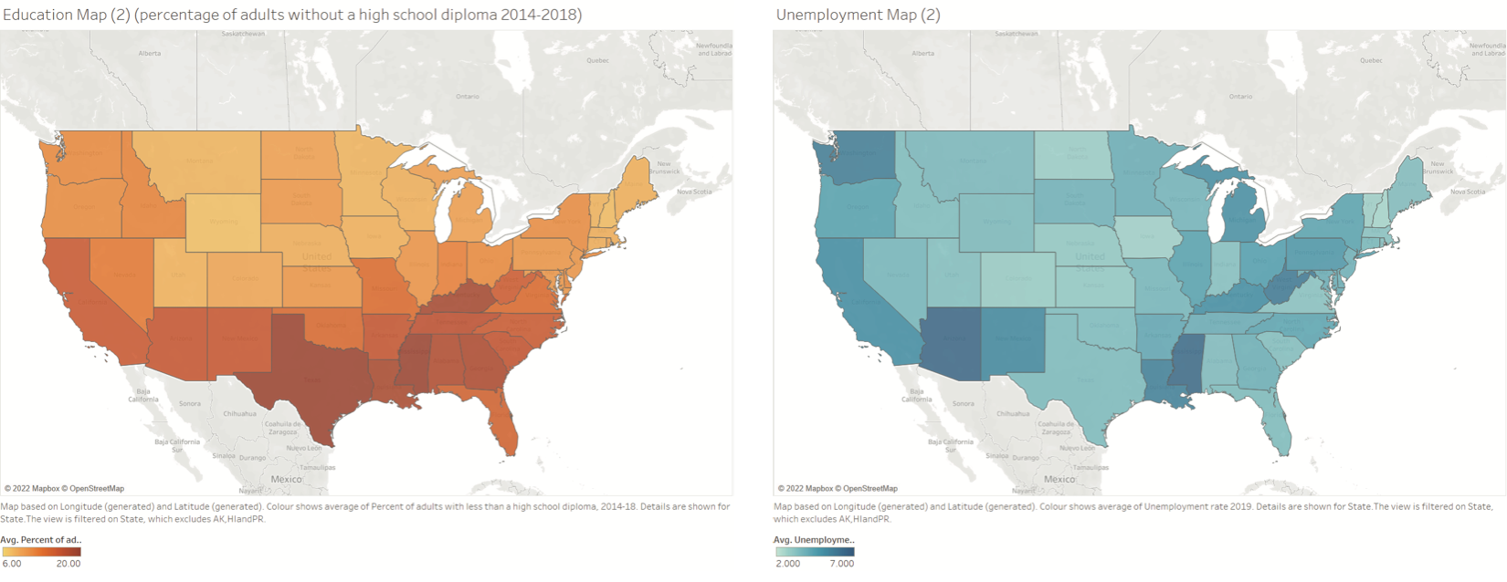
High school attainment (2014-2018) and unemployment (2019)
Question 2
In the tutorial about using Tableau with the Life Expectancy Data I made a “bad” visualization - a pretty useless spaghetti plot:
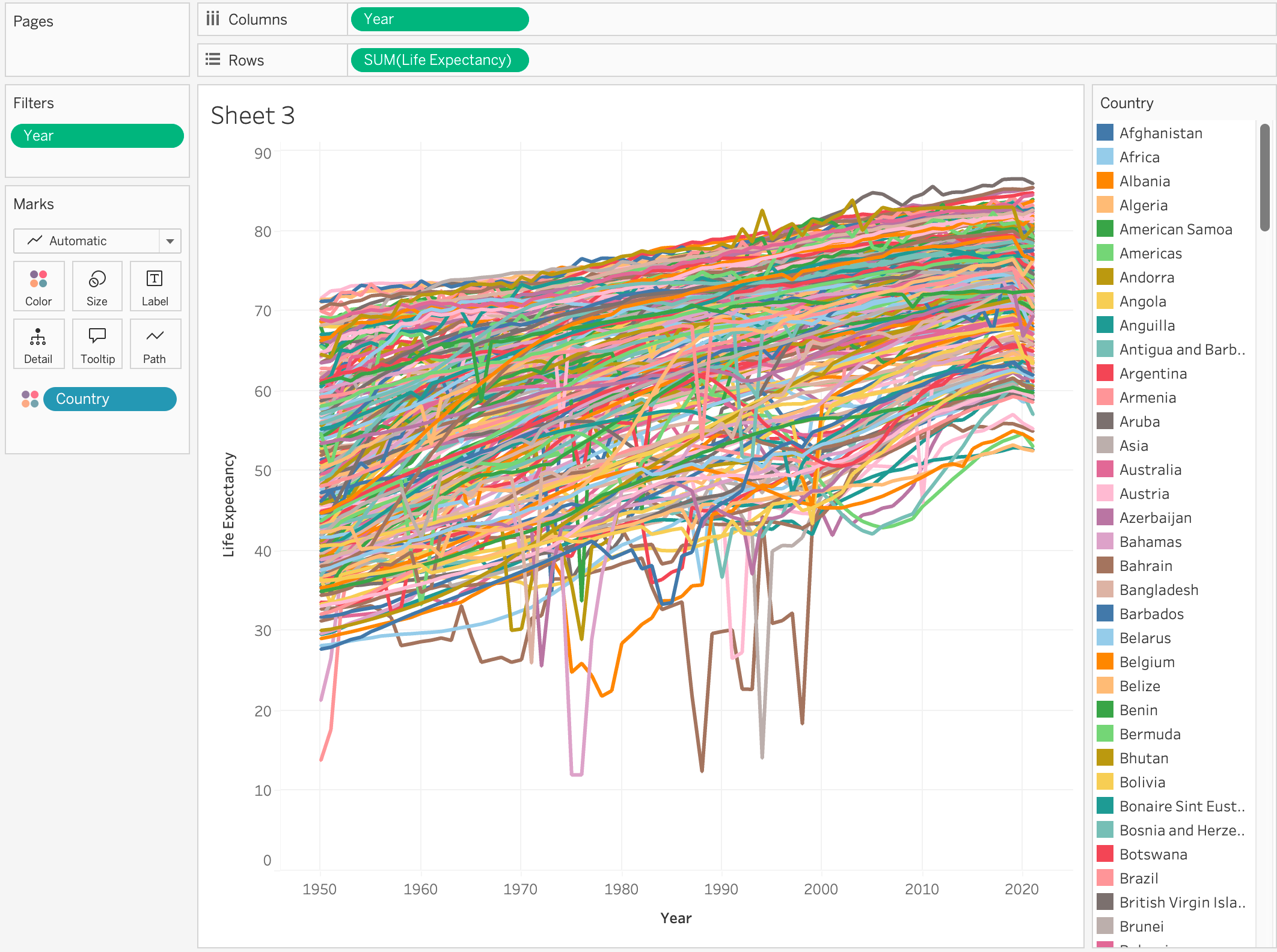
Life expectancy in a large number of countries.
This visualization is problematic in many ways - it was made to show how to work with the tools, not necessarily to make an effective visualization.
Imagine that the goal of the visualization was to provide a sanity check on the data in a broad way - an overview that shows that things are reasonable, and what is there.
Give a critique on a few elements that could be improved. (you might think of this as multiple critiques).
Question 3
In the tutorial about using Tableau for the Census Data, I made a map that put a dot for every data point - which turned out to be effective for finding problems in the data!
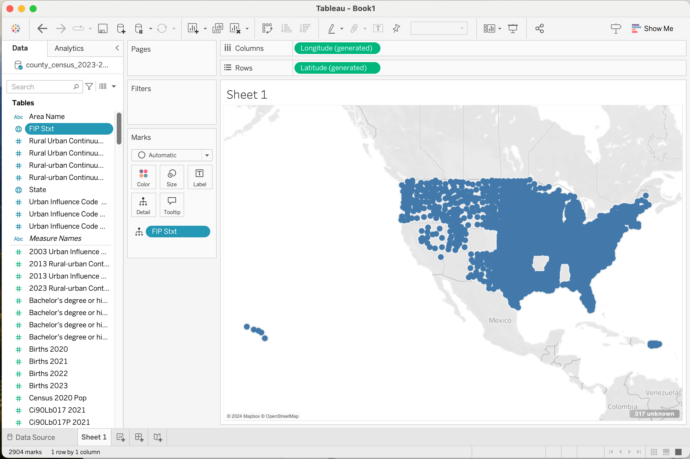
A dot for every county in the data set.
Assume that the goal is to check the completeness of the data set. Provide a critique of this design.
Question 4: A Comparative Critique
In the critique of the NY Times visualization Unemployment Changes Across The Country at the end, I say “I’ll leave the comparative critique as an exersize for the reader” (and actually give some hints on what to think about). You’ll probably want to look at that writeup to understand the visualizations and my rationale.
Let’s try a comparative critique…

My Design: Color indicates percent change, circle size represents total employment.
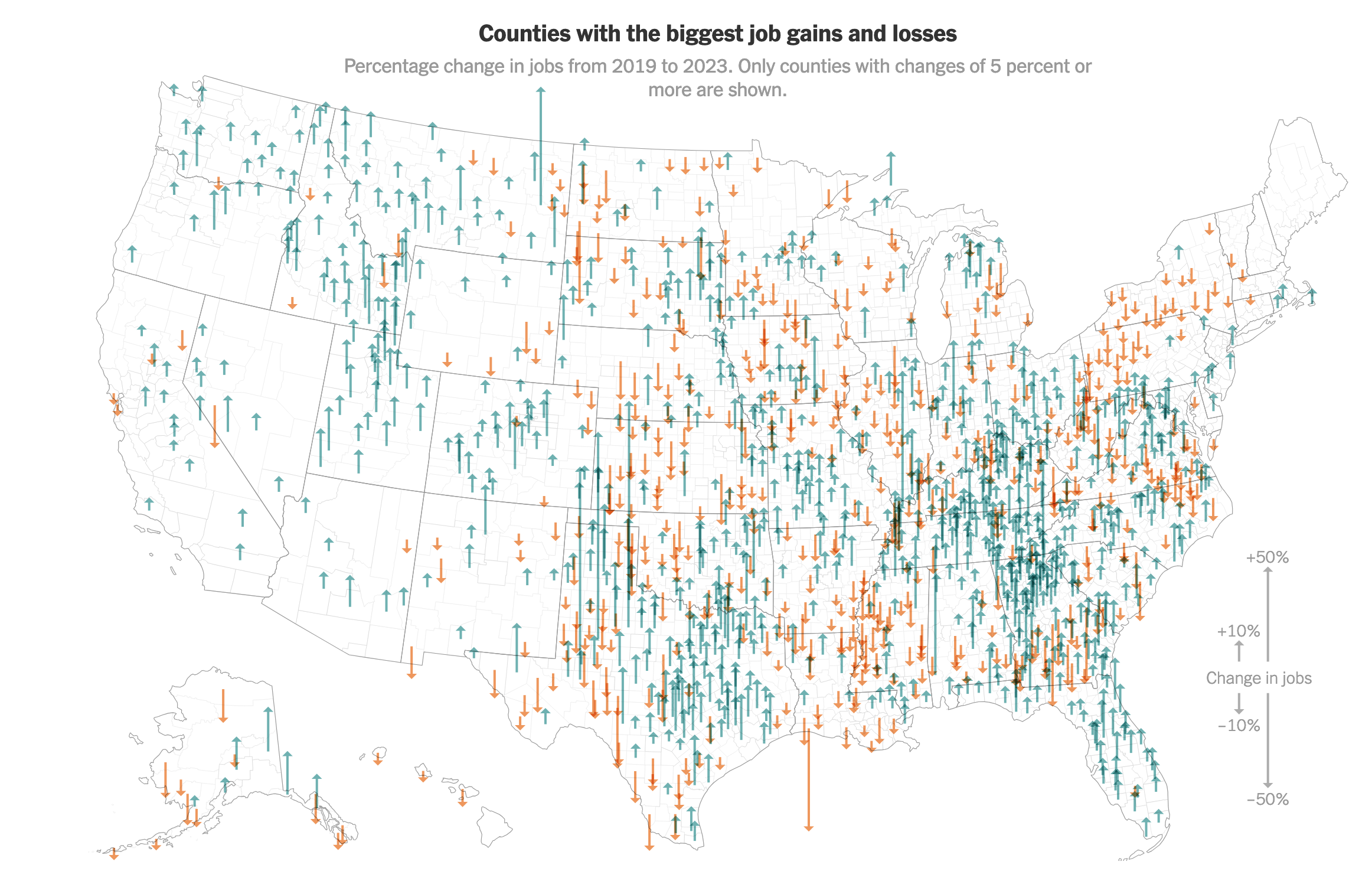
NY Times Design: Arrows length indicates percent change.
Give a comparative critique that discusses what one does better than the other. You can pick which one is “better” and critique why (which should include what it is better for).
Question 5: A Newspaper Example
Here is a visualization from the New York Times (article for context):
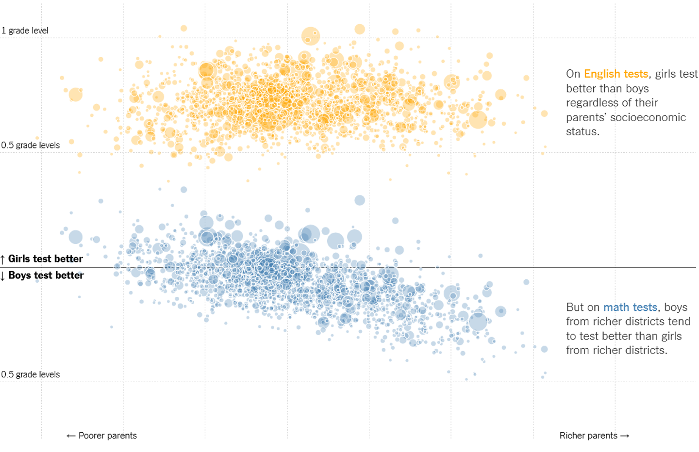
NY Times visualization of Test Scores. Each dot represents a school district, the size of the dot is the size of the school distruct.
Critique this. There’s a lot of good things in this one (and some things which are a little confusing).
Question 6: A Student Example
This is an example from the 2021 class. The data set was college tuition pricing.
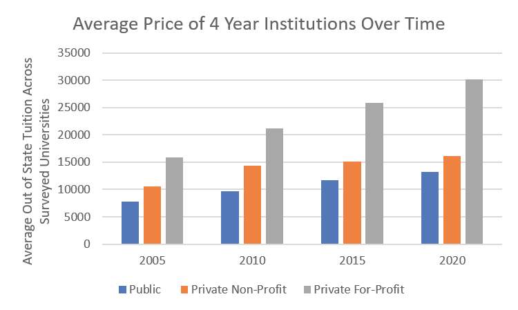
A student visualization of tuition trends for different types of colleges.
Critique this one. Consider suggestions on how to improve it by thinking of something you want to see, but this does not make easy to see. If you can’t think of possible improvements, provide a critique that explains why you think the chart is effective for what you want to see in it.