
Design Exercise 1-1: What Can You See? (Comparing Visualizations)
In our first design exercise we’ll look at some different visualizations of the same data set and you’ll try to figure out what each one might be good for. The goal of this exercise is to build intuitions about task and effectiveness in visualizations. You will turn in your answers to questions about the visualizations on Canvas as Design Exercise 1-1: What can you see? (chart comparison) (due Fri, Sep 12)
Introduction
This assignment involves a data set of US Census data from the USDA. Past versions of this class worked with this data set. For this assignment, you don’t need the data - you just need to look at some visualizations I made from it.
These visualizations are a sample solution to an old assignment that asked students to identify a story in the data, and then make a visualization to tell them. Course staff created these examples (they are designed to be used as a prop for critique, rather than as great visualizations).
You will get more from this assignment if you do the parts in order without peeking at the later parts. Part B has visualizations that you shouldn’t look at until after you’ve done Part A. Part C has hints for part B. (the hints are “hidden” so you can read over the whole assignment - but please don’t expand the expanders until you’ve done the previous parts).
Mechanics
This Design Exercise (like all design exercises) will be turned in as a Canvas Graded Survey: Design Exercise 1-1: What can you see? (chart comparison) (due Fri, Sep 12). Each question will have either a type in box, or a file upload box. We do this to keep the different parts separate.
When you turn in the survey, Canvas will give you a default grade (87 - a middle AB). Later, we will grade it and give you a score on the A is >=90 scale. Remember, if Canvas gets confused and gives you a percentage (out of 87) it is confused.
Canvas will let you turn in the survey more than once. However, each time it will start from scratch - you will lose what you did previously. Therefore, I recommend you write your answers first (in some text editor) and then copy the answers to the Canvas quiz later.
For many questions, we are asking for a list of questions. Please number them, put each on a separate line, and put your best ones first. We ask for 3-5, but feel free to give more.
Part A (Questions 1-2)
First, look at Visualization 1 (the two maps). It is much clearer as a PDF, but here’s a thumbnail:
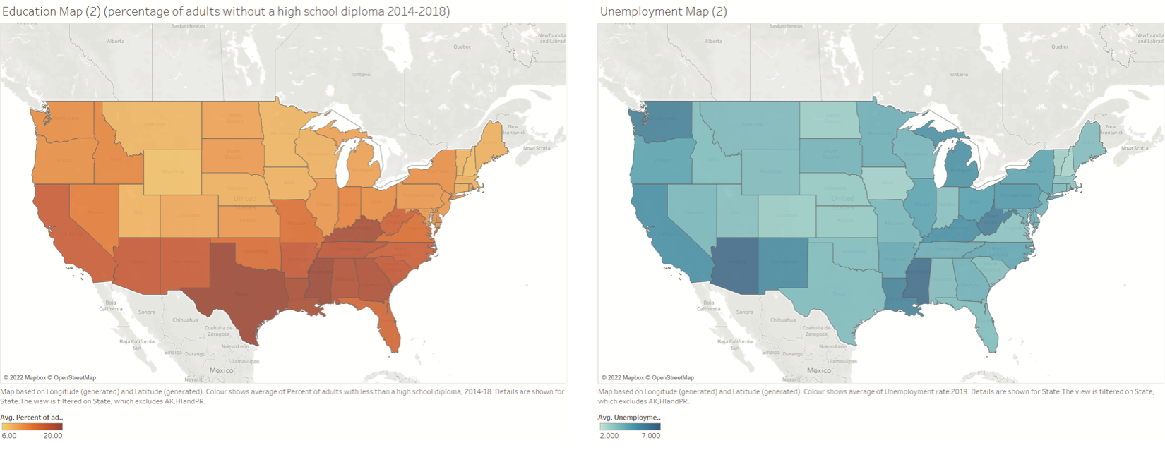
High school attainment (2014-2018) and unemployment (2019)
Note: the visualization is the pair of maps, they are meant to be viewed together. Also, this map shows levels of high school attainment and unemployment rates in specific years (you can pretend they are both for the same year).
Question 1: List 3-5 questions that you can answer (relatively easily) about the data with this visualization (Visualization 1, the maps). Try to pick questions that this visualization is good for answering. See if you can try to guess what questions it was designed to answer.
Question 2: Make a list of questions (at least 3-5) that the visualization (#1, the maps) inspires you to ask next - that you probably would need to make another visualization for. Try to pick questions that would “need” a visualization to answer (rather than ones with a specific textual answer), and that cannot be readily answered with this visualization.
Part B (Questions 3-5)
Visualizations 2 and 3 are two different visualizations made from the same data.
This is a bit of a “comparison” exercise: what is each one potentially good for?
Visualizations Hidden - Don’t peek until you complete Part A
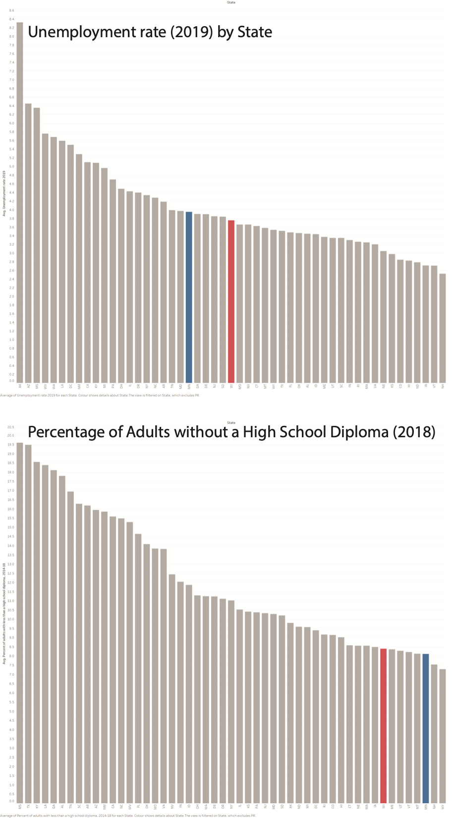
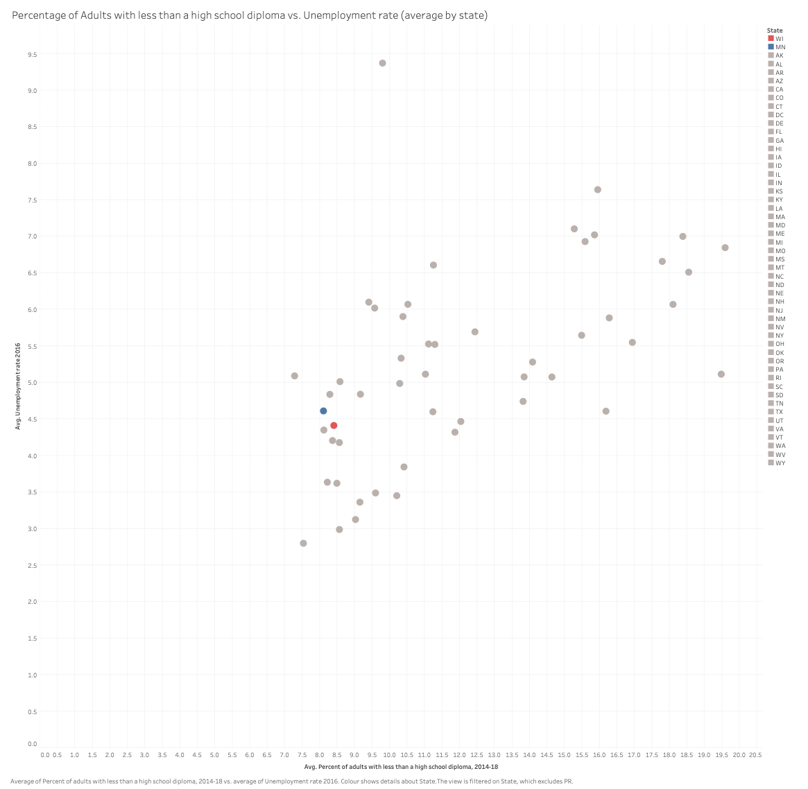
Note: this is a bit tricky, because it’s hard to know. Use your eyes and intuitions. In the future, we’ll understand some of the science.
Question 3: Make a list of questions (3-5) that would be easier to answer with Visualization 1 (maps) than with Visualization 2 (bars) or 3 (scatter).
Question 4: Make a list of questions (3-5) that would be easier to answer with Visualization 2 (bars) than with Visualization 1 (maps) or 3 (scatter).
Question 5: Make a list of questions (3-5) that would be easier to answer with Visualization 3 (scatter) than with Visualization 1 (maps) or 2 (bars).