
Tableau Tutorial for CS765: Getting Started with Census Data
This is a tutorial on how to get started with Tableau using the Census Data for the Design Exercises. It will walk you through what I did to make a few initial pictures. This will show you some of the quirks of Tableau, and the dataset.
Learning Tableau is a bit tricky. It’s a big complicated system. But worse, it is based on some tricky concepts (that will make more sense if you know the visualization and database theory). My experience is you can figure out a lot by poking at things and trying. But it helps to see a few examples, and to have someone help get your data set up initially.
Here, I’ll walk you through what I did to make the first pictures for class. I’ll give you the resulting workbook, so you don’t have to do this yourself. But it’s probably worth going through it just to practice pushing the buttons.
I am not a Tableau expert - and I haven’t used it in 2 years, so this was “re-learning” for me (I only use it for class). I am doing this with Tableau Desktop on a Mac. Cat (the 2024 TA) checked that the instructions work online (and provided some pictures where things are different).
This is more of a “walkthrough” than a “tutorial” - I am going to show you what I did, with minimal explanation of the concepts behind it. But, from experience, understanding these concepts is what makes Tableau make sense.
My (non-expert) take:
The trick to Tableau is to tell it about your data. You might think of Tableau as an automated design tool: you give it a Vis problem, and it decides what visualization to make. You get to change the problem, and the details at the end, but basically you have to coax it into making what you want. This can be frustrating.
Warning: The Tableau term for a variable is a field (this is database terminology). I will often use the term variable.
Getting Started
Goal: Get the data loaded and clean enough to use.
We start at the tableau start screen. I want to start by connecting to data, so I pick the “Text File” option (under “Connect to a File”). And pick “county_census_2023-2024_raw.csv” (which I have downloaded from Canvas).
On the browser version of Tableau, adding a data file looks more like the below picture.
Now I am in the “Data Source” view (I know this from looking at the lower left corner - red arrow below). In this view, I’ll do some data cleaning to make sure Tableau has interpretted my CSV file correctly. Again, a key to Tableau is to get it to know about the data.
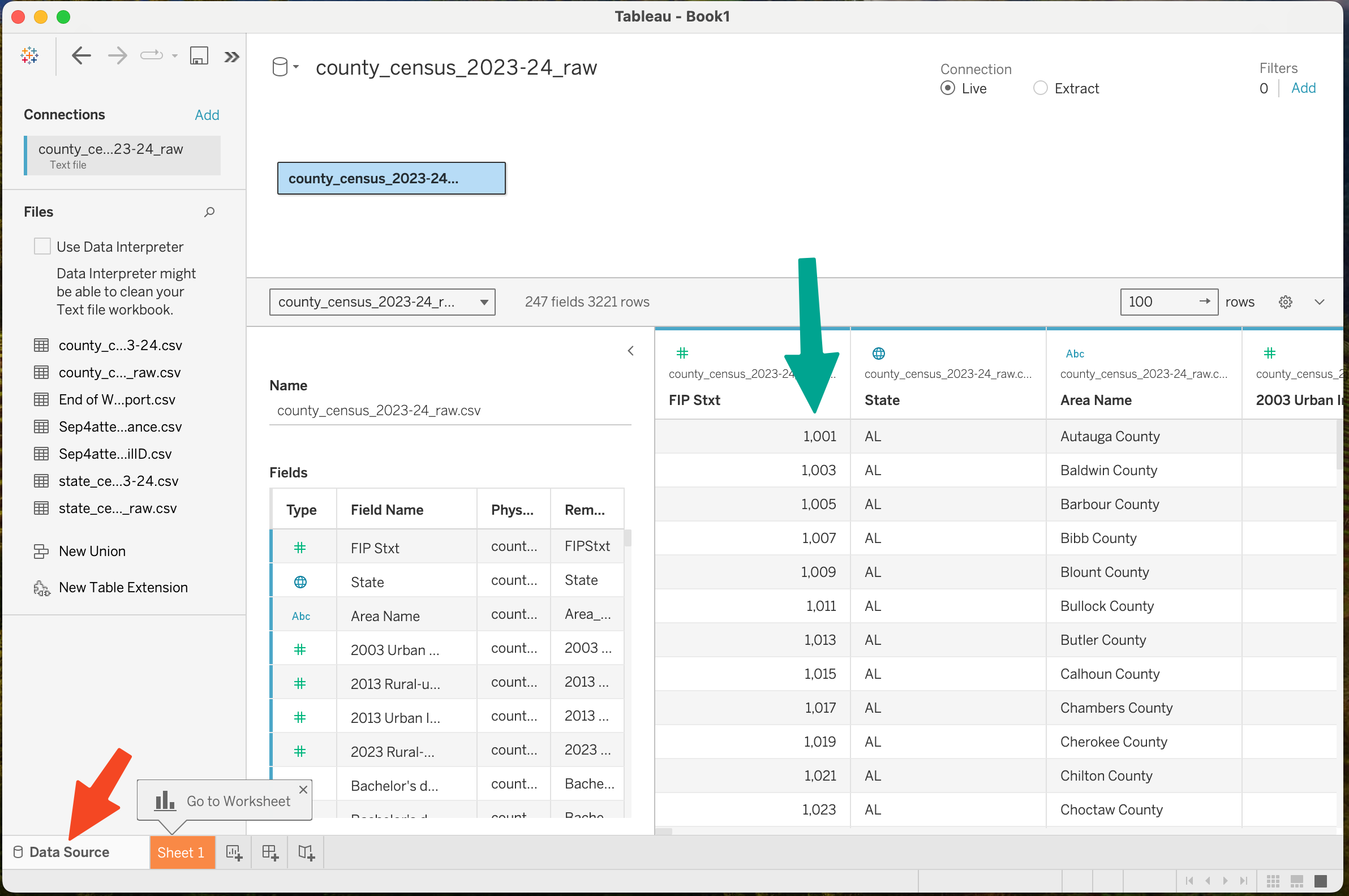
In this view I will look at the data to see if there are problems that I should try to fix. Right in the first column (green arrow) I can see a problem: it is interpreting the “FIPS code” as a number (it should be a 5 character string with leading zeros). I’ll come back to that later. But notice that Tableau did recognize that the “State” column is a geographic type.
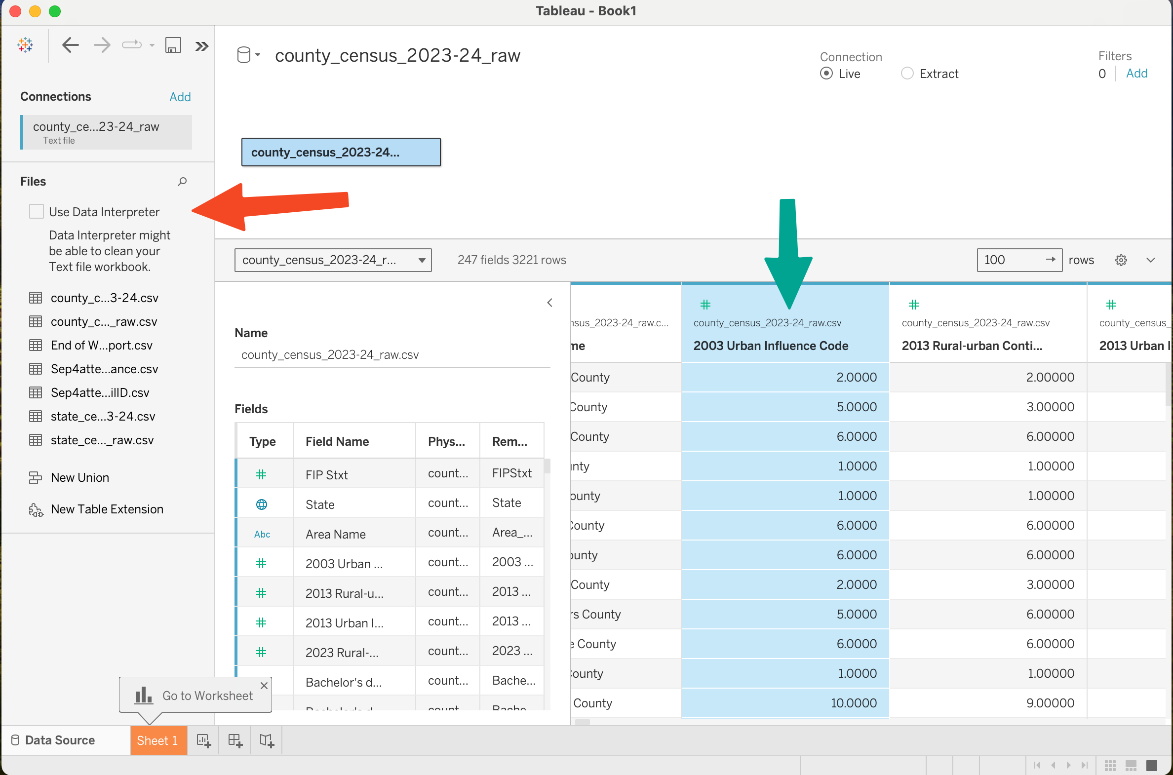
Scrolling to the right in the spreadsheet view, I notice that the columns that should be integer codes (2003 Urban Influence Code - green arrow) is a real number, not a discrete value. Rather than trying to convince Tableau to change all the columns, I try the magic “Use Data Interpreter” checkbox (red arrow). It changes those columns to integers (but not necessarily an ordinal variable, it’s still numeric). I am not sure how to tell Tableau “this column is ordinal, not numeric/interval”.
A First Picture - Making a Map
Goal: Make a map that color codes each county by the unemployment rate in 2021.
To make a picture, I need to go to a Worksheet. Tableau gives me a hint - it highlights the first worksheet in the lower left. It’s called “Sheet 1” - this aspect of worksheets is similar to Excel.
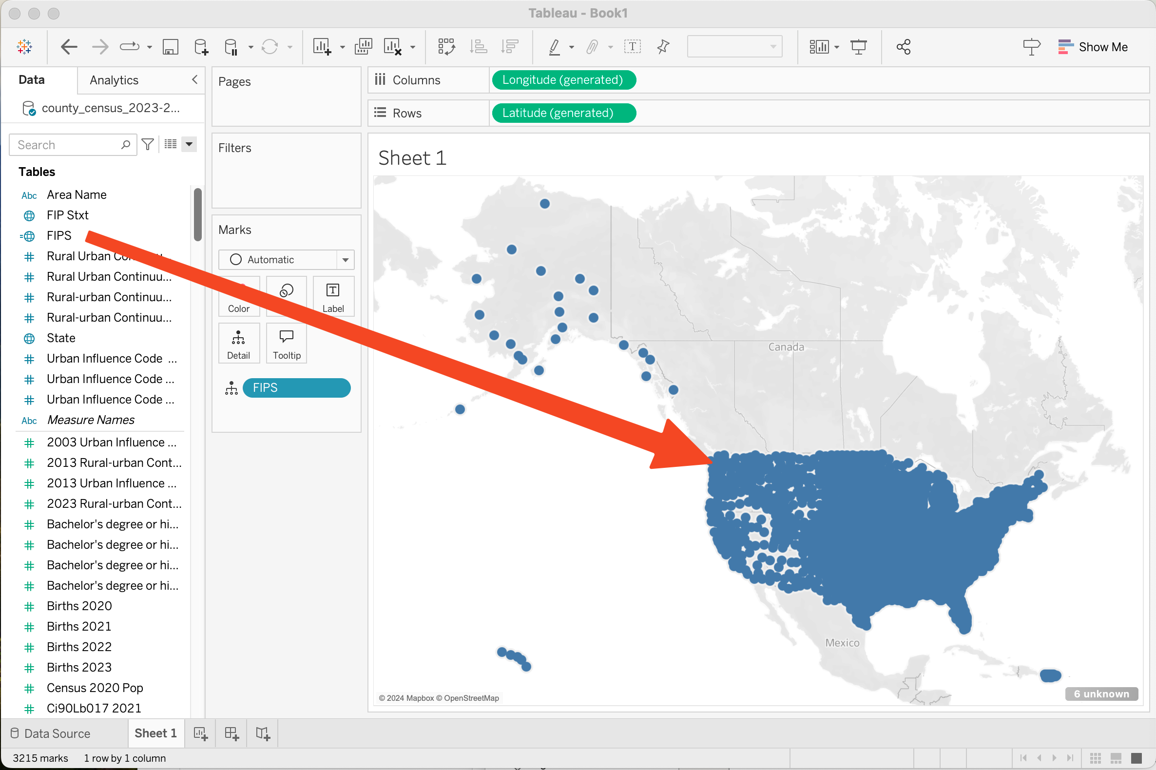
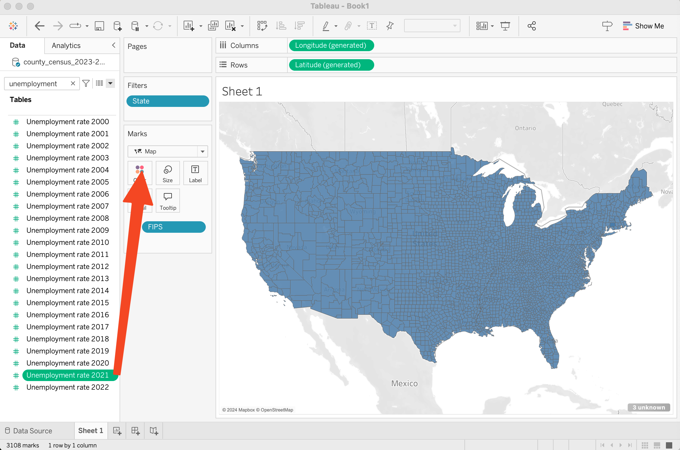
My first goal is to make a map. To start with, I need a geographic variable. The FIPS code (the column is “FIP Stxt”) is a code for each county. I select it in the left column. It is green (this means Tableau thinks it is a measure, something quantitative).
I could try dropping it on the sheet (in the center of the sheet where it says “drop field here”). I get nothing useful - Tableau doesn’t know that these numbers are county codes, so it decides that the right thing to do is to sum them together. Undo.
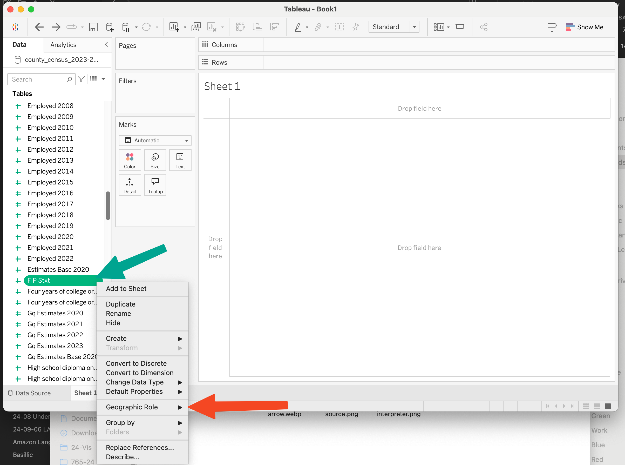
I right click on the green “pill” around “FIP Stxt” (green arrow) and set it’s “Geographic Role” (red arrow) to county.
When I do this, “FIP Stxt” moves to the top of the variables list on the left, because it is now in a different section. When I click on it, it lights up as a blue “pill” because it is a dimension, not a measure.
If I drop it on the center of the sheet (where it says “drop field here”) I get a map! It shows me a dot for each county.
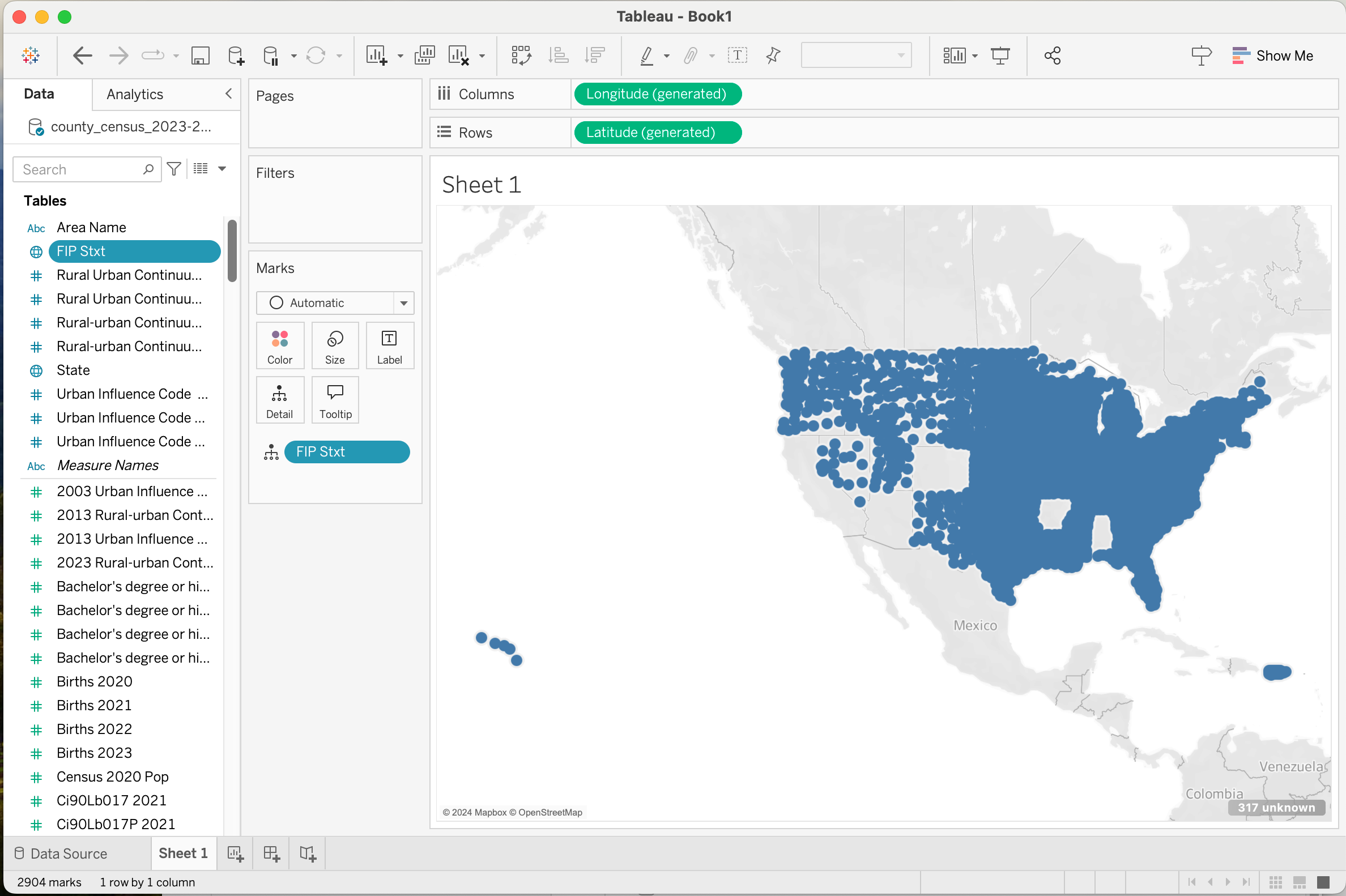
Note that some states are missing. Alabama, Alaska, Arizona (all the ones at the beginning of the alphabet). These are states with low numbers (the FIPS codes are ordered by state), so they are places where the missing zeros in the FIPS code are a problem. 1001 for Autauga County, Alabama doesn’t work - it needs to be 01001 (the first two digits are the state code).
To fix this, I searched for a solution and found a nice answer here. Basically, we will create a new column and compute the value using a formula that converts the number to a string, adds zeros at the beginning, and then chops the string to length 5. You can follow the steps on that web page, or…
- Using the triangle next to the search box (red arrow), pull up the menu and pick “Create Calculated Field”. This is one way we do data transforms in Tableau.
- Name the new field “FIPS” (in the top box, red arrow)
- Type the formula “Right(“00” + Str([FIP Stxt]),5)” into the calculation part.
- Make sure it says “The calculation is valid” at the bottom
- Press the Green OK Button


Notice that there is now a “FIPS” variable in the variable list. I right click on it and set its geographic role to county. Notice that is has a globe next to it, since it’s a geographic variable.
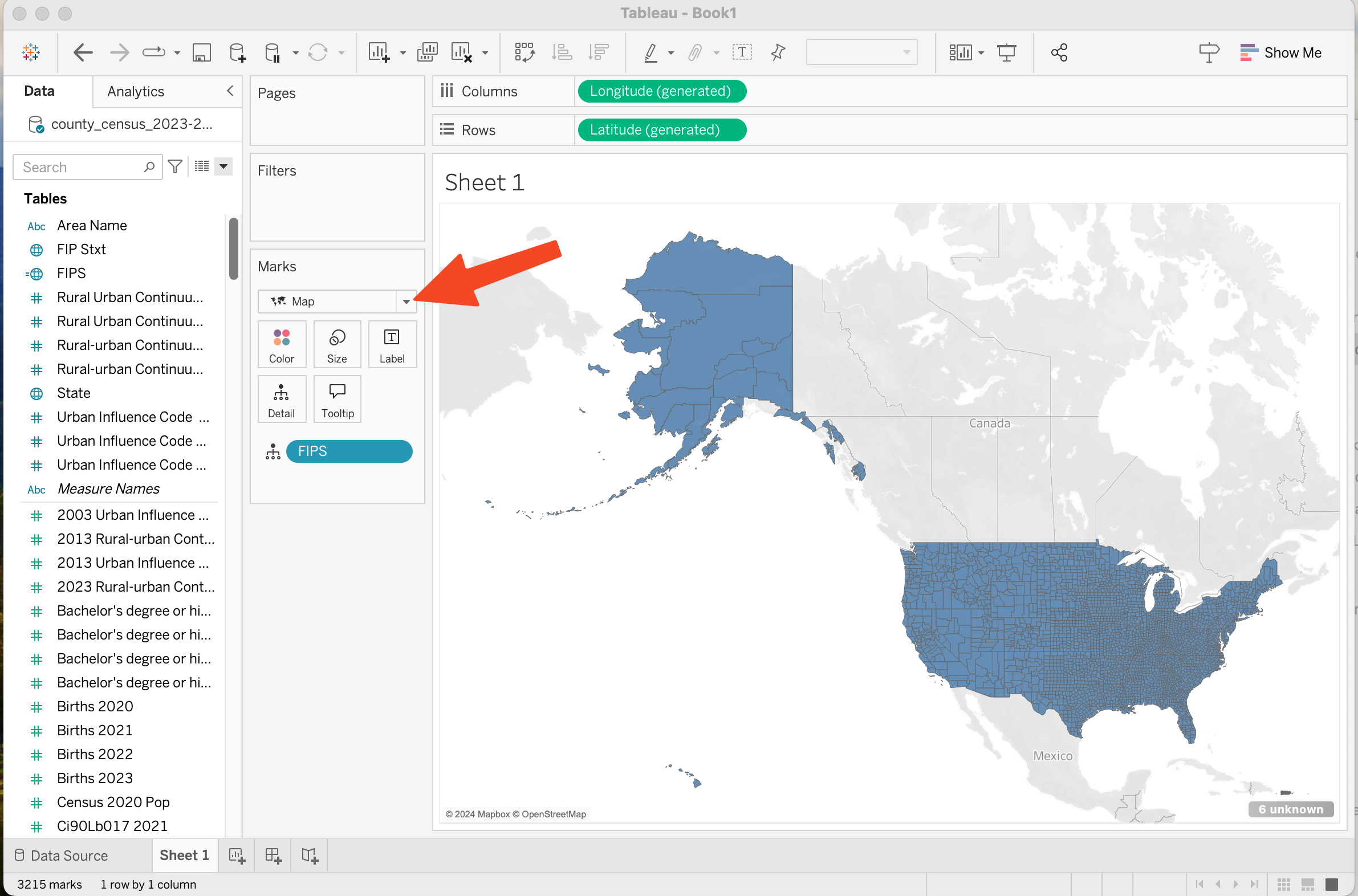
OK, now let’s use this to make the map. We need to remove the FIP Stxt - in the “Marks Area” click on the blue pill “FIP Stxt” and press delete. Then drag FIPS from the variable list onto the map, and viola, we get dots for all the counties in the US! (including Alaska, Hawaii, and Puerto Rico)
Now, I want it to show me areas - not just dots. To do this, in the marks panel, I pick the Mark Type as Map. (before it was auto, so it made each data point a dot, now it makes each data point a mark shape).
While I am at it, let me show another feature of Tableau - filtering. I want to limit myself to the continental US (remove Alaska, Hawaii and Puerto Rico) - since it will make the map more manageable (Alaska is big - and makes the rest of the country small). Mainly, I want an excuse to show off filtering.
To filter, I drag a variable into the “filters” section, I’ll filter by state, so I’ll drag the “State from the variables list to the Filters Section.
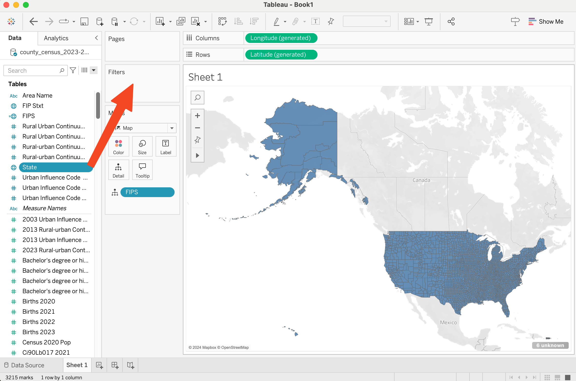
When I do this, I get a dialog box to pick states.
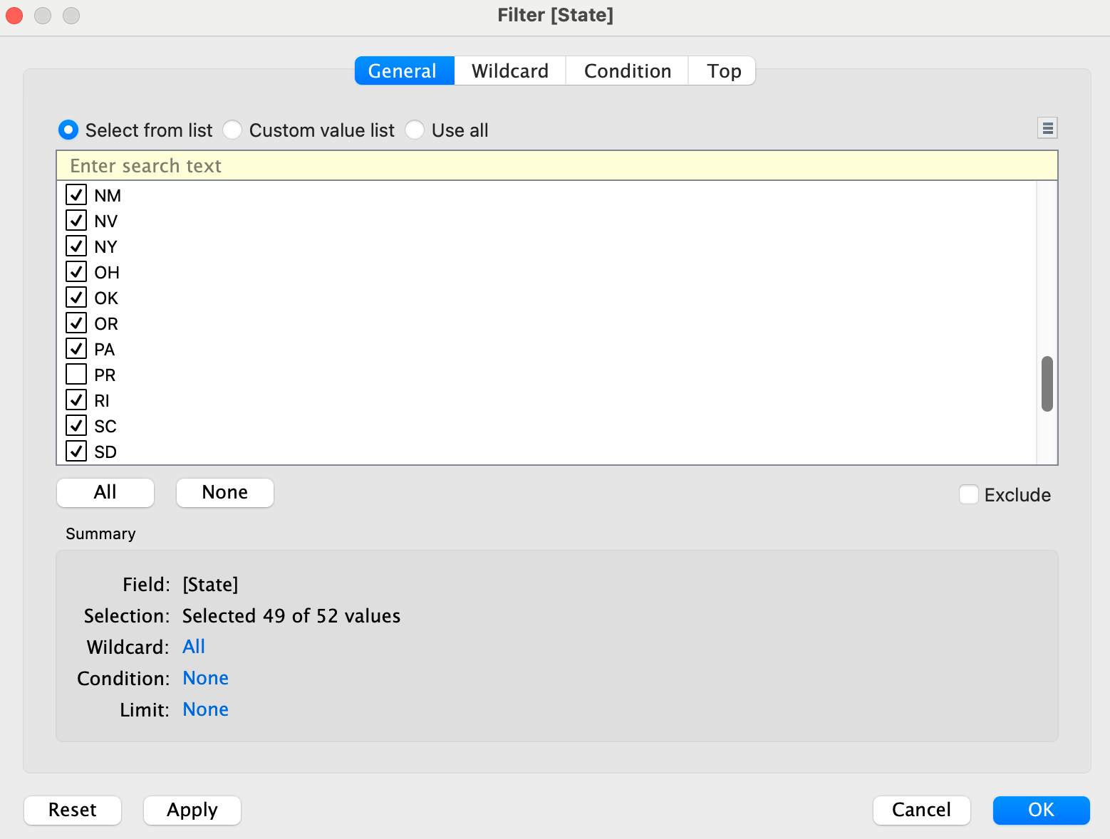
I click all, then uncheck AK, HI, and PR. Then I press Apply. and now I have a much more manageable map.
(In a browser, it may be easier to select the “Exclude selected values” option, then select AK, HI, and PR.)
Now I need to pick a variable for the colors. On the variables list (left of the screen) I look for “Unemployment Rate 2021”. If I click on it, I see that it has a “green pill” (so it is a measure). I drag this measure to the “color” field in the marks area.
And we have a map of unemployment!

So, now for some details…
- I should give it a title so I know what it is. I double click on the title (which says “Sheet 1”) and change it to “Unemployment Rate 2021”.
- I can tweak the colors by double clicking on the “color” square in the Marks area (where I dropped the Unemployment Rate field). I changed it to 7 steps (rather than continuous), and made the range go from 0-18 (rather than .9 to 17.5). Changing the range is under “advanced”. I did this to make the legend look nicer.
- If I hover over a county, it shows me the two variables I am using (FIPS and unemployment rate). I can add more variables by dragging them to the “detail” area of the marks. I drag “Area Name”, “Unemployment Rate 2000” and “Unemployment Rate 2019” to the “Detail Area (1 at a time).
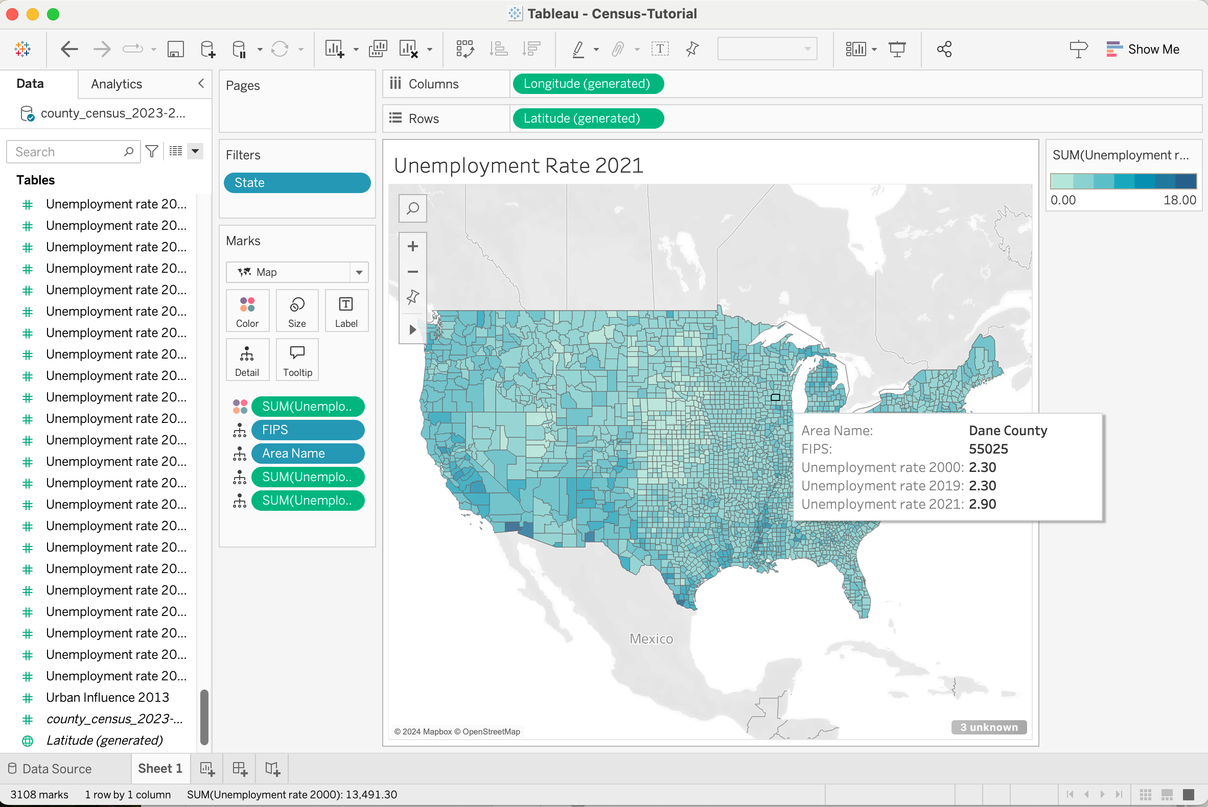
Notice how my tooltips have more useful information!
We’ve met our goal, but I want to point out a weirdness that you may have noticed. All the places where we use unemployment rates say “Sum”. This is because Tableau always wants to aggregate things - it wants some way to put many data points together. Because there is only one value (unemployment rate) per county, summing is OK. We could change it to some other aggregation function (it’s under the “measure” menu if you open the menu for a green pill).
Side By Side Maps
OK. Now Let’s try to make 2 side-by-side maps showing different variables (two different years).
At the bottom, next to Sheet 1, I press “+” to make a new sheet.
(Note: I could have started by copying the sheet from the previous section, but I am starting from scratch to practice.)
I basically need to repeat what I did last time, but since we’ve already made the FIPS variable, that part will be easy!
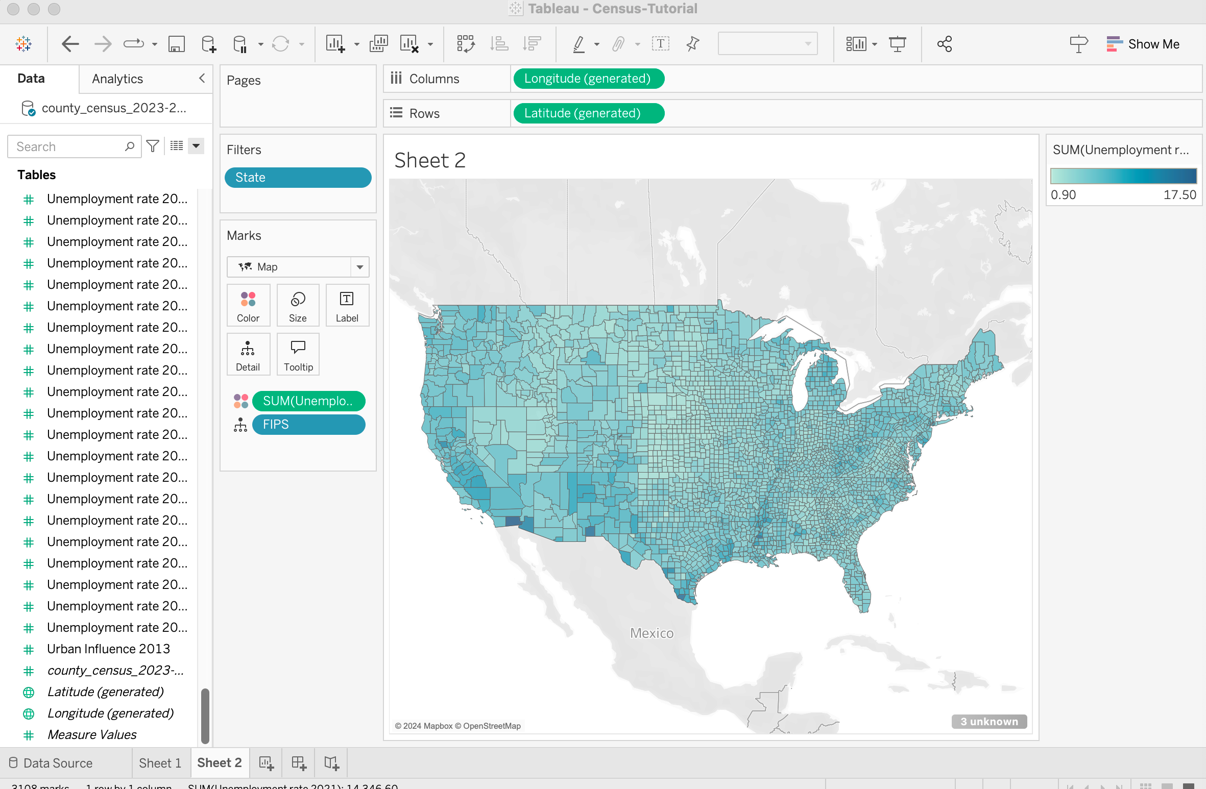
- I drop the FIPS variable on the “drop field here” in the center of the worksheet.
- I make the filter. (filtering state to remove AK,HI,PR)
- I switch the Mark Type to Map.
- I color by Unemployment Rate 2021.
Much faster this time.
Now, to put two side by side. The trick here is that I want to have two things side by side in the “column” shelf. I notice that what’s already there is “Longitude (generated)” so I drag that variable to the shelf so there are two of them, and, viola, two maps side by side!
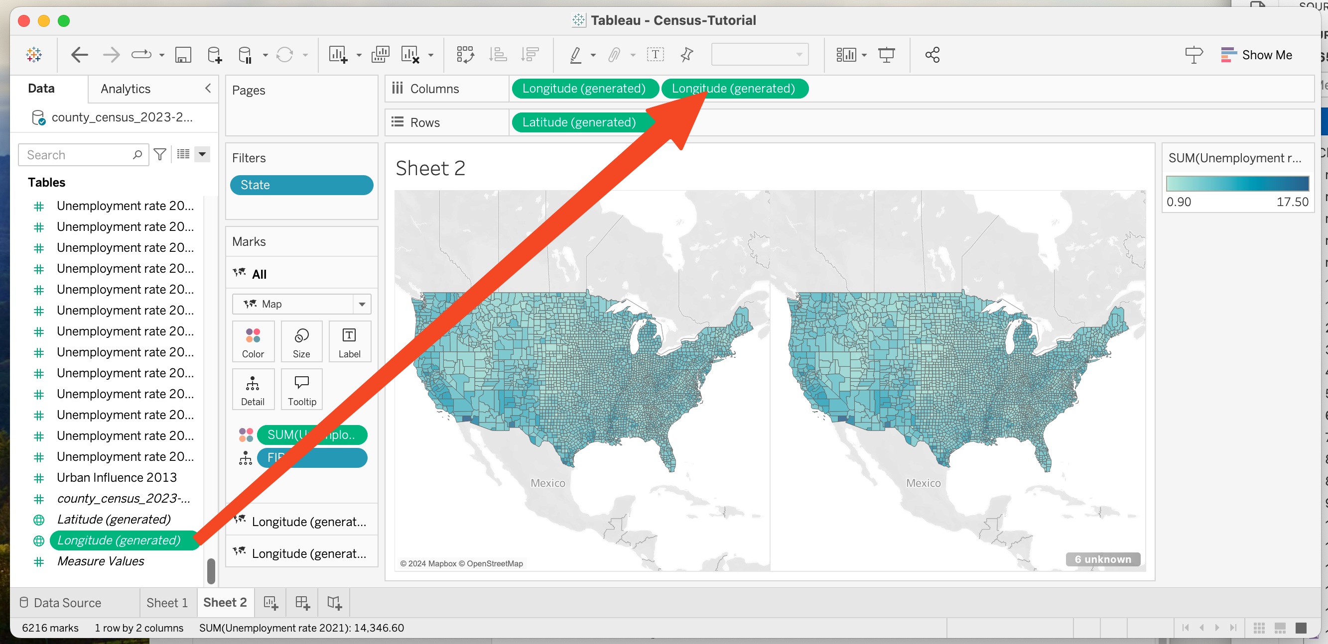
But they are still showing the same data! To fix this, notice that in the mark area, there are now three “regions”: All, Longitude(generated), and Longitude(generate). (yes, the bottom two have the same name). I click on the first “Longitude generated” and drag “Unemployment Rate 2000” to it’s color area.
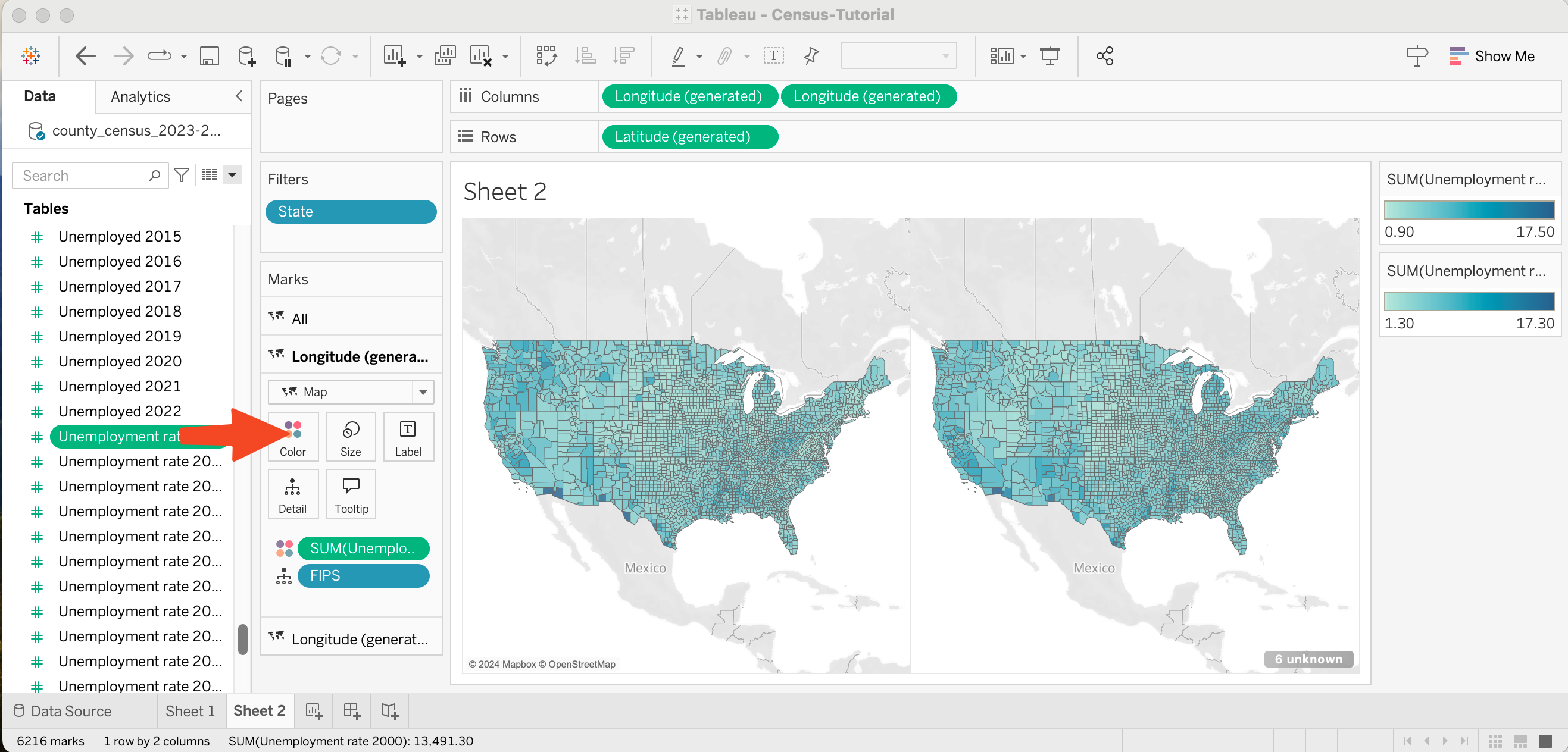
Notice that each one has a different scale (one goes from .9->17.5, the other goes from 1.3->17.3). I have to edit each color separately. Maybe I could have changed the color once before I split the map. I made both go from 0-18, and used a 7 step ramp (because I prefer stepped ramps).
Derived Change
Goal: Make a map that shows the change in unemployment rate (color coding the rate of change).
We’ll need to create a new field that computes the change, and then we can use the same method to make a map using it.
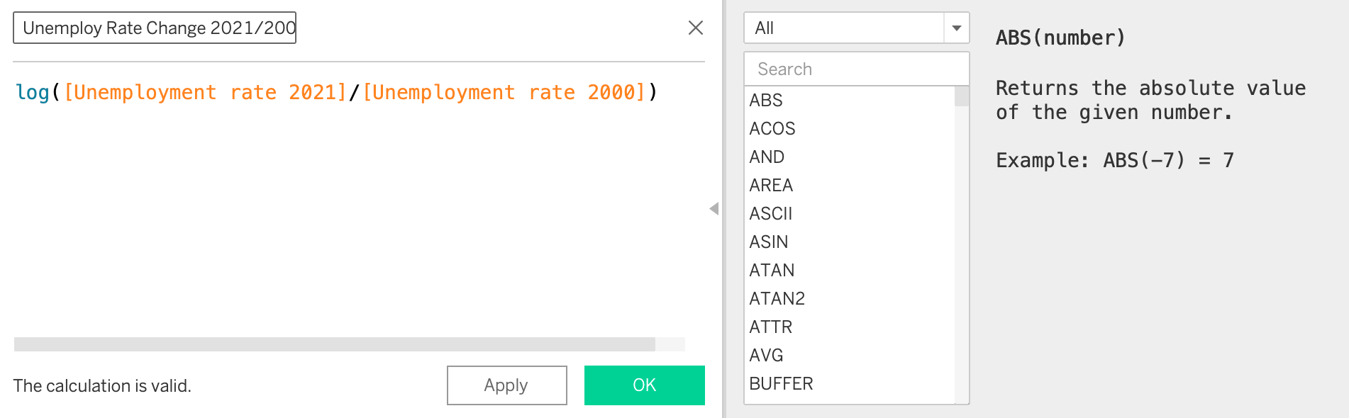
I use “create calculated field” (little triangle next to the field search), and create a field named “Unemployment Rate Change 2021/2000”. I use the formula: “log([Unemployment rate 2021]/[Unemployment rate 2000])”.
And then I just need to go through the process above to create a map (make a new tab, …). The only difference is this time I’ll use my newly created field.
OK. To make it go faster, I duplicated sheet 1, dropped the new variable on color, and changed the title.

A Scatterplot
Goal: Make a scatterplot comparing the unemployment rates of 2021 and 2000.
Let’s try to make a scatterplot to see if there are correlations between the 2021 rates and the 2000 rates.
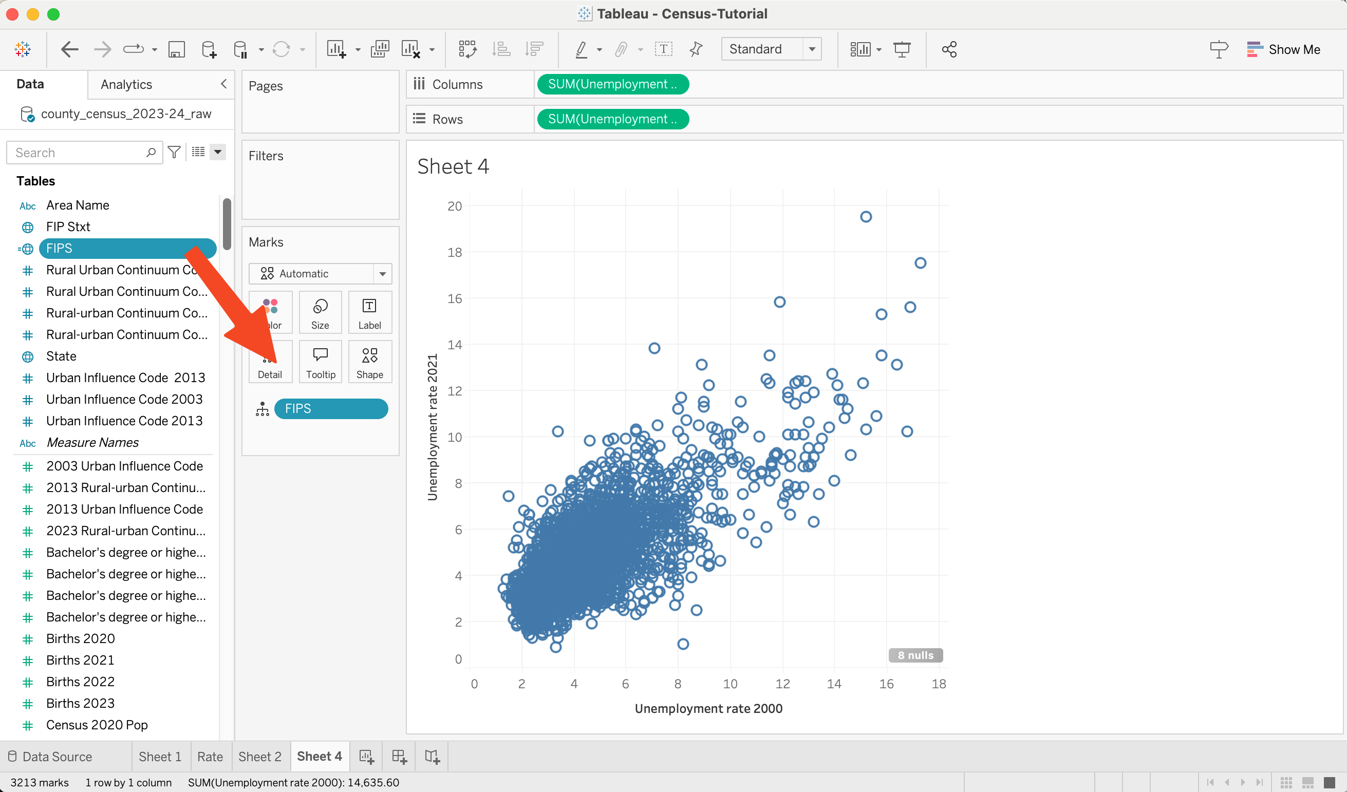
I start with a new sheet. I will drag Unemployment Rate 2000 to the columns and Unemployment Rate 2021 to the rows (the shelves on top).

This actually is a scatterplot! Just not the one we want. It has one point, because Tableau is grouping like points together. And when it can group things together, it aggregates them (by default by summing). One way around this is to add in another variable that makes all the points different. If I drop the FIPS variable on a detail (which we want so it shows in the tooltip), I get the scatterplot I wanted.
Now we can tweak the details. We can change the size, shape, color of all the dots by clicking on the square in the Marks Area. I like smaller, filled in dots.
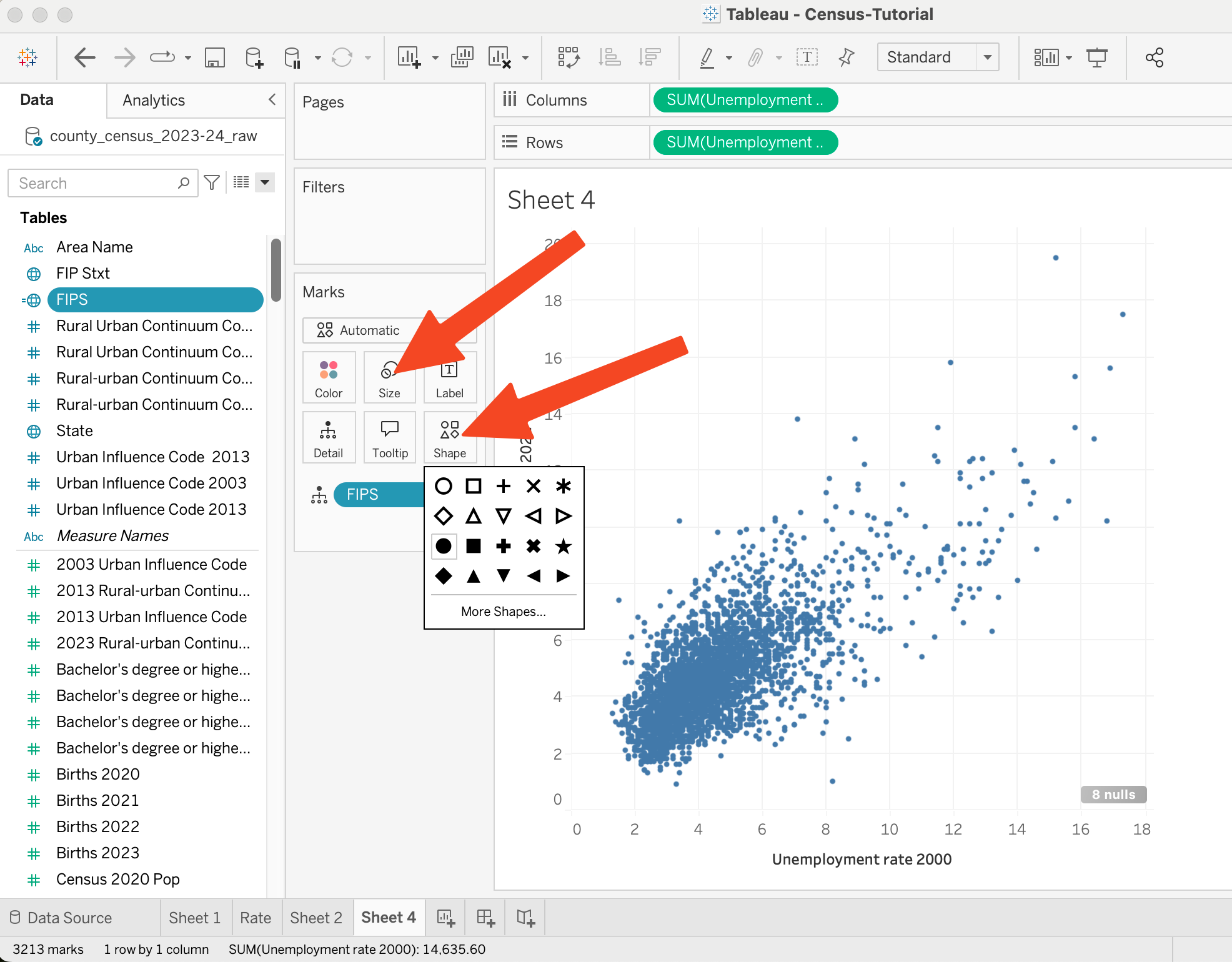
Or, I can drag another variable to one of those mark properties. Here I drag the “Rural Urban Continuum Code 2023” to color.

A Bar Chart
Goal: Create a Bar Chart of the number of deaths in 2020, 2021, 2022 and 2023.
It turns out, that this will be tricky in Tableau because of how the data is organized.
The first thing I tried to do is to select the 4 variables and drag them to the rows shelf. I get 4 bars, but each one is a separate graph (faceted). This faceting was great for the map, but here it’s useless.
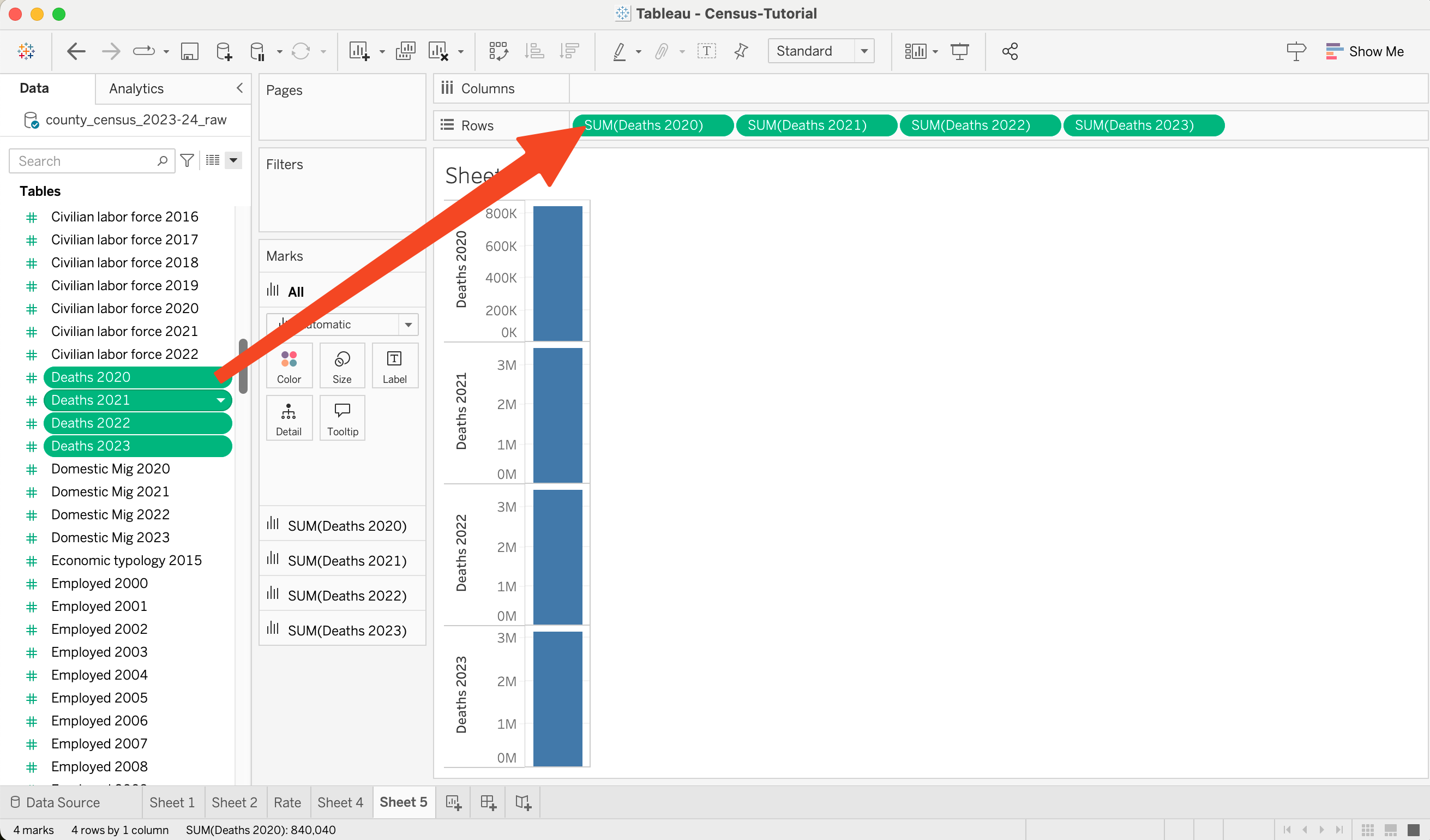
But notice that there is something right: it is summing up all the deaths in each year to make one bar (aggregation doing the right thing).
Instead, we start with one bar.
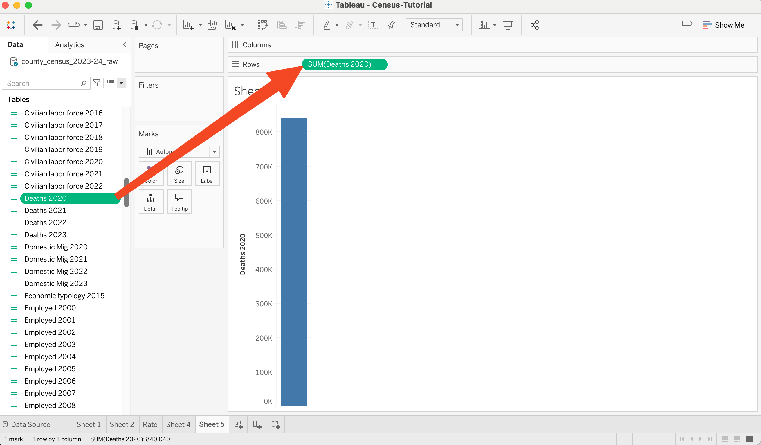
Now I drag the remaining fields to the axis (the Y-axis). I literally drop it on the axis label (where it said “Deaths 2020”). After dragging, the Y-Axis label changes its name to “Value” (and the X-Axis names become informative).

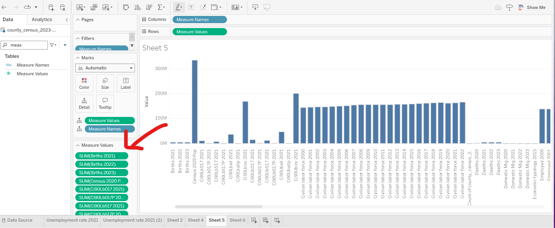
On our browser tests, this drag-and-drop interface didn’t work. The best option (that we know of) is to move “Measure Names” to the columns shelf and “Measure Values” to the rows shelf. Then, you would have to manually remove all of the variables you don’t want from the measure values table (a tedious task, given how many variables there are…)
There is something weird here: notice that the number of deaths is really low for 2020. I am not sure what is happening, but I can guess (based on other census data). When the pandemic struck (March 2020), things shut down. Including the census. Lots of people were dying, but the census wasn’t necessarily counting them correctly.
A bit about what Tableau is doing here… There is no variable for the X axis. If you look at the columns shelf, you’ll notice that it is using the field “measure names.” Tableau prefers to put one field on an axis (not multiple fields). This will make things tricky…
A different bar chart
Goal: Make a bar chart comparing the number of counties in each state.
This bar chart lets me use Tableau in a more standard setting, where each column (bar) is a value, and the X-axis is one field.
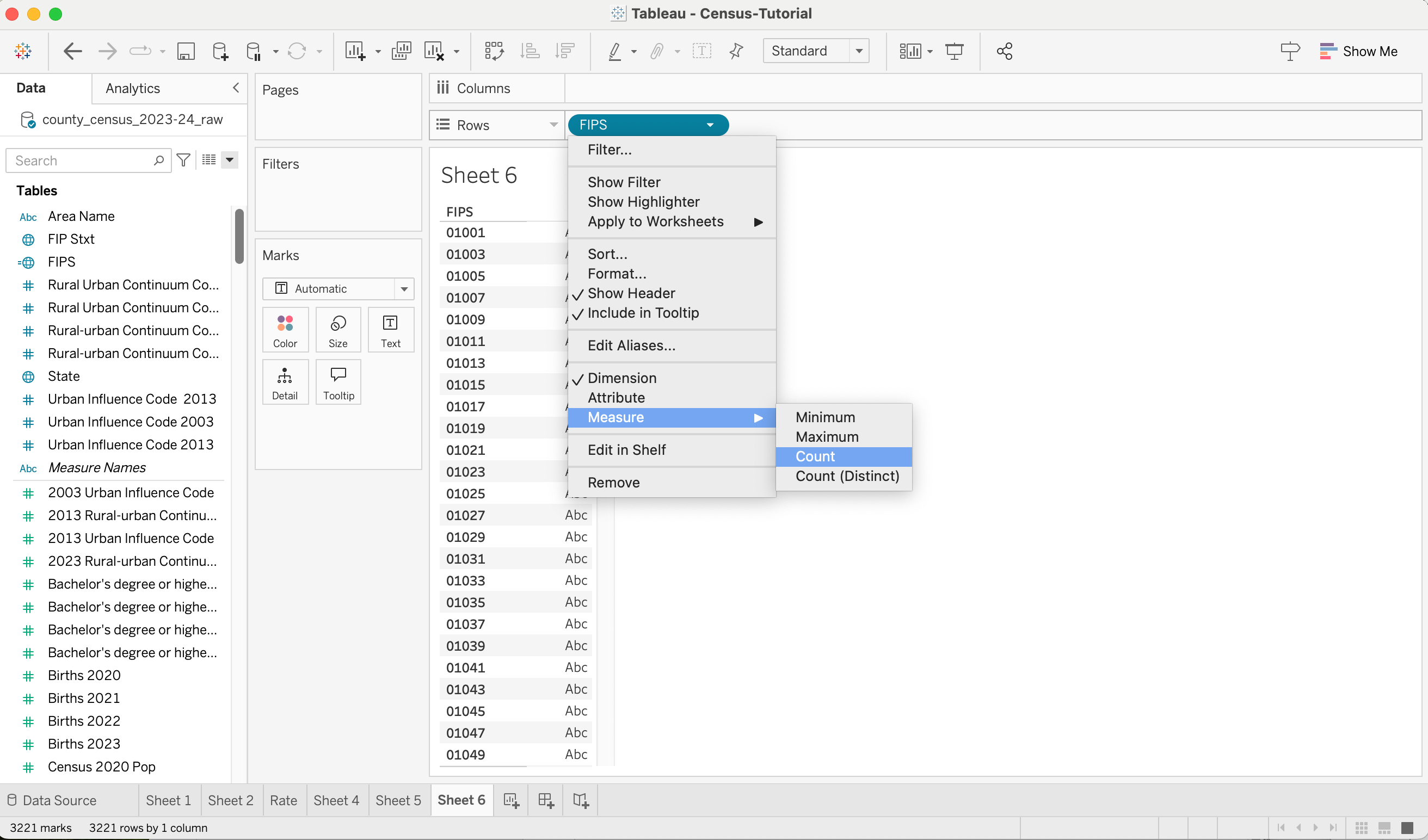
To start, I’ll put the FIPS codes on the rows - but this will show the FIPS codes (because it’s a dimension). I need to change it to a measure, and aggregate it by counting. To do that, I click on it (in the shelf, using it’s little triangle) and change it to a Measure, and aggregate by counting. Note that I change it in the Shelf - not in the field list (because I only want to change it for this one usage).
Now I have a bar chart (with one bar). I can drag a different dimension (State) to the columns, and I get a nice bar chart.
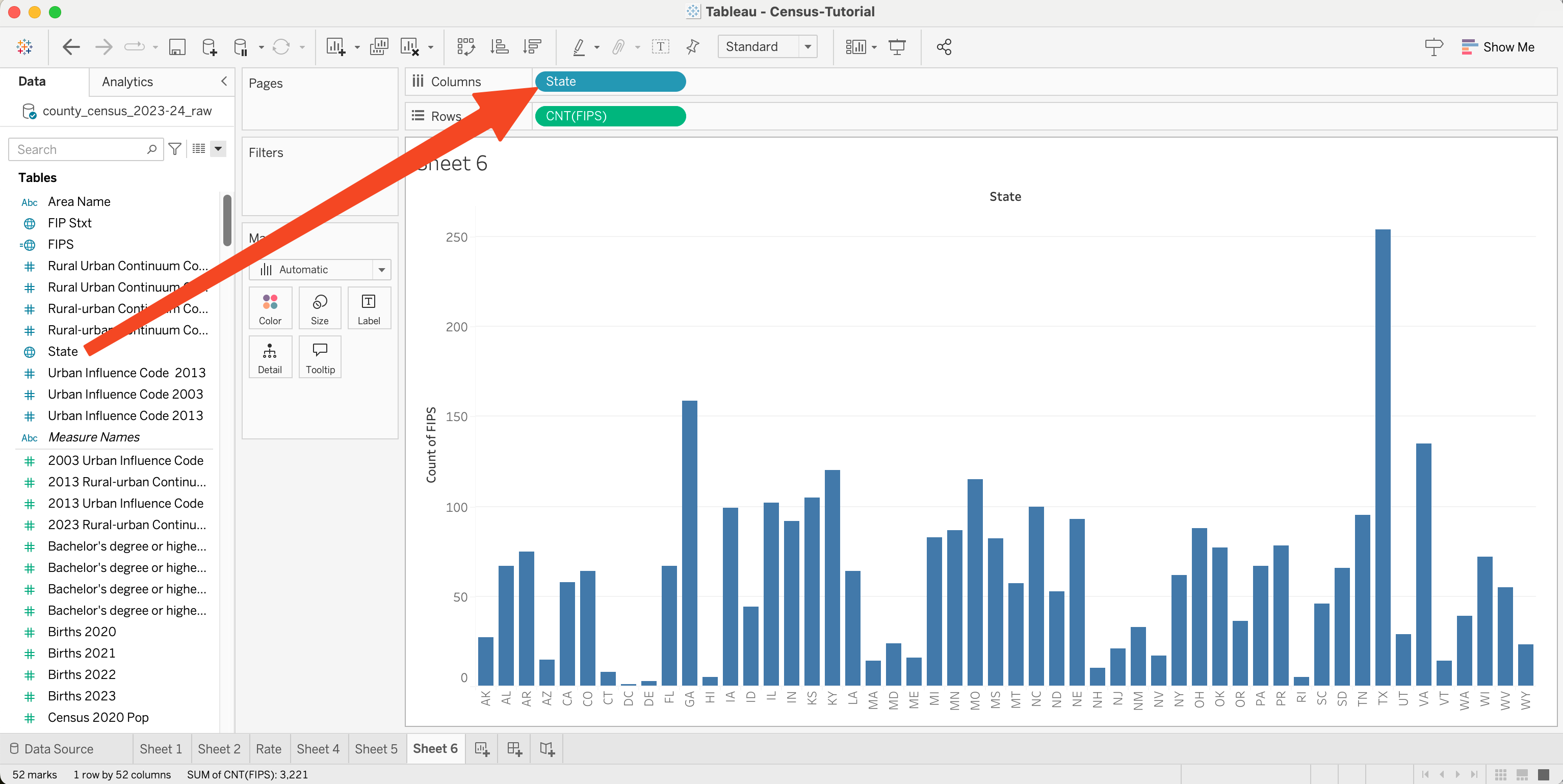
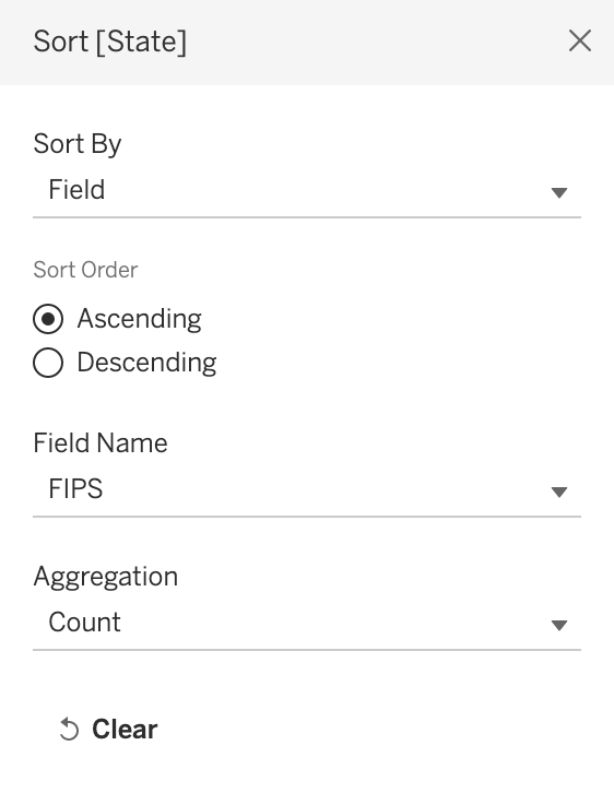
This orders alphabetically (since states are strings, this is how Tableau prefers to order things). Ordering by name is good for looking things up (WI has a medium number of counties). We might prefer to order from most to least (I call this a “pareto ordering” - but I am not sure anyone else uses the term). Using the blue pill in the columns shelf, I pick sort, and select “sort by field” (and use the same field and aggregation we use on the Y axis).
And I get the ordered bar chart:

And, just because I can… I can drop some categorical variable (field) onto the color square in marks, and get something that shows me the composition (how many of each type in each state)…

OK, Maybe that isn’t a useful visualization. But it was easy enough to try. Notice that because each row of the data gets used once in the graph, tableau can slice things up very quickly. In the previous section, where each row of the data was being used for multiple fields, doing things like this can be a little trickier.
Summary
Now we’ve been through a basic walkthrough to make some charts in Tableau. Over the way, you’ve seen some tableau concepts:
- Loading and cleaning data
- Describing fields (variables)
- Computing fields (deriving variables, data transformations)
- Dimensions and Measures
- Filters
- Controlling marks with data
- Layout by placing dimensions on shelves
- Faceting Axes
- Aggregating and Dis-Aggregating
- Putting multiple measures on one axis
- Using Aggregation to group data and create marks
- Ordering Axes
Now you can make your own visualizations!
If you’d like to start with my workbook, it is (Census-Tutorial.twb 1.0mb). We will also put it on the online instance (once we figure it out).