Here are some selected student responses that earned kudos. We picked one of each type somewhat randomly (these are not the “best” - they are a random example of something that earned a kudo, which is in itself a random sampling of things that are good).
We are providing these to give you a sense of what your classmates are doing that catches our eyes.
Discussion - Initial Postings
This is one style of initial posting that makes sure it covers all the aspects of the prompts using headings. While the answers are often short, they show thought and provide examples. This overall posting is quite extensive as it addresses so many different subquestions. And it connects back to the readings.
Discussion 2 - Initial Posting
Why does one make a visualization?
We create visualizations to present data in a way that makes it easier for people to understand, interpret, and draw meaningful conclusions. Visualizations are a great way to transform raw data into pictorial formats that makes it easier for people to understand and enables us to grasp large amounts of information at once in a concise manner.
What are the purposes of visualizing?
Visualizations simplify complex information, reveal patterns and trends, help to make comparisons within the data and gain actionable insights from it.
What might you try to achieve by doing it ?
When creating a visualization, it is important to keep in mind the specific goal you’re trying to achieve and the target audience you’re addressing. We try to achieve that the visualization we make effectively communicates the intended message to the right audience. As highlighted in Chapter 3, “The Beauty Paradox,” the figure depicting the Brazilian population is a good example. If the goal was to communicate to a general audience, the figure would likely be too complex and difficult to interpret, but for a technical audience it is a great visualization.
Why is visualization an attractive way to present or interact with information?
As mentioned by Cairo in the first chapter, the primary goal of visualization is to serve as a tool that extends our eyes and brains, allowing us to perceive and understand information that goes beyond their natural reach. Visualizations are particularly attractive because they transform complex data into an intuitive and engaging format, making it easier to understand, identify patterns and trends, and support decision making.
What are the alternatives?
Other alternatives to present or interact with information include Sound, textual data, or directly understanding data in raw form without any pictorial visualizations.
What can well designed visualizations do that other modalities cannot?
Well-designed visualizations excel at helping us quickly understand and draw insights from data. As Munzer points out, the visual system offers a high-bandwidth channel to our brains, allowing us to process and absorb large amounts of information far more efficiently than through other modalities. For example, if we wanted to show which regions were most severely impacted by a hurricane on a map, we could use bright colors like orange to highlight the hardest-hit areas and lighter shades for less affected regions. This approach makes it intuitive and quick for anyone to grasp the information at a glance.
Other modalities, such as sound, are less suited to conveying large amounts of information as effectively as visuals. Sound can also be disrupted by background noise, making it harder to focus on or interpret complex data.
Here’s a different one for the same question. This one focuses on going deeper about a few of the sub-questions, it has less connection to the readings.
Discussion 2 - Initial Posting
The question of “Why make visualizations?” can be answered in a simple way - it’s easier to understand visual cues than having to read long strings of words. The best example was one that we discussed in class on Monday - the red hexagonal STOP sign. If a simple board with the word “Stop” would’ve been written on it, then it might have been missed or simply ignored among all the other road signs that people drive by. If it was just put in Red but in a circular shape similar to the speed signs or walk signs, then people might confuse between them. However, designating a specific colour - shape - text format makes it very intuitive for people with varying visual capacity to interpret the sign.
To explore the question of “Why make good visualizations?”, I think the underlying motive remains the same - to help someone through the activity, but finer details would come into play:
The data may or may not be perfect, but the visualization should not move away from the original purpose. An outlier point that shortens the graphical area due to its presence needs to be dropped to maintain proper context & show rightful relationships - such cases are commonly observed in case of experiments & plotting sensor outputs in robotics.
The viz should be inclusive & incorporate accessibility. People could have varying levels of vision capacity - having a monochromatic scheme may make it harder to distinguish colors for them. Or the display device where it is being shown has a flawed display scheme & turns blue dots into green ones - in such a case, having the entire viz in hues of blue & green would make it difficult to understand. Some people might be colorblind, so viz’s should have proper markings to potentially demarcate variations.
Setting contexts - Everyone might’ve seen visualizations where the context is difficult to understand. There may not be proper legends, axes may not be named, scales might not be drawn - the list goes on. But making a good viz that encodes information appropriately helps the reader to understand instantaneously. Seeing a graph that just says “Number of coffees drunk per day, M vs F” is fine, but a graph that properly denotes “Number of cups of coffees consumed per day, Males vs Females vs Others” and uses proper scales would instantly help someone draw conclusion from it.
Discussion Responses
Good discussion responsive connect to the posting that they are respond to and add something - it might be a question, a point of contrast, a connection to something else, etc.
Reacts to a specific point and expands
Hi (name removed)),
Your writing about giving the viewer “the greatest number of ideas in the shortest amount of time…” has me thinking, and I agree! A strong visualization doesn’t need to necessarily tell an audience what to think, but it can get them thinking. I can imagine a strong visualization that simply compels an audience to say “well, that’s interesting…” and compel them to look at it further or take up an interest in pursuing different questions that they may have based on that interest. I’d call that a strong visualization, too!
Seek and Find Postings
A good seek and find not meets all the requirements (embed an image, give attribution, respond to prompt) and goes beyond to make connections between the visualization and the lessons of the week/class.
Note: the formatting of these examples and how the images are embedded are different than in the Canvas postings.
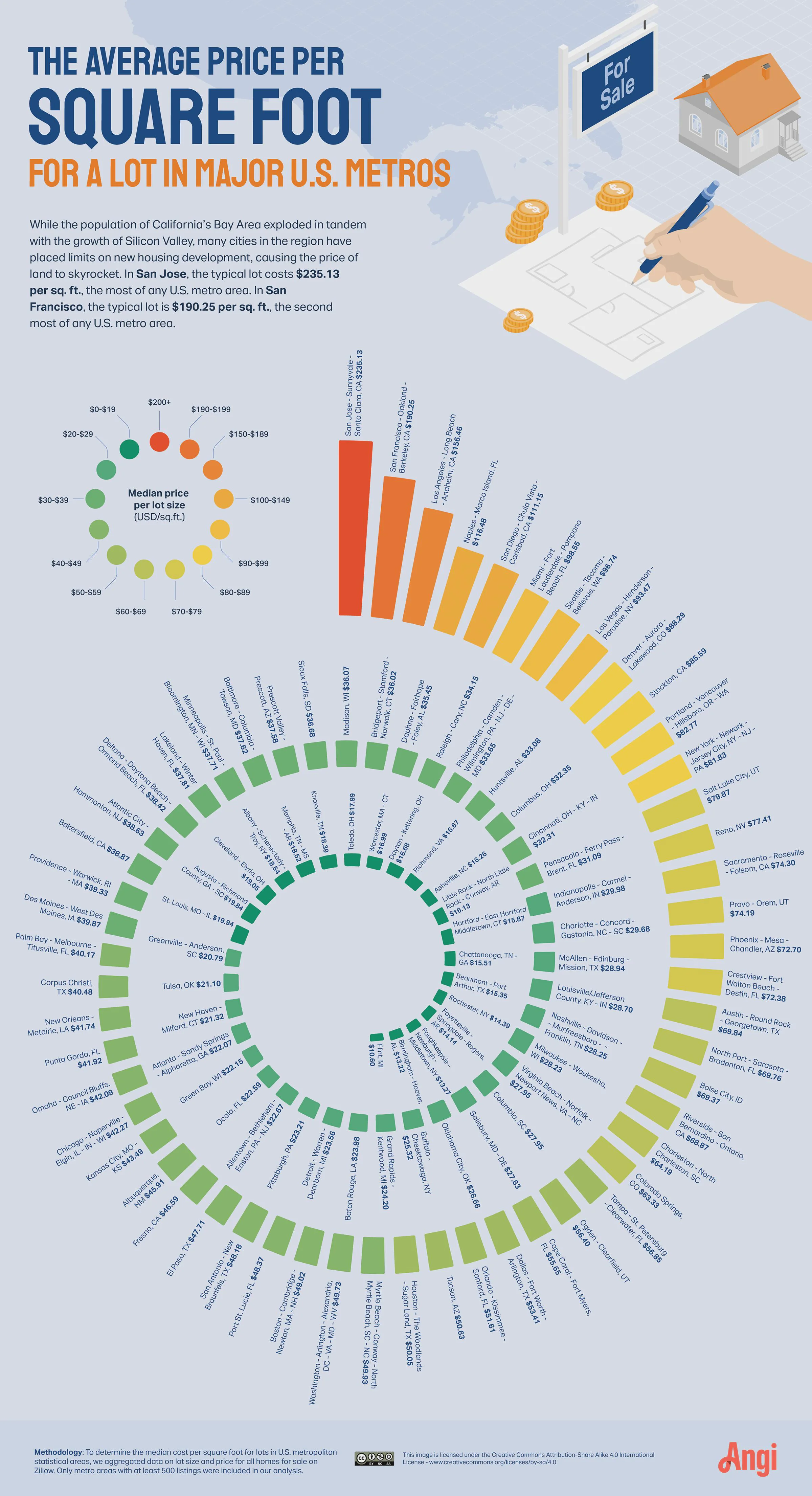
My seek and find above is from the r/madisonwi subreddit, which is a repost by user Terrible-House-9852 for a post originally on the r/infographics subreddit by the user cursingpeople.
I believe this to be a data visualization as it is using a picture created to display data on the pricing of lot sizes. To put it in Dr. Gleicher’s terms of “Visualization: a picture(1) that helps someone(2) do something(3).” from reading 1’s “Tutorial 1: What is Visualization and How Do We Do It?”
Picture: I don’t think this requires much explanation
Person: It would seem, at first, to be a general audience
Task: The description included IN the visualization would indicate that the task was to leverage lot pricing data to persuade viewers against limits on new housing development by comparing the lot costs of cities in silicon valley compared to other major metros.
Why did I pick this as my visualization? what do I find interesting about it?
Without digging into critique too much; I actually didn’t like the way that the data was presented in the image, at least initially. The issue I had was that the text labels are really hard to see: it is such a large image but you have to zoom in to get to the actual information, as exemplified by my embedding.
However! That is what makes it interesting to me for this discussion, I think it provides a great example of the importance of task. In the image. What was the image’s task? Not only what I said above, but to also draw the eye of the reader! The spiral layout with the color encoding certainly does that; and the smaller print forces the viewer to come in closer and see what the visualization has to say. With that in mind, I found it interesting that the reduction in usability and accessibility of the visualization could actually be done on purpose (designed; say!) to help achieve the task of persuading viewers by drawing them in.
It’s data about UW-Madison graduate programs, including admission rates, doctoral funding and number of master’s and doctoral graduates. The visualization is interesting as it chooses 3 kinds of visualization methods for the 3 kind of data, which all serve for its goal. For admission rates, the providers may want to highlight how difficult to get admitted and the number of students who eventually enroll, so they use bar charts to show the number clearly. For doctoral student funding, people don’t care about the detailed number. The focus shifts to the likelihood to get a RAship to suuport their PhD program, so pie chart is suitable to present the data as a whole and for easier comparison. For the degrees awarded, they may not want to compare the number of master’s and doctoral alumini, so they represent the digits simply. The design carefully reflects the underlying message, ensuring the visualization effectively communicates the intended insights.
Design Exercise 2 - Questions
These responses not only asked for more than the minimum, but all the questions are appropriate and in the spirit of the assignment.
Question 9 - Questions that benefit from a Visualization
How have unemployment rates changed over time in different regions?
Is there a correlation between unemployment rates and other socioeconomic factors?
How do unemployment rates vary by industry or sector?
How do unemployment rates compare to other countries or regions?
What are the demographic characteristics of individuals experiencing unemployment in different regions?
What are the economic implications of high unemployment rates in different regions?
This critique has many of the aspects of good critique, although it doesn’t (all) have the stylized form.
Question 7 - critique one of the visualizations
I want to critique the map (Visualization 1). First of all, regardless of tasks, the state name on the map is really hard to read. This causes extra trouble for an international student who is not familiar with the US states. Also, the precision level of the two maps is different. On the left it uses 6.00-20.00, 2 digits after decimal point, whereas on the right it uses 2.000-7.000, 3 digits after decimal point. Such disagreement can easily cause confusion. If the task is to show the regional differences of unemployment rate/high school attainment rate among 50 states, omitting AK, HI and PR seems to be a bad choice since quite some information is missing. Even though it is mentioned below the graph, I, as a reader, would love to know the reason behind this design choice, and I think giving a more detailed explanation of leaving these states out is preferred.
ICEs
We do look at the ICEs (briefly) and sometimes give kudos for things that are good. They need to clearly show thought put into the assignment, usually beyond the basic responses.
concise answers that follow the intended form, especially for critique
from an anonymized student assignment
part of a more complete answer, shows that a sketch doesn’t have to be fancy