
DE5-6 Codes: Feedback
To expedite feedback, some common things are given as codes. We use codes to tell you about good and back things we see in your visualization (it is feedback). For an explanation of how we grade, see Design Exercise Rubrics 04,05,06,07. If we point out problems with a code (as feedback) it is to help you learn and improve - it doesn’t always mean that it hurts your great.
You should look through the codes to get a sense of common problems (so you can avoid them) or common positives (so you can try to achieve them).
Note: just because you didn’t receive one of these codes, doesn’t mean it doesn’t apply to your design.
If you did get a code… think about why we felt like giving you the code (even if you think it’s OK). For example, we might say something is a data dump - if you see a story, maybe you aren’t making it clear enough to the viewer.
Note: you can expand (the little triangles) to get more description, and in many cases see an example.
Note: the examples often show multiple good/bad things.
Note: sometimes we put a “+” or “-” after the code to “modify it” - e.g., a bad code might be flipped, or a good code might be emphasized).
A few other common problems:
- Beware using absolute numbers, since the main effect is to show the state sizes. California has more of just about everything. (in DE6, we gave this a code)
- Make sure to have good titles and captions. Especially if the story doesn’t jump out, guide the viewer to know what you want them to see.
- Sometimes I forget to say “no clear story emerges from the visualization.” But make sure that one does - if the goal is to show a “null” result, say so in the title/caption.
General comments on the subjective categories
There are a bunch of codes that basically say “we don’t see an interesting story.” This is both (1) subjective, and (2) specific to the assignment (not the quality of the visualization). Different codes get at this in different ways.
The NR (needs rationale) code is often a symptom: your image doesn’t make an interesting story clear enough to us. This might mean “maybe the interesting story is there, but you need to point it out to us” - or “it’s not clear what you’ve done to make the story stand out (so you better tell us)”. Ideally, the story, and the design decisions that make it stand out, are clear from the image (including the title and caption).
We don’t usually use a US (ininteresting story) code - maybe you think the story is interesting. But that sentiment is captured in other codes. You should be aiming for “make a story that is interesting to most viewers including the course staff.”
There isn’t really a SS (simple story). There’s nothing wrong with a simple story - but, part of the point of the assignment is to explore how to bring multiple variables and aggregations together. Instead, we prefer NMV (not-multi-variate) - which gets not only at the number of variables, but also that there is some story in how they connect. If you are telling a “simple” story (in terms of the variables and reliationships), you should tell it well with good design and details.
Sometimes, there can be a lot of data and we just don’t see the story. This is where DD (data dump), NCS (no clear story), and CFA (consider focusing attention). Your job is to make visualizations that cause the story to stand out to the viewer. If we don’t see it, it could be that it isn’t there, it could be that you didn’t make it stand out, or it could just be that we don’t see something that you do.
Not used for DE05 2024
Positive Comments - general/overall
AE - achieving excellence (this is very good - likely to be considered A level work; use it as an opportunity to see how to make something really great)
Many designs were very good. These are cases where things are good enough that it is really meaningful how to make adjustments to turn it into something even better. It’s often getting details that make the story come out more clearly.
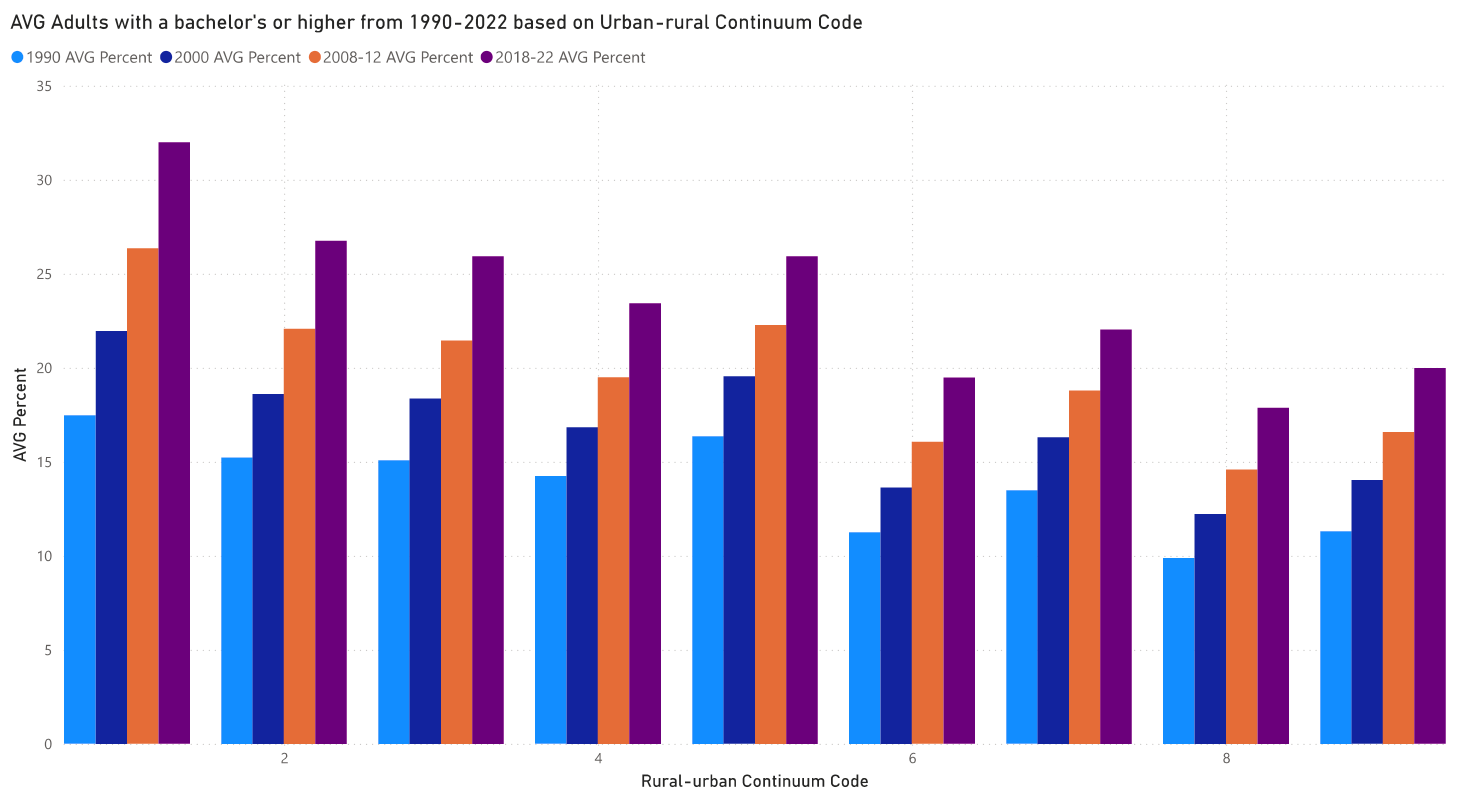
A visualization showing the increase in number of college grads over time in all levels of ruralness. Anonymized from a student submission.
This design makes it clear that there is a positive trend in all ruralness codes. However, it is more difficult to compare between the different codes. Are there design choices that might make it easier to see the similiarites and differences?
Some details could be re-considered as well. For example, the choice of colors could re-enforce the ordering of the categories encoded. (see IEC below)
Specific Positive Things
GS - good selection (good use of selecting a few data points to tell a focused story; consider including context of ’the others')

Rather than showing thousands a counties, this student told a story by selecting the top few. Anonymized from a student assignment.
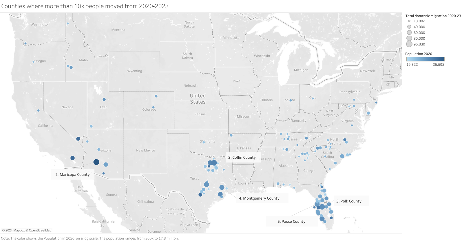
This student enhanced their story by picking a few points to highlight. Anonymized from a student assignment.
Serious/Severe Problems
You shouldn’t do these. In most cases, we mentioned them in class.
IE - inappropriate encoding (this uses a design that doesn’t work for the data)
This is often the standard data/encoding mismatch. Such as using a line chart for discrete objects, or a treemap for something that isn’t part whole.
Inappropriate is almost always bad. Avoid it.
Here’s an obvious problem…

A line graph doesn’t make sense here. Why emphasize the slopes? What does it mean to be half-way between Hawaii and Iowa? What’s the dip between Washington and West Virginia? Anonymized from a student submission.
On rare occassions, using a line encoding in such cases can be OK. But the design should help the viewer see the the lines are encoding something (like connection) not actual data values.
IEC - inappropriate encoding: color (e.g., use of colors for too many categories; use of categorical colors for ordered (or vice-versa))
Use colors correctly and wisely. Only encode with color if it makes sense, and use an appropriate encoding.

A visualization using a color encoding to show a categorical variable for 100 categories. The legend doesn’t even fit in the image. Anonymized from a student submission.
Here is a example from a good design (see AE above)…
A visualization showing the increase in number of college grads over time in all levels of ruralness. Anonymized from a student submission.
Here, the colors are encoding an ordered variable - but a non-ordered color palette is used. Because color is a redundant encoding (the ordering is also encoded by position), it might be less important. This is a less “inappropriate” than “not as effective as possible”.
IA - incorrect aggregation (uses an aggregation that doesn’t make sense, such as summing rates/percentages for different counties, or summing medians)
This often comes from using Tableau’s defaults (tableau likes to sum things).

Unemployment rate in the thousands is the sum of all the percentages in the different counties. Not sure what it means to sum percentages over hundres of counties. Anonymized from a student submission.
Note that for this example, it might be a different problem (a typo in the label).
General Problems (assignment specific)
These are “problems” that are generic “big picture” things that prevent the design from being effective (or effectively responding to the assignment). These aren’t always problems in general - they just go against the goals of the assignment.
DD - data dump (seems like it just puts the data in a picture, not clear what choices are made to make a story emerge)
Visualizations (for communication) to help guide the viewer to know where to look. Putting lots of data into a picture is not necessarily good or bad. But if there is a lot of data, the viewer needs some guidance on where to look and what they should try to see.
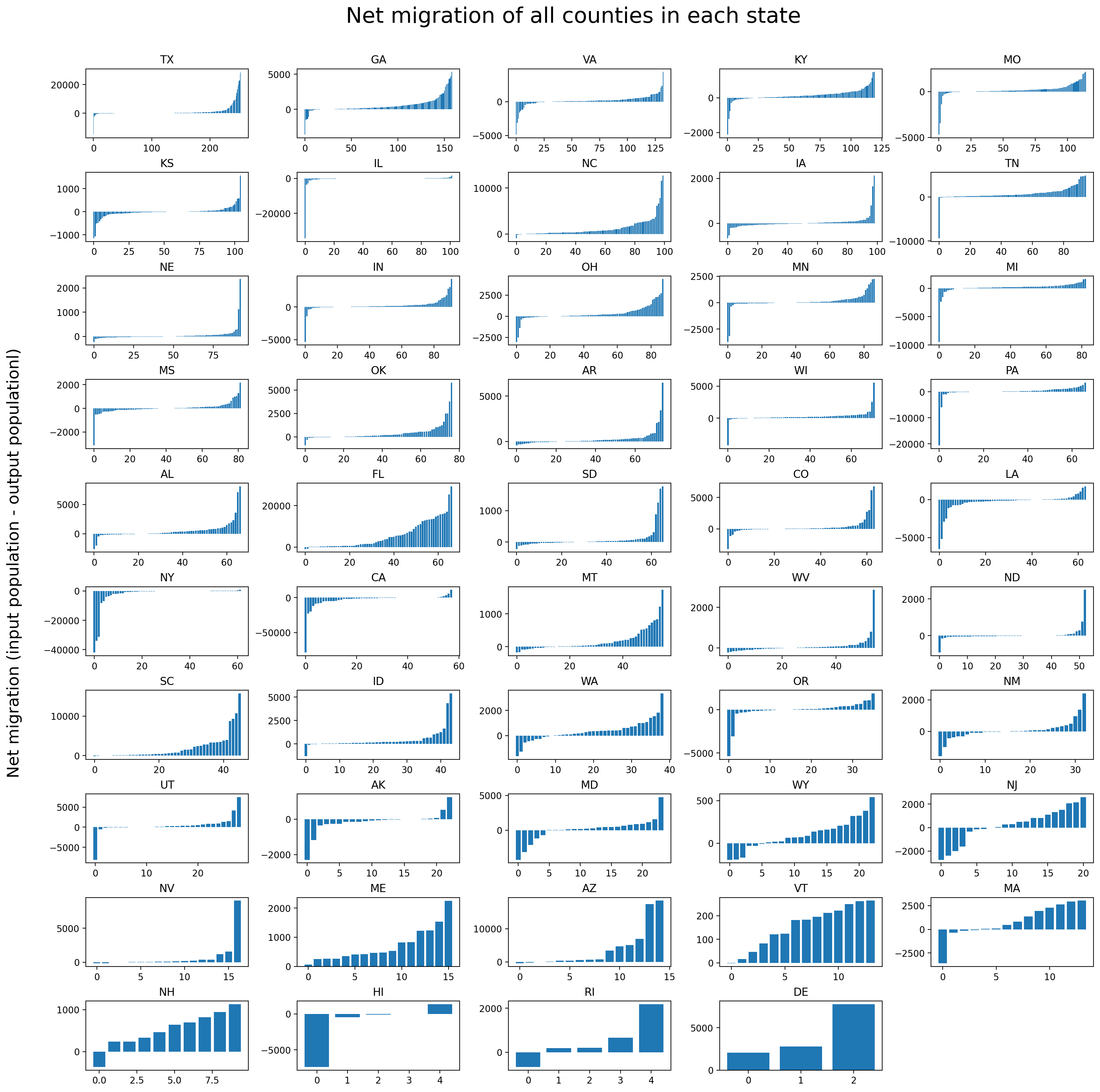
A visualization showing a lot of data. Please help me (the viewer) know what to look for! Anonymized from a student submission.
Visualizations that provide a lot of data (densely) often need to use mechanisms to guide the viewer and help them focus.
BAN - beware absolute numbers (DE6) - when absolute quantities are used, unusual things can happen since the groups have different sizes
When group have different sizes (for example, states have widely varying populations, and more people live in cities than rural areas), care needs to be taken because the size might dominate other things.
There are two common categories of problems:
- The bigness of the big ones comes out as the main message. For example, if you were to plot the number of births or unemployed people, you would see that California is really big - because they have really big populations. In this case, controlling for size (using rates) can be more interesting.
- The dynamic range might make differences hard to see. If you show the differences for a big state, that will make the small state hard to see.

More people live in cities (code 1) - which makes it hard to see that there is a similar trend in the rural areas (high numbered zones). Anonymized from a student submission.
Specific Problems with Details
Sometimes, getting details wrong can mess up the bigger pictures.
UML - use meaningful labels (make sure the titles, labels, captions, legends use terms that the viewer is likely to understand)
Your legends and labels should be meaninful to the viewer. Meaningless codes, or Tableau code.

A visualization of some complicated thing compared with some other complicated computed thing. The viewer not only needs to interpret the Tableau computations, for these labels they have to guess at the parts that get truncated! Cropped from an anonymized student submission.
Could be good or bad DE6 things…
Potential Improvements through Details
In some cases, some small details can improve things a lot.
CLP - consider labeling points (there are curious outliers, or points of interest; labeling a few of them could answer viewer questions and/or provide some grounding)
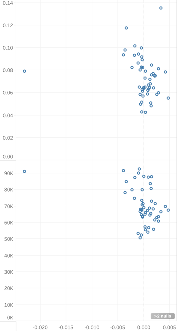
A paired scatter plot of (labels cropped) - but the most salient feature in each is that outlier. I (and I suspect most viewers) will really want to know (1) what it is, and (2) is it the same item in both charts From an anonymized student submission.
Places for improvement
These are general problems, at different levels. Some of them are topics we haven’t discussed in class (yet). Others are design choices that could be re-examined for possible improvement.
OS - overly summarized (the statistical modeling abstracts the data so far from the actual points that it may be difficult for the viewer to make a connection)

An example of over-summarization. The design does not help the viewer to connect the summary (statistical model) to the data, for example, to assess how appropriate the model is. anonymized from a student submission
BEOD - beware excessive over draw (when too many points are piled on top of each other, things are obscured; make sure the design still works)
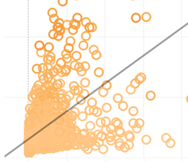
With too many dots piled on top of each other, it is hard to see what’s going on. Cropped from a (more complete) anonymized student submission.
The problem of excessive overdraw is even more problematic if the design relies on aspects of the marks - since changes in drawing order might cause things to be badly obscured.

With the piled points, it’s hard to know if there are teal points under the red/orange zones (seems to be), or if the dark blue is only in the corner, or if they are obscured. Cropped from an anonymized student assignment.
Here, the designer made things “less bad” by careful choice of the drawing order. By drawing teal, red, orange and dark blue last, the image sortof implies that the “orange zone” is contained inside the red zone, etc. But this needs to be done carefully - and even then, it is hard for the viewer to figure out.