
DE05: Stories from Data (EDA)
In this design exercise, we’ll continue working with the Census Data and make more visualizations. The idea is to try to “tell stories” with the data (illustrate interesting things). The problem is, we also need to identify the stories that are worth telling, which means we need to do some exploring. So part of this assignment is to try to do “Exploratory Data Analysis” where we make pictures that suggest what the interesting stories are.
In this assignment, we ask you to (1) identify two stories in the Census Data and (2) create visualizations that tell those stories effectively.
Part of this assignment is to encourage you to engage in some exploration to identify the stories, and then to create visualizations that refine them.
A Caveat and Example and Tutorial
As you start exploring, beware that counties vary greatly in size.
Actually, I can give an example of trying to tell this story in a visualization:

Number of counties at at rural-urban continuum code, and the number of people that live in them. While there are more of the most rural (code 9) counties, this accounts for a small amount of the population.
Some of this stems from the fact that different states organize themselves into counties in different ways, and that some of the splits happened in different historical eras.
Here’s another real, but boring, example… I was curious… do states with more population have more counties? So I started with that question. And the first thing that came to mind was to make a mark for each state, and put the total population on one axis, and the number of counties on the other.
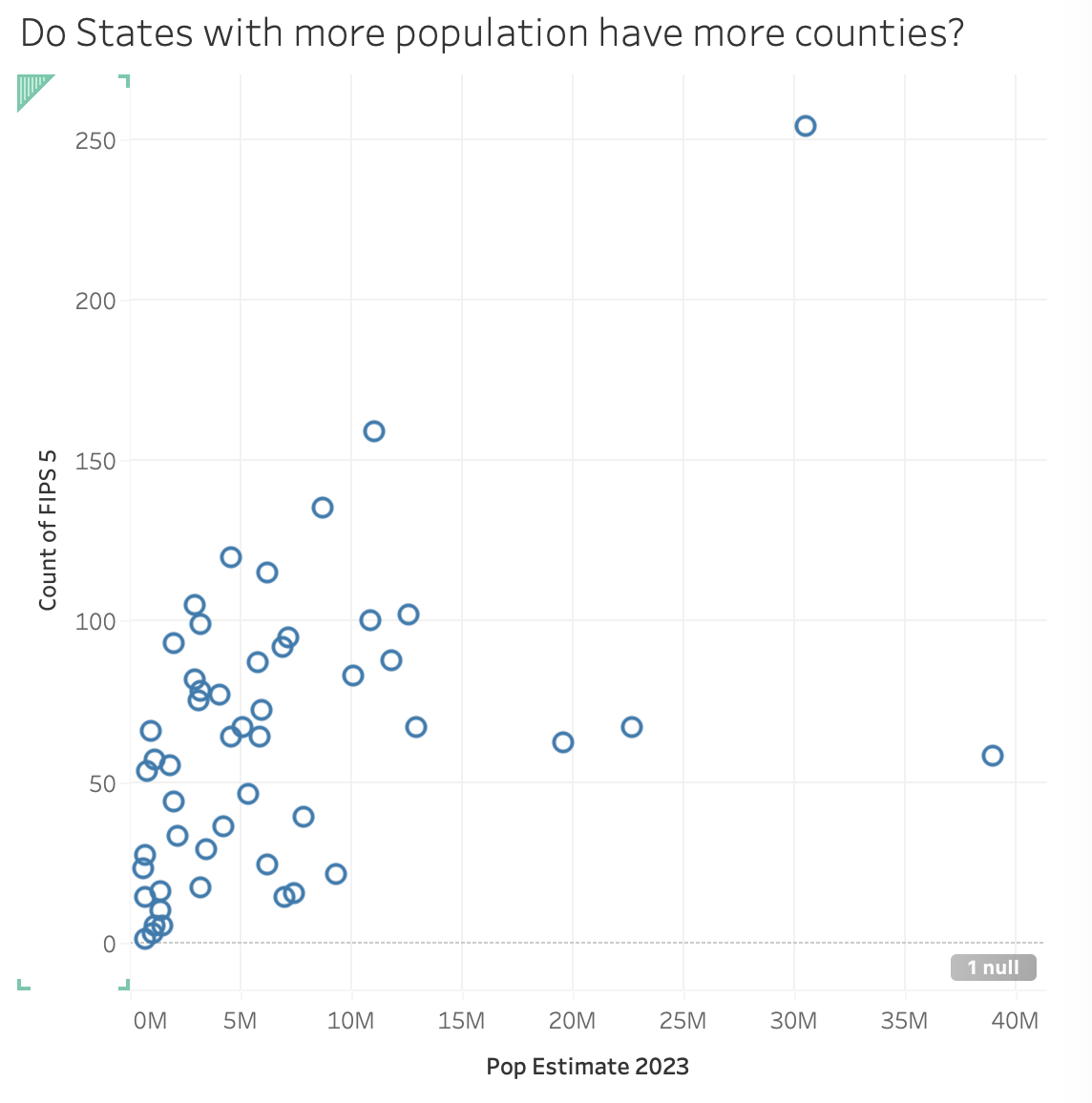
Number of counties and population of each state.
Tableau Hints - how I made that scatterplot
If you’re curious how to make this in Tableau…
I put “state population” (which is sum of its counties) on one axis, and “count of FIPS” on another. The second choice (counting county codes) may not be obvious - but I wanted to count some variable that was unique per county. Since FIPS code is a dimension, I needed to convert it to a measure with a count aggregation.
Of course, this gives me a single count/sum - since Tableau aggregates everything. To dis-aggregate by state, I dropped state on the “detail”. That both gives me the set of marks I want, but also means that when I hover over a dot, I see what state it is.
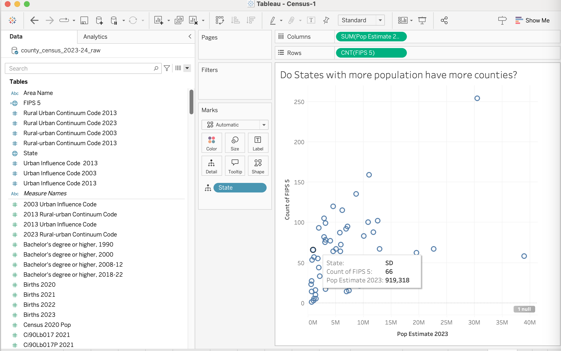
The Tableau interface used to make the previous visualization. When you hand things in, you should not include the Tableau interface.
The graph is more interesting in Tableau, because you can interactively hover over the dots and see information.
A few points from this:
When you are doing “analysis” be careful: a large number of counties account for a small amount of the population. If you make a finding based on the number of counties, it might not be representative of the population, and it will over-emphasize certain states. You might show “most counties X”, but that might only mean a small number of people. That said, our goal (for this assignment) is to make visualizations, not necessarily to do good social science.
These examples may not be great, but they are examples of the kinds of things we will ask you to do in this assignment. In both cases, there is a story I wanted to convey to you (or question I wanted to answer for myself). I made choices that tried to make the story come out in the visualization.
Notice that I used captions and titles (I didn’t label points - except in the Tableau hint, but that’s a hidden example of showing an interesting point).
In each of these, there are probably follow up actions. I can think of detail improvements to the charts (e.g., leave out DC since it isn’t a state and therefore doesn’t divide into counties); I might think of a better visualization to tell the same story / answer the same question; I might ask a better (or at least different) question.
The population vs. number of counties graph is a straightforward 2-variable correlation. The simple question is answered well by a standard chart. But, since you can see the answer well, that might lead you to ask a more interesting question. The rural-urban counties design connects 3 variables. The two bar charts together form a unified design that answer the question (we can talk about how well - or if there is a better design).
The Actual Assignment
Your goal is to find interesting questions, and create visualizations that do a good job answering them. Of course, the data has to cooperate - you might have a good question, and look at the data the right way, but the answer might not be so interesting.
Since you don’t know the data, you don’t know what stories it holds. You need to do some exploring to find the stories. Or, you might be lucky and find something quickly.
The process is (1) ask a question, (2) make a visualization that should answer the question, and then (iteratively) either (3A) refine the question; (3B) refine the visualization; (3C) move on to a completely different question in step 1 (either because you succeeded, or because you are giving up).
We are asking you for:
- Your initial question
- Your initial visualization to “answer” the question
- What you see in #2 (and your rationale for the design), and what it leads you to
- Another visualization (that iterates from #3)
- What you see in #4. This should include the question/story the visualization is meant to tell and a rationale for why you think the visualization tells the story well
There might be more iteration. The visualization in step 4 might not be the second one you make (and #2 might not be the first). The idea is that the first three are early in the process, and 4 and 5 are more evolved. #2 should do a reasonable job at showing #1 (so you can see if you are on to something). The counties / population thing would have been a decent #1/#2 (but please, don’t just do what I did).
Note: it probably isn’t worth spending too much time making the visualization in step #2 great. You want to get to “good enough that it helps you decide what to do next”. For #4, it’s more “final” - you should put more effort into making it really tell the story.
We are going to ask you to go through this cycle twice (turn in two sets of the 5 things).
You need to have two distinct stories (one for each “explore/visualize” cycle).
What are we looking for?
We want you to:
- Think about how to ask questions from data that can be “answered” with visualizations.
- Design/create visualizations that give you quick answers, that can help you dig farther into the data.
- Refine your questions and designs.
- Create appropriate visualizations for both exploring and for showing what you’ve found.
What we will grade you on:
- Asking reasonable questions based on the data
- Asking interesting (multi-variate, non-trivial) questions
- Providing designs that appropriately and effectively “answer” those questions (show how the data supports it)
- Articulating the rationale for those designs
Here’s a great hint from a 2021 variant of this assignment:
… we are looking for explicit choices you made to emphasize your “story.” A “data dump” (just making a chart of some of the variables) is not likely to get you a good score. If you make explicit decisions - selecting subsets or data, highlighting particular points, arranging designs that emphasize certain aspects, etc. - this will be rewarded.
Some notes on this assignment and what follows …
For each of the two “stories” you need to “turn in” 5 things (listed above, but repeated here for emphasis). Since you are turning this in as a 10 question Canvas quiz (5*2 stories), you probably want to have your answers written out before hand.
- What was your initial question? (text type in)
- Upload your initial attempt to answer that question.
- What you see in #2 (and your rationale for the design), and what it leads you to. (text type in)
- Upload your “final” visualization.
- What you see in #4 (the story that is supposed to come out). You should include the question/story the visualization is meant to tell, and a rationale for why you think the visualization tells the story. Explain the design choices that you made (give a rationale for the visualization).
In the ideal case, you wouldn’t need #5 - the story should jump out from the visualization (with some help from its title and caption), and the choices that lead to its effectiveness would be clear. In practice, play it safe and tell us why you think things work. Sometimes the data or design doesn’t quite cooperate.
Your stories must be different. The visualizations must be different. Part of the exercise is to show how you can tell different stories from the same data by presenting it differently.
In the next assignment, DE06: One Data Set, Four Stories (Census Data Edition), you will be asked to make four visualizations that tell stories from this same data set. The visualizations you create for this assignment can be the first two of them.
You need to turn the entire assignment in on the canvas survey Design Exercise 05: Stories from Data (due Fri, Oct 04). As usual, Canvas gives you points for turning things in. We will give you a grade later by some other mechanism.
If you turn in this assignment on time, we will provide you with some feedback on at least one of your designs in time such that you can act on that feedback.
Ground rules for this assignment:
You will turn in this assignment on Canvas as Design Exercise 05: Stories from Data (due Fri, Oct 04).
- You need to create static visualizations: things that work in “print” (or just as an image file). If you create something interactive, we won’t see the interactivity.
- Each visualization must be a single “picture” (one page, preferably PNG - if it’s a PDF it can only be 1 page). You can put multiple charts together into a single image, but remember - it must fit on a page/screen.
- It is OK to use “approximately correct” years. (so for example to use 2003 urban codes to look at 2000 data)
- You can use whatever tools you like. You will be asked what tools you used to complete the assignment.
- We aren’t doing the actual social science here - these graphs are descriptive. We are showing (at most) correlation, not causality.
- You can use the questions that you thought of from previous design exercises. We prefer that you do not use the questions that we (the course staff) have already posed in the assignments (unless you push them farther).
Some notes on “A Good Question”
This is from the last version of the class:
For the purposes of this exercise, a “Good Question” has a non-standard (but still hand-wavy) definition: it will make for a good visualization.
I should also say that I am using the terms “Good Question” and “Stories in the Data” in a very similar way. The idea is to find something interesting in the data: you might phrase it as a question the data answers or a fact/pattern in the data (that would answer a question).
A good question/answer should be:
- Interesting (non obvious, ideally it is something that the course staff who has looked at this data hasn’t already seen; uniqueness is valued)
- Multi-variate (involve bringing together many variables)
- Taking advantage of visualization (Generally, this means the answer is complex. But it could be a simple yes no, but the visualization would have value to give context, or support the answer, or help address followup questions, …)
- Can actually be answered from the data (you could actually make a good visualization to answer the question)
Good questions (for this assignment) lead to solutions which do well with the following questions (the resulting visualizations):
- Is the question/story interesting and clear?
- Is it multi-variate?
- Is the design effective? (is it well adapted to the story/task?)
- Do the details represent good choices?
- Is the design appropriate for the data?
- Is the rationale properly stated (in the documentation)
- Is the design complete (it has enough of a caption that it stands alone)?