ATUS Data for 765-24
The American Time Usage Survey is a big data collection effort from the U.S. BUREAU OF LABOR STATISTICS (BLS).
The survey collects detailed time usage data (how people spend their time) for a sampling of people across the US.
They provide the data files in a very detailed form: data files page. You can get lots of information about who the people are and what they did.
One thing that makes this data interesting is that it is done with a great deal of statistical care to document each thing very carefully so that it can be used correctly.
Another interesting thing… it’s a massive data set that is a familiar enough topic.
In the past, working with this data meant joining together many files, and summarizing it. The official BLS site will give you a lot of detail, about the people surveyed and how they spend their time (the details of the observations).
But, for this year we will allow you to work with a version of the data provided by IPUMS, and organization that provides convenient access to the government data. They put the data into an easy-to-use form, that doesn’t have all the details - but is sufficiently interesting for our purposes.
For later stages of the assignment, you are welcome to obtain more detailed data (from either IPUMS or BLS). For the initial stages of the assignment, we prefer you work with the “easy” version of the data we provide.
The Provided Data Set
I created an “extract” (a pull from the data base to create a data set) using IPUMS extract builder. This created a nice, clean CSV file from the data. I got to pick which samples (all) and which variables (both attributes of the person and how they spent their time on the day of the sample).
I retrieved samples from the entire history (2003-2023) (this is “all samples”). I picked an assortment of different attributes about the person being sampled.
The resulting data file has 245139 rows. Each row is a “sample” - it’s a description of what one person did on one day.
There are 69 columns. They tell you when the sample was taken (year, month, day), demographics (age, sex, etc.), some other information (levels of education, etc.)
For some of the columns, you need to look at the data dictionaries to interpret the codes. The official data dictionaries are at BLS. But you can also find information scatterd about the IPUMS ATUS site. Note: be sure to translate the codes in your visualization legends and labels.
A hint… the ATUS data is part of the “Current Population Survey” (CPS). The “raw” ATUS data from BLS assigns each person a code, and the data about the person is found by looking that code up in the CPS. With the BLS data you can also connect a person to a household and learn about who else lives there. For the extract data, IPUMS has joined the ATUS and CPS data (so each row has the demographics). But, you might need to look up the column definitions in the CPS documentation.
The ACT columns are the amount spent in the 17 “main categories” of activities. These do add up to 1440 minutes. The are described here.
The BLS columns are more specific categories of time usage. They are described here. There are a total of 431 categories - they get very detailed. If you want more categories, you can get them in the BLS data, or from IPUMS.
You can download the CSV file on Canvas (atus_00006.csv 52.5mb)
If you’re wondering why the data file is “ATUS_00006” - it’s because this was my 6th attempt to create a data set.
A Few Notes on the Data …
For this assignment, we are doing “descriptive” statistics. We are describing the samples. The BLS data has information on how you can generalize from the sample population to the broader US population (basically, this requires applying weighting factors to the samples). But performing such weighting is not required (or recommended) for this class.
While the data may seem big (245000+ samples), it breaks down pretty quickly. If you start to divide people into groups, you quickly get to small sample sizes.
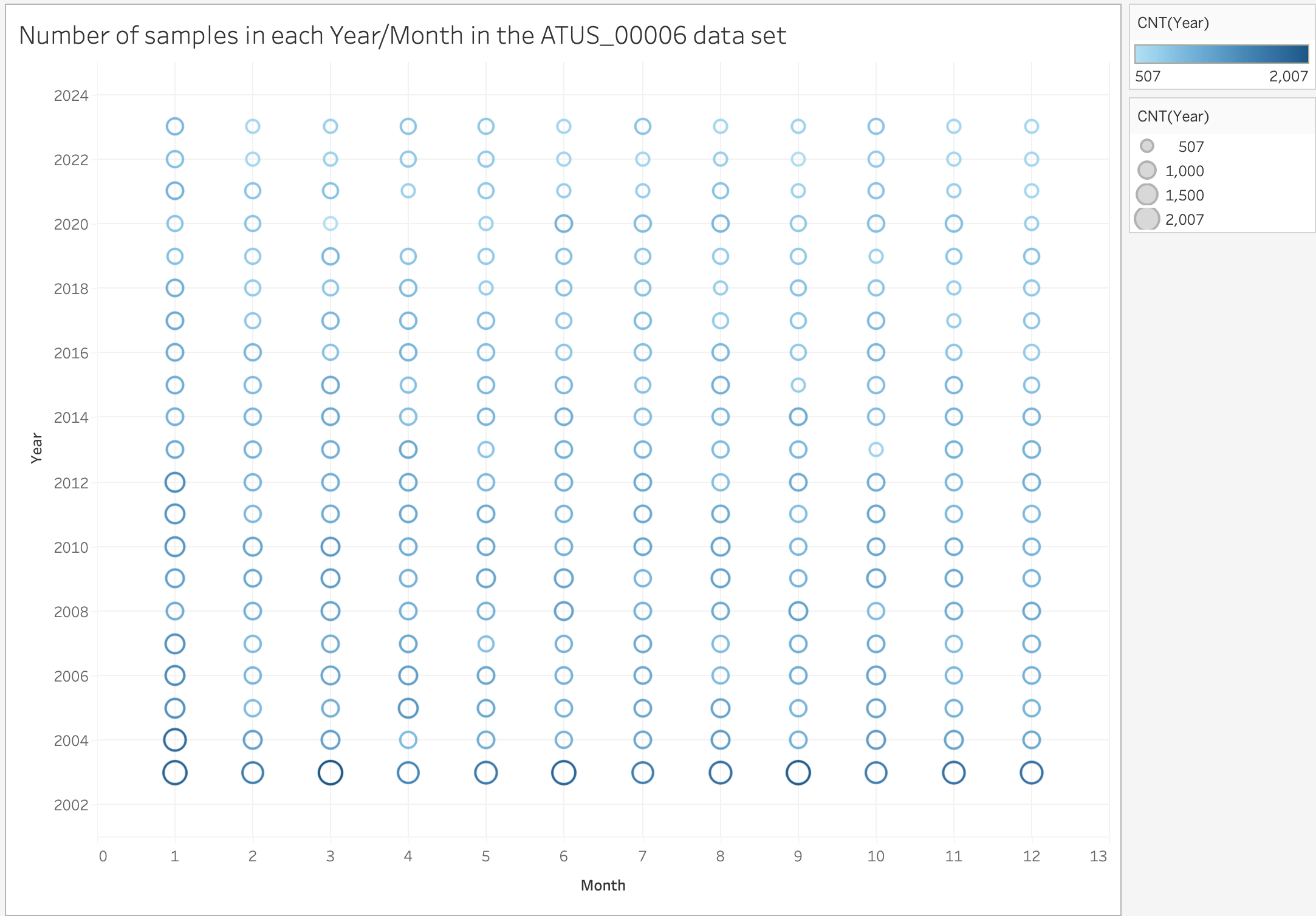
The number of samples are not uniform. Some years sampled far more people than other years. The data sources make a point of saying that sampling was unnusual when the pandemic broke out (e.g. April 2020 has no samples). However, the number of samples varies a lot in all years.

What does the Data Mean?
The time use variables are defined at: https://www.atusdata.org/atus-action/time_use_variables/select_template
The data we provide uses the documented codes: we did not define any “user defined variables”.
There are two sets of variables: The ATUS codes (17 categories, beginning with ACT), and the BLS codes (which are very detailed, they are a three level hierarchy). In the data we provide, we only use the “top level codes” (defined on this page). But you can get very detailed data if you want.
The BLS codes do not nest exactly (so the detailed codes don’t necessarily add up to the category codes).
The ACT codes are enough to do many interesting things. Although, a few key things (like sleep) are bundled together. We recommend using the ACT codes for cases where you care about part-whole, and specific BLS codes for details you are interested in (like sleep or housework).
A Historical Note
We’ve used ATUS data in the past - but we didn’t have the nice, easy to use IPUMS version. We forced students to use the data directly from BLS, which required doing the joins (Tableau can do it easily). If you’re curious the 2022 Data Description will give you the details, and a guide if you want to try to use the BLS data yourself (for example, to get more detailed categories, or to get more demographic information).
Tableau Hints…
Note - in the pictures here, I am showing you the whole Tableau interface since I want you so see how I made things - you won’t show the interface in what you turn in (use export, not screen shot).
Creating New Variables
I find it extremely useful to create new variables - either by calculation, by binning, or by grouping.
Some examples:
- I created a variable (dimension) “Employed or in School” - which converts the confusing Employment and School Status variables into a single binary variable. (this is a computed field)
- I created a variable (dimension) “Grouped Sleep” - which divides sleep into groups (they aren’t bins since they aren’t equal size) 0-4 hours, 4-6 hours, 6-8 hours, … (this was done with grouping, not binning)
- I created a variable “AGE (bin)” that bins the ages into 5 year ranges.
Stacking Bars
One of the most common things to do with this data is to make a stacked bar of the Activity (ACT) measures - (since the day is a part-whole). This is a little tricky, but…
- Set the default Aggregation for the ACT measures to “Average” (since you want the average of all the samples)
- Drag “Measure Values” to an axis (I am using vertical)
- Remove the measures that aren’t averages of the activity. (you might be able to achieve a similar effect by using the “Measure Names” filter)
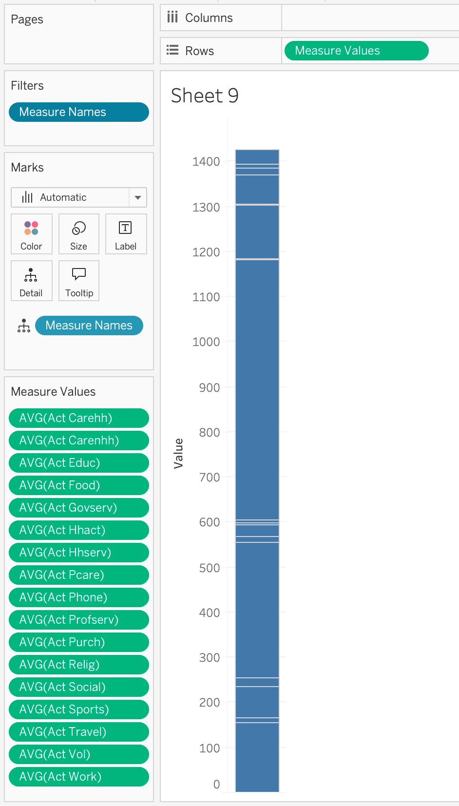
Here’s a picture of what the basic setup looks like:

Notice that it does add up to (close to) 1440 (the number of minutes in the day). It isn’t exact because of rounding (which gets compounded by the averaging).
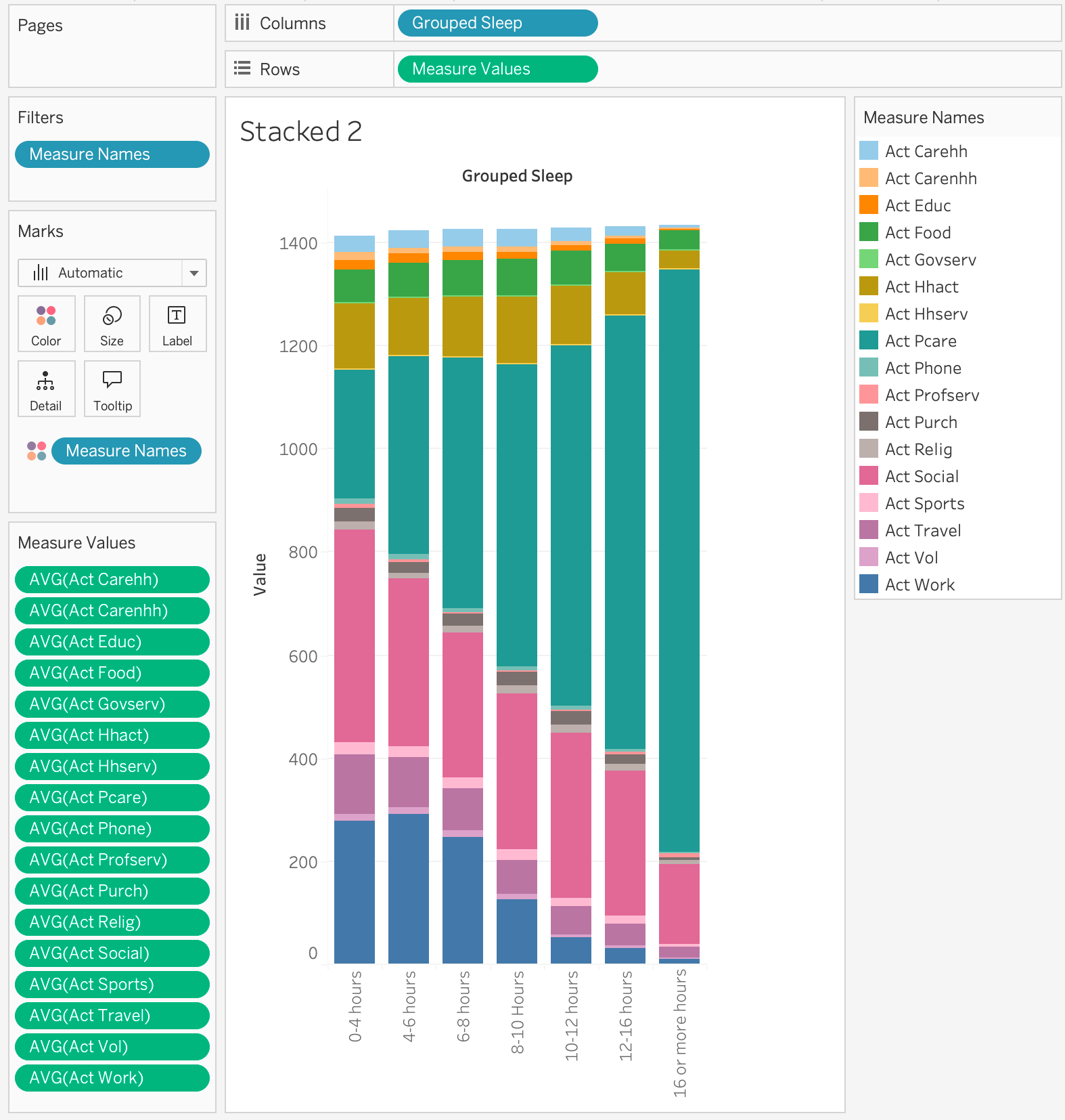
You can drag “measure names” to colors (although, you get 17 colors!). And you can split on other dimensions… For example:

Note: this is not a great visualization. It is a good exploratory visualization (it gives me a starting point for digging deeper). The amount of sleep (Act Pcare) definitely goes up as the amount of sleep goes up (Act Pcare includes sleep). If people sleep more, what are they doing less of?