
Grading Information for Aid Data Design Exercises (DE3-DE5)
The grading (assessment, not critique) for the “Aid Data Design Exercises” puts together all the scoring information from the 3 assignments (drafts, critiques, and final handins).
Short version: your final score is a number between -2 and 2, where 0 is meant to be “expected” (where the mean is). This doesn’t tie neatly to grades.
Initial thoughts
This turned out to be more complicated than I had thought it was going to be.
Each exercise was graded separately, and these were put together.
Note that each category uses a +/- scoring scale that gets put together in the end.
The subjective nature of grading means that it was hard to be consistent, despite all the complex schemes. Therefore, we add corrections for “bad luck”.
Assessment is not critique. The idea was to give grades in a “fair” manner: similar assignments should get similar grades, an assignment that is better than another should get a better grade. And to make sure the distributions work out.
The quality level is based on “expectation” of what should be “good enough”. I had in mind what a “decent in a grad class” assignment should be (adjusted by reality), and everything is based on that.
The Categories of Designs
Note that the categories of design is independent of quality. You can have a good or bad example in any category. The categories are detailed later (we use them differently in different parts). But broadly:
- (ID) Inappropriate Design
- (DD) Default Design - uses a standard chart type. Initially, this was intended for the “expected” standard chart types used in the “expected” ways (the common design), but we use “Default Design” to use an implementation of a standard chart.
- (AD) Adapted Design - uses a standard chart type, but in a manner that is sufficiently different that the standard way of using it.
- (SD) Separated Design - puts together multiple charts to make a single whole.
- (CS) Creative Solution - a design that shows creativity and non-standard usage
The categories are subject to interpretation, and they are just roughly used to group different things. For DE5, we had a more detailed classification to be consistent and to aid in assessment.
Grading of Drafts (DE3)
For DE3, we can only really ask for the “promise of effectiveness” (since the sketeches are usually too crude to really decide). For DE5, effectiveness can be demonstrated either with something clearly effective to the grader or with a well-argued rationale.
By “creativity” we mean making non-standard design choices. Using a standard chart type with default options (or options that do not clearly contribute to the storytelling) is not creative.
Designs can be effective without being “creative” under these definitions, so we tried to make sure that both extreme effectiveness and creativity can be rewarded.
If you submitted multiple designs, we tried to focus on the one we thought was best and the one you thought was best.
- -2 unacceptable - not gradeable
- -1 doesn’t show an effort to respond to prompt, unclear what the design is
- 0 good enough - provides a reasonable answer, shows some thought
- might not be interpretable (needs too much explanation to figure out what the design is)
- might be difficult to see how it can be effective (especially in )
- +1 shows (promise of) effectiveness or creativity
- +2 shows a lot of effectiveness, or (promise of) effectiveness and creativity
- Artistic Merit / Implementation Effort Bonus
- Explorer Bonus (tried different things)
- eXplaination Bonus (gave explanation of design, or facts in data to be highlighted - this could also be “good captions”)
- Hard to Grade warning (turned things in in a manner that made it difficult for us to grade) - generally we didn’t do this for multi-page PDFs (but we should have)
Each design gets a category and a number, so “CS1” is a +1 design in the CS category. We generally did not give negatives unless things were really bad.
- (ID-1) Inappropriate Design (e.g., Treemap of non-part whole)
- (UD-1) Unclear Design - not obvious what the design is (generally for DE3)
- (DD0) Default Design (e.g., spaghetti plot,stacked bar) with little tuning of details to make it work better, or explanation of why you think or would be effective (DE3). For DE5, the effectiveness criteria is higher (see DD-1)
- (DD1) Default Design (e.g., spaghetti plot,stacked bar) with some thoughts to details and/or explanations
- (AD1) Adapted Design (e.g., plot matrix, multiple views)
- (AD2) Adapted Design (e.g., plot matrix, multiple views) - well executed, good thought to details, deviations from standard to better address issues
- (SD1) Separated Design (provides a separate chart for each question, with little effort to unify onto a single page)
- (CS1) Creative solution that doesn’t seem effective (for DE3, we give the benefit of doubt, for DE5 it must either be clearly effective or have a good rationale to get CS2)
- (CS2) Creative solution that seems effective (for DE5, effectiveness might come from the rationale)
Grading of Critiques (DE4)
We looked at all of the critiques turned in together, so things are “averaged” together. Sometimes, a higher score is given because there was one or two things that stood out. In-between scores are given (infrequently) when there is a mix.
- Quantity - while length isn’t correlated to quality, there is something to be said that responses must be a certain length in order to show adequate thought.
- -1 - Unacceptably short
- 0 - Terse (may not be too problematic)
- 1 - OK (a few senteces as a paragraph on average)
- 2 - Longer
- Quality - does this show some element of really looking at things; identification of an aspect, pricinciple, and problem. A prescription can be a good thing - if it is supported.
- 0 - Unacceptable
- 1 - OK
- 2 - Good
- Form - is the critique presented in a manner that allows the reader to see the thought process (states intent, identifies problem, connects to principle).)
- 0 - Unacceptable
- 1 - OK
If you got an above average score, you keep your score. If you got a below average score, maybe you just got unlucky, so you get the average of your score and the average (done for each component).
Then the parts are added - The score is between 2-5, with 4 as a median. (above 5 is an outlier - we gave an extra bonus to some people). Scores are rounded to .5 (by construction, few scores are near boundaries). We shift this to be zero centered in the useful range (-2 to 2).
You might notice that this only really goes up to 1 (except for outliers), so we gave everyone an extra .5.
Grading of Final Handins (DE5)
We had a more detailed categorization scheme so we could be consistent.
Description
Columns in grading:
Quantity (again, being concise is good, but if things are too short, your can’t really say what needs to be said)
- unacceptably short
- acceptable (terse/concise)
- thorough (might be wordy)
Clear that 3 parts are covered
- no
- yes
Rationale
- not really descriptive
- explains what (description) by not why (rationale)
- gives rationale (or better)
Critique - this is tricky because it depends on the critiques you received (maybe the critic didn’t actually give you critique). Blindly accepting a critique is not necessarily good, accepting or rejecting it can involve thought and explanation. Note: we will unweight these numbers later.
- clearly unresponsive, or doesn’t say
- minimal response
- provides good explanations of why or why not to listen (or better)
Basically, we gave full scores for “good enough” so we didn’t have the ability to recognize excellent. We put each one on a 0-1 scale, summed them, and then subtracted 2 to get -2 to 2.
The scores in this part are high (because “decent” gets a full score).
Scores for Visualizations
Each DE5 design was scored on a scale where 0 is the center point and means “meets expectation” (think of this as a low AB, the B/AB border). The grades are more or less +/- 2 - a few outliers are +/- 3 (-3 = bad, unacceptable, 3 = awesome, above and beyond). In general, I wanted a coarse grading scheme - fine details are hard because its subjective. The exact conversion to grades will happen later.
Each visualization was scores independently (Q1 and Q2). In both cases all 60 were graded, and then I looked at the statistics to check backwards. For both Q1 and Q2, the median is 0, and the average is a little above zero (so students generally did around my expectations, maybe a little better).
To come up with the scoring scheme: all the assignments were grouped. For each group (e.g., “DD-A”), I looked at all in the group and gave labels with scores. In coming up with these scores, the idea was to have fairness within groups (similiar assignments get similar scores, better assignments get better scores), but also between groups (“1” assignments in one category are roughly the same quality as “1” in another category, although they may be quite different.
After this first pass, I had a grid where the columns were the groups, the rows were quality levels, and each square had a description for what it means to be in that square (for an assignment in that group to get the particular grade).
Here are the tables - note that a square only gets filled in if I saw a visualization that it described. The colors will be explained in a momoment. The first grid is for Q1, the second is for Q2.
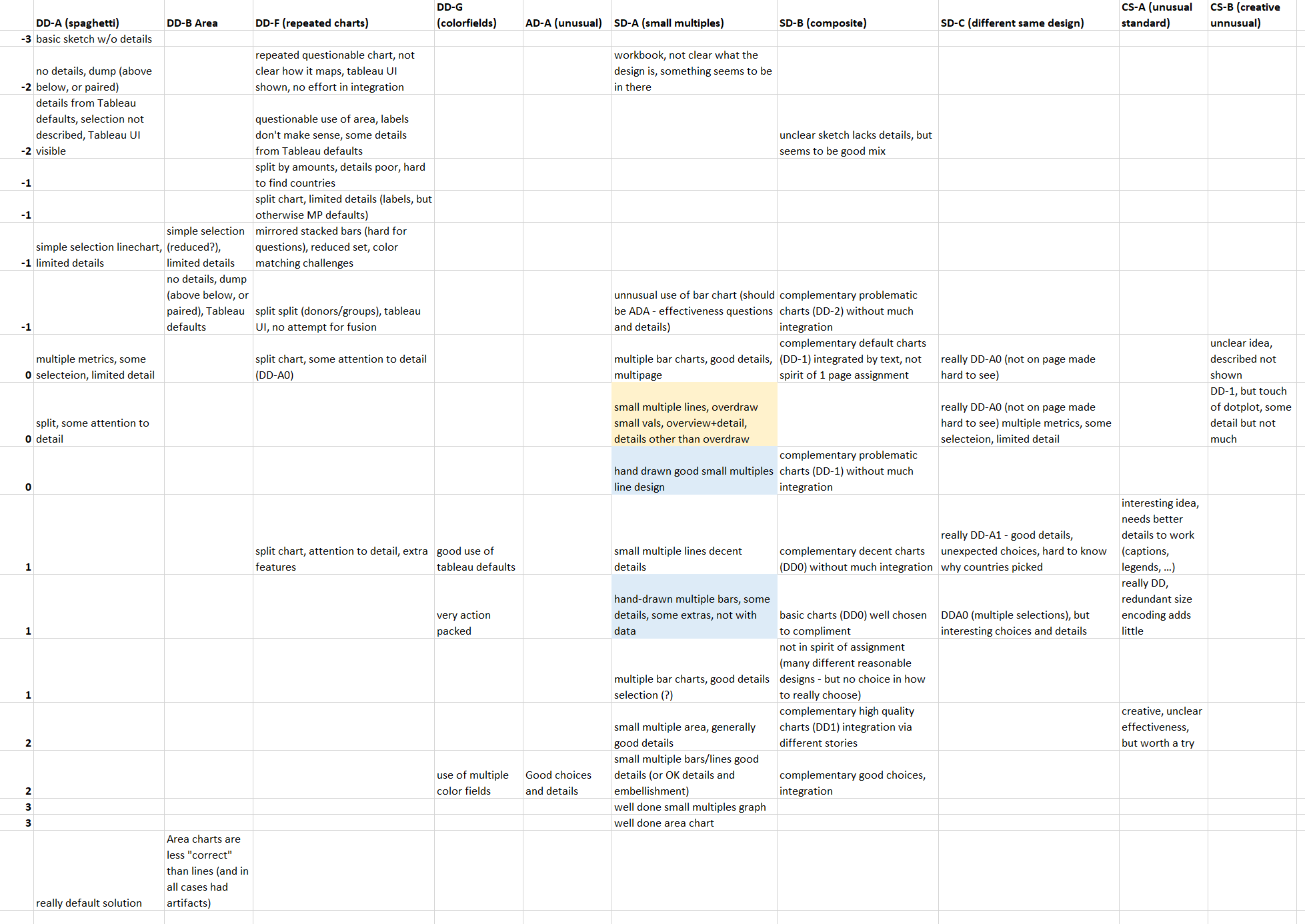
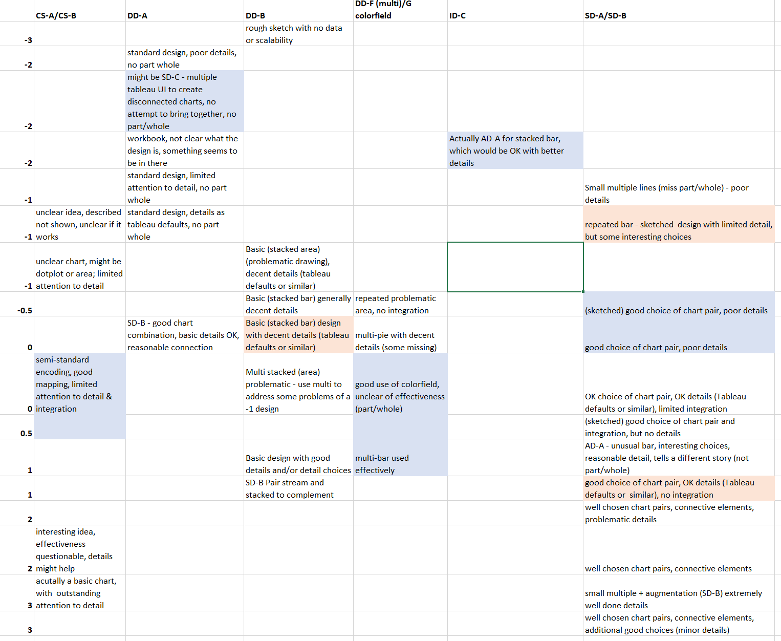
The colors: because I was trying to stick to the integer buckets, I wanted a way to mark “maybe this category is a little better (blue) or worse (pink) than the number suggests.
With the tables to serve as a rubric, I then went back and scored each visualization based on what bucket it was in. For some visualizations, I felt it was good or bad for its bucket, so I decided colored it (blue/pink). I might use this to nudge scores one way or another.
Some small stuff that comes up
Tableau has problems drawing the stacked areas if there is too much complexity. This choice is penalized, not because you didn’t implement proper stacked area, but because you didn’t notice it was problematic and made a more appropriate choice. (a stacked bar is arguably more effective, but is certainly more effective given problematic drawing)
Turning it into a grade
What we have is:
- (20%) 2 scores for DE3 (-2 to +2)
- (20%) a score for the critiques (-2 to 2, after giving and extra +.5 to everyone)
- (50%) 2 scores for DE5 visualizations (-3 to 3, but 3s are rare)
- (10%) a score for DE5 description
Which gives everyone a score in the (roughly) -2 to 2 range. The median is a bit above zero, the average is a lot above 0. 2/3 of the class scored above 0 (met or exceeded what I expected).
How do I map this to grades? Well, I don’t want to - since it has to balance into everything else. I don’t want to quantize things until the last minute.
Roughly, if you are “meeting expectations” then that’s a low AB. But I will adjust things in the end so that enough people get good grades. (if everyone exceeded my expectations, I have a smart class, if too few students do, then I haven’t done a good enough job and I shouldn’t penalize people).
So, if you really want to convert things to grades… A is at least the top 3rd (maybe more), which is about .75, and AB is the top 2/3 (maybe more), so about -.1. If you’re getting worse than -.75, you are in danger of worse than a B (only a few people).
OK, if you really want a formula to estimate… 3.35 + .5*score is really close (using the A=4 scale and standard rounding).
And, of course, this is only a part of the overall grade.