
Theme4: Part Whole Distributions
In this theme, you need to invent designs to show the distributions of part whole distributions. This is more design oriented: you need to identify tasks, and come up with design alternative, and assess those alternatives. I am not aware of standard accepted designs.
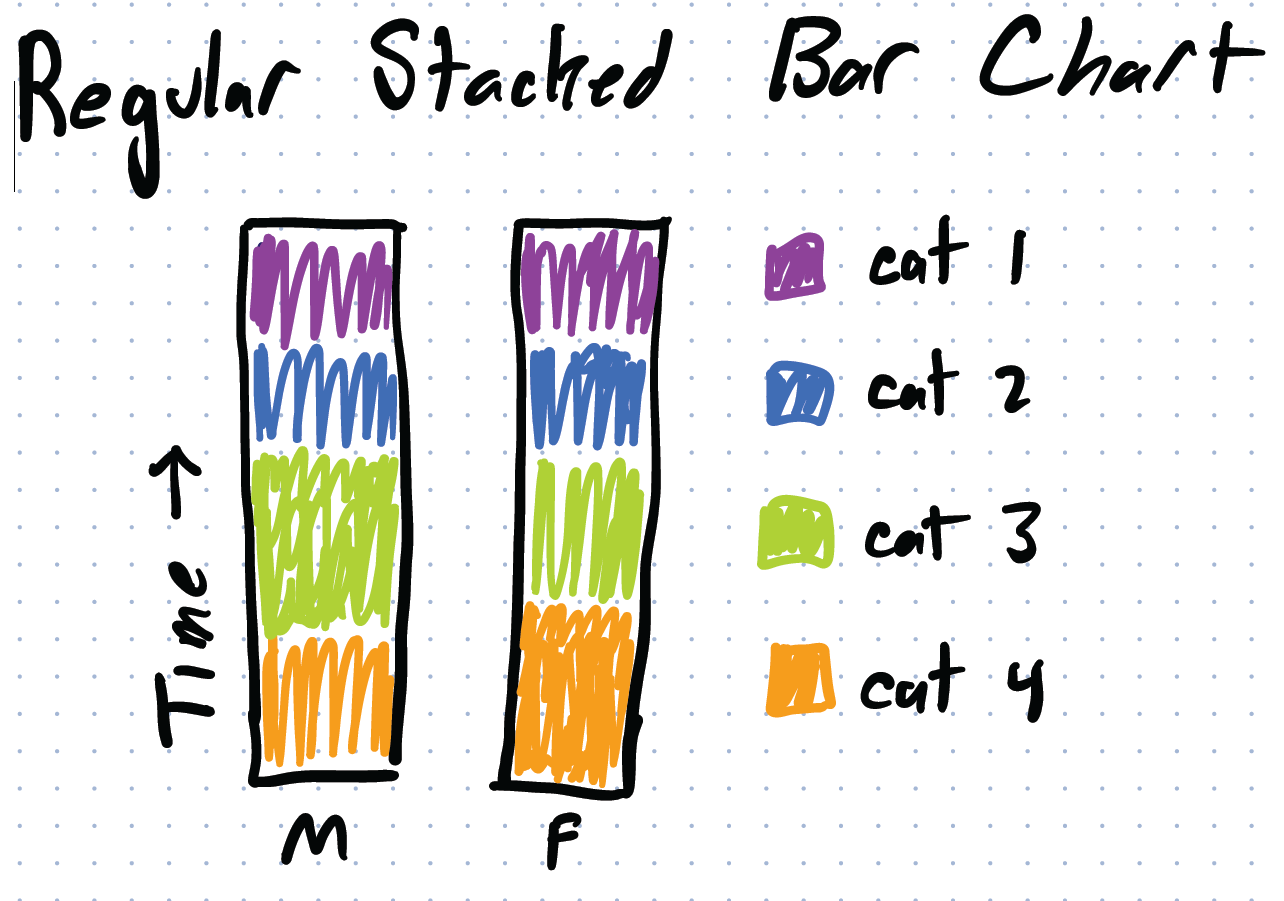
Consider the problem of showing a part whole relationship. To use ATUS, we have the distribution of a person’s day (1440 minute, or 100%) into some number of categories. To show this, we have a number of good part/whole designs (pie charts, tree maps, stacked bars, …).
These designs also work if we’re considering the average time usage. If we have the population, we can look at the average. It is still a part whole relationship. We can still divide up the data and use a standard design. If we want to compare groups, we can show the average usage over the group.
The problem is that this doesn’t show the distribution of distributions: how much variance is there among the different people we averaged together?
If we were talking about numbers, we have lots of choices in how show distibutional information. We can take a bar chart (or dot plot) and add error bars or candlesticks, or turn it into a box-plot, or even a histogram or violin plot per item (and many more). A bar chart (used to compare values) easily becomes (bar chart with error bars, box plots, …) to allow for comparing distributions. You can look at the Seaborn documentation for lots of examples (as implemented in a nice Python library).
But, if we have a part whole relationship… it’s trickier. If each category isn’t a distribution of values, but rather a distribution of distributions… To show the “mean” of the category, we can show it as a stacked bar chart (or pie chart, or tree map). But what is the equivalent of error bars (or box plots or …) for a stacked bar chart? (or a piechart, or a treemap, or …)
I am unaware of good ways to show distribution information for a part/whole distribution. So, I challenge you (in this project) to come up with some ideas and try them out.
Implicit in this is a notion of summarization: you aren’t going to show all members of the category (there many be a lot). But you want to provide more information than just the mean.
Showing a summary might mean showing the mean and standard deviation/error/CI (like error bars would), or quartiles (like a boxplot would), or the whole distribution (like a histogram or violin plot would).
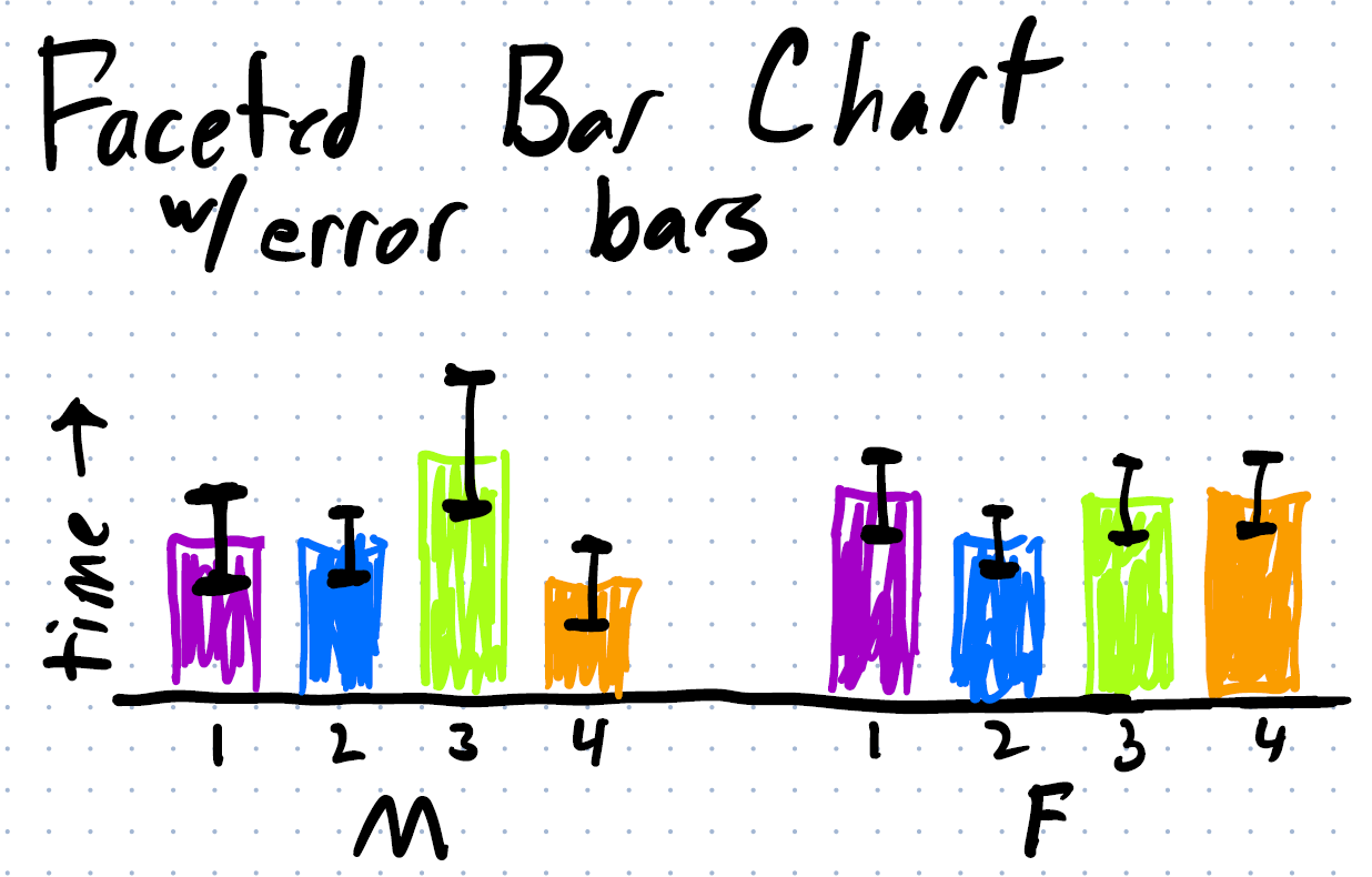
A baseline design: we could ignore the part/whole relationship, treat the part whole groups as a regular numerical variable, and use a standard way to show the distribution (basically making a faceted chart).
Here is an example where I have two groups (say, male and female), and 4 categories (say sleep, paid work, unpaid work, and other). Just showing the distributions…
If I facet I could show it as a bar chart with error bars:
Or even a histogram per category (per group):
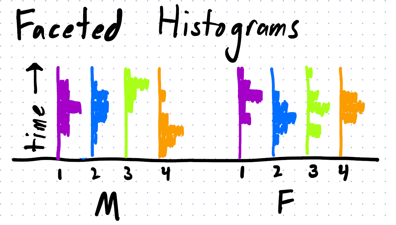
Note that this design does not respect the part-whole relationship. It doesn’t convey the proportion of the parts to the whole (how much of the day is sleeping). And the interdependence of the categories (if you spend more time sleeping, you must spend less time doing something else).
(with the sketch, I did not preserve the amounts. In the Faceted Bar Chart, the 4 bars need to add up to 100% of the time, in the faceted histograms, each of the vertical histograms needs to add up to 100% of the samples)
Note: that the stacked bar is just one possible design… we might want to do the same thing for stacked area charts, or tree maps, or pie charts, or …
Also: this example, all of the wholes were the same size. What happens if each group has a different amount (for example, the groups are the sales at different stores, which sell different amounts of stuff in total, and have different distributions among product categories).
The Challenge
You job is to come up with new designs that show the distributions of the parts of part whole relationships.
Of course, a “good” design means that it is effective for some task(s). So you need to identify what the tasks are. Part of a good answer to this theme is to identify the tasks well.
I recommend proposing multiple designs, and comparing them with the baseline (the baseline is faceting the histograms and using an appropriate distribution - making a “faceted box-plot” is not a new design). You might conclude that the faceted designs are actually really good for some tasks.
You might try to implement your design to show things with real ATUS data, or you might just try to sketch (try to use realistic scenarios). Your sketches should be better than mine. There is a “part whole” notion on effort: if you do nicer implementation (e.g., program with real data vs. sketch), you might do less creative design exploration, and design analysis.
You might try to critique the baseline design as a way to generate ideas.
When we evaluate this, we will consider:
- Your design exploration. How good were the designs you came up with (in terms of quantity, quality, and creativity/novelty)?
- Your “implementations”. This could range from crude sketches to programmatically implemented versions that work on the real data.
- Your analysis. How well did you identify tasks? How well did you analyze the effectiveness of different designs?