
A Quick EDA Example with the ATUS data
This is a quick example of doing Exploratory Data Analysis (EDA) using the ATUS data set (see ATUS: American Time Usage Survey).
Note: my goal here is to make some quick visualizations in order to figure out what better visualizations to make (or deeper analysis to do).
I’ll start with the vague questions: how much variance is there in how much people sleep? Who sleeps more/less? What do people do instead?
Note that I cannot use the provided reduced data: the category hierarchy lumps “010101 Sleeping” into “01 Personal Care Activities” which I might not want to do at this point. That might be something for me to think about in this exploration: do I want to group the data differently for my purposes. But for now, I’ll use the “raw” data set. Tableau handles 218mb of data without much of a problem.
To emphasize, my goal here isn’t to make great visualizations. My goal is to make quick visualizations that can help me get ideas to
Getting Started
I connect Tableau to (atussum_0321.csv 222.8mb). I probably should put some effort into describing the data, but instead, let me just dive in…

Let me start by looking at the distribution of the amount people sleep.
If I make it a dimension, I can see the range, but with 200K people, this doesn’t show much. But I can already see there are some weird things (does someone really sleep more than 20 hours a day?).

Even better, let’s try a box-plot (box plots were invented for EDA). I select the T010101 measure and click “boxplot” in showme…
To actually get something interesting, I have to tell Tableau to look at the values as distinct things (i.e., make it a dimension by right clicking on it). This is ironic, because if it was a dimension, Show Me wouldn’t have let me make a box plot.
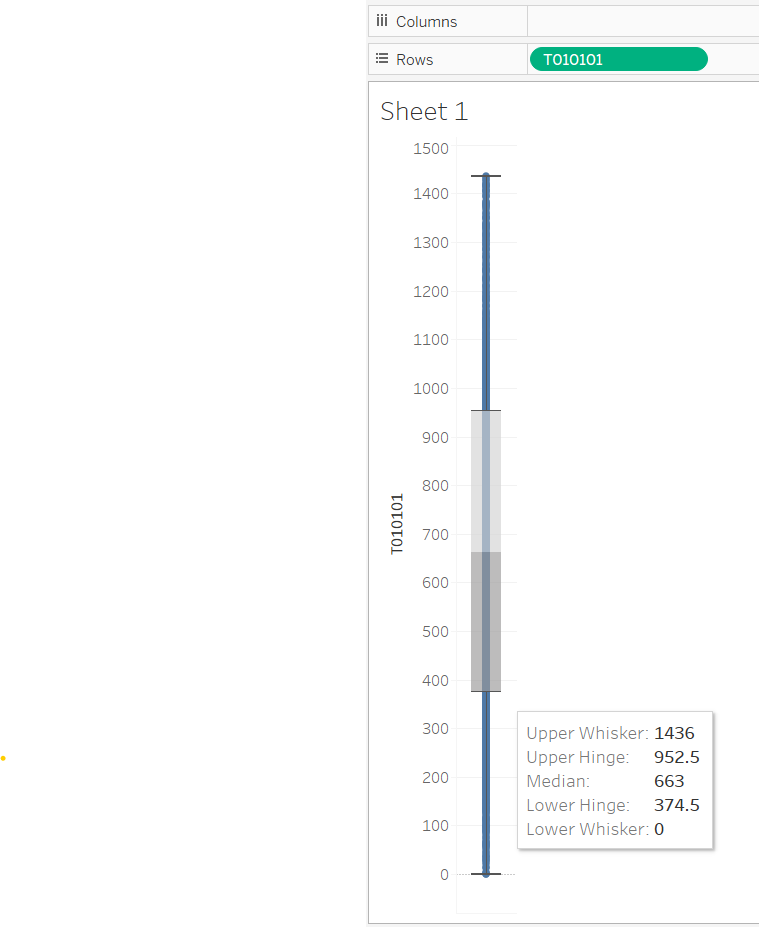
So, this is already telling me a lot. There are some weird outliers (someone who sleeps the entire 1440 minutes! as well as 0s). But most of the data is in the 375-975 minute range. That isn’t too unreasonable. It does make me wonder… who sleeps so much. It also makes me think that the extremes are outliers/data errors.
But, this really doesn’t help me see how many people are in the different amounts. For that, a histogram seems good - but for that, I need to bin the data. So, I right click on T010101, pick create, bins, and the bin dialog pops up. I’ll pick 30 as the size of the bin (half hour increments), and name it “sleep (bin 30)”. Once I have this, it’s easy for me to use this new attribute (I’ll count the number of people in each bin).
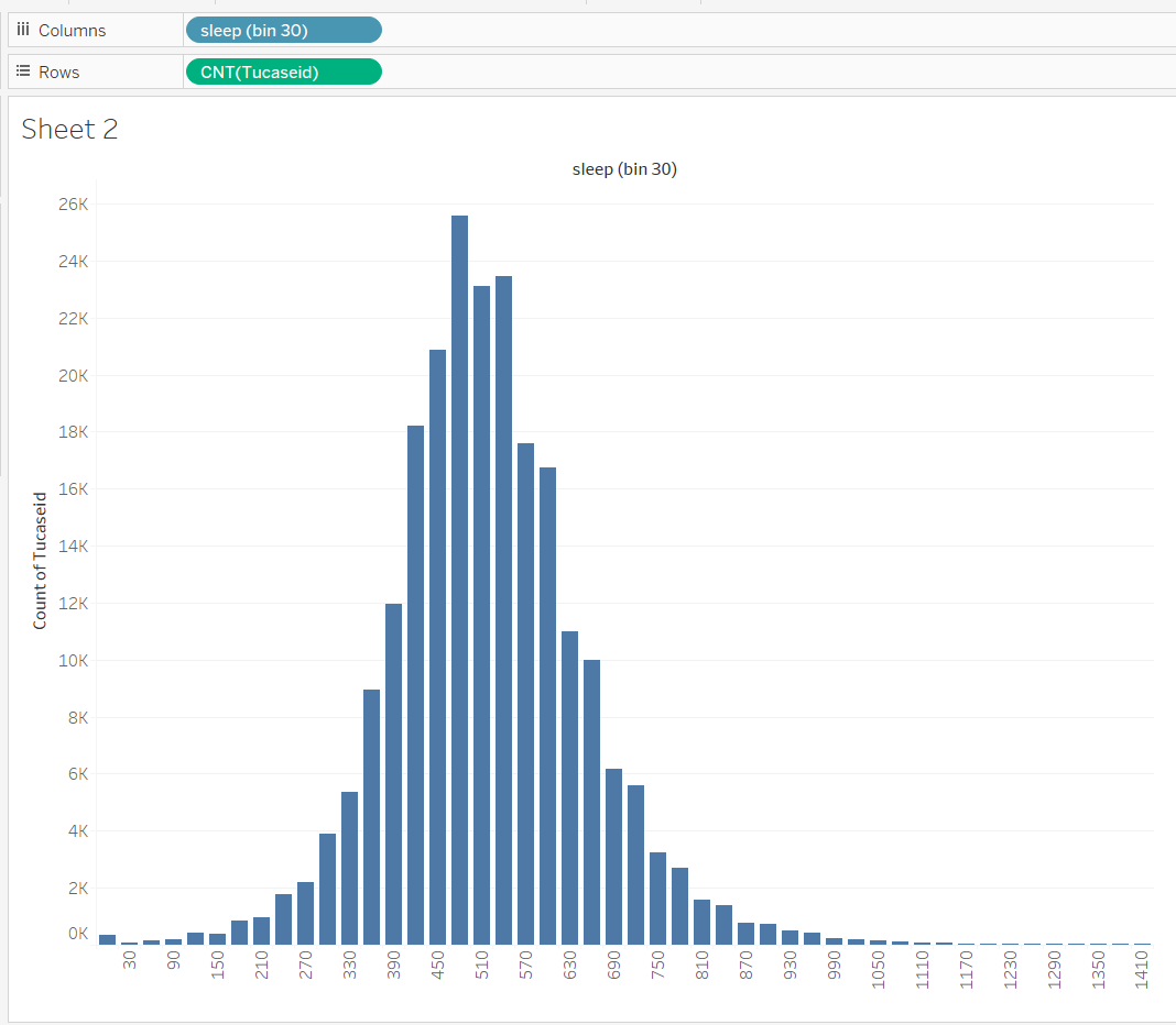
Notice how great this is for a quick sanity check. Most people seem to be in the 390-630 buckets (6-10 hours), and the peak is around 8 hours.
Can I work with the reduced data?
Next, I am wondering if it is possible to work with the reduced data… If I take the entire “01” (Personal Care) category, is that good enough? So my thought here… make a stacked bar chart of all of the different 01 categories and see which one dominates. Making a stacked bar chart in Tableau can be tricky (I often have to look it up), but the trick is to use “measure names” for color, and measure values in the rows (use select, and make sure to set as average). Not that I am still using sleep minutes as the X axis.

For most columns (the ones that are reasonable amounts of sleep), the amount of category T010201 “Washing, dressing and grooming oneself” is non-neglegable, but a lot smaller than sleep. To see this better, I’ll focus on the reasonable range of sleep (set a filter on T010101, on all values, limit from 180 to 900 minutes, or 3-15 hours), and get get if showing T010101 in the bar height (since I get it from the X position).
What causes people to sleep a lot?
What could be going on with those people who sleep so much? There are a lot of people who sleep 12 (or more) hours. Here, what I might try to do is make a guess (hypothesis), and then make a quick picture to see if anything seems to happen…
Since I’ve made the sleep bin chart, I could throw the day of the week on the colors. So this is the counts, divided by day of the week:

If I look at the groups with high amounts of sleep (690, …) it does seem like the weekends (1=Sunday, 7=Saturday) are over represented. I could “zoom in” by filtering out everything that isn’t high sleep, but I could, instead try a better design…
First, I should see if there is a relative balance of days sampled.

There are a lot more weekend samples, so I need to be careful. One quick thing would be to look at the average amount of sleep on the different days…

It is higher on the weekend, so maybe this is something worth digging into.
I could, of course pick something else… like, does employment status. As long as I am looking at days of the week, I could add that as a variable:
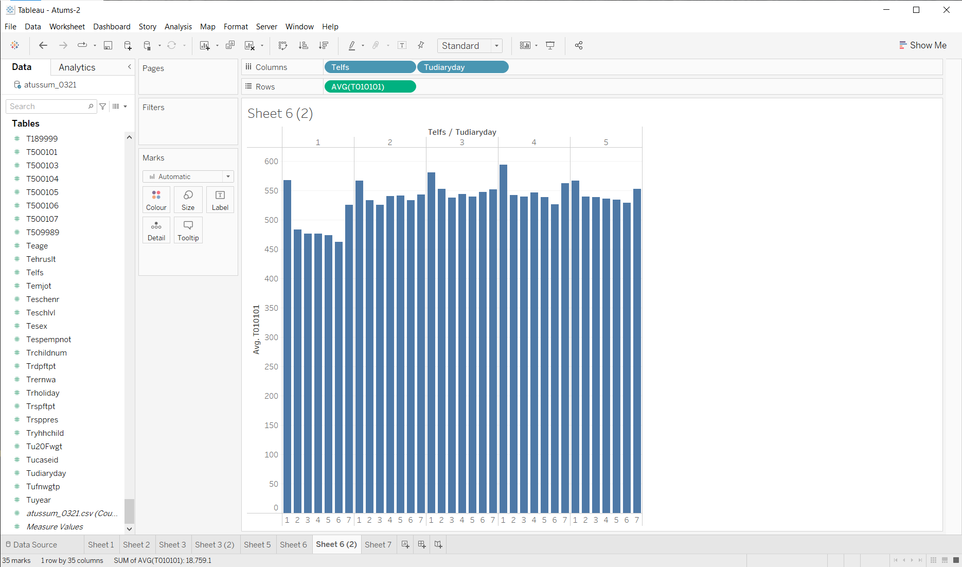
It’s not pretty, but we can see that employment code 1 does have a different pattern (less sleep on the week days). This would require a little more careful examination: but that’s the point! I am quickly looking at things to try to find things of interest worth exploring more carefully.
Of course, I could also just look at the average over the different classes to see that working people sleep less on average. I really would have prefered something to look at the distributions, but I don’t know how to do that quickly in Tableau.
What do people do instead of sleep?
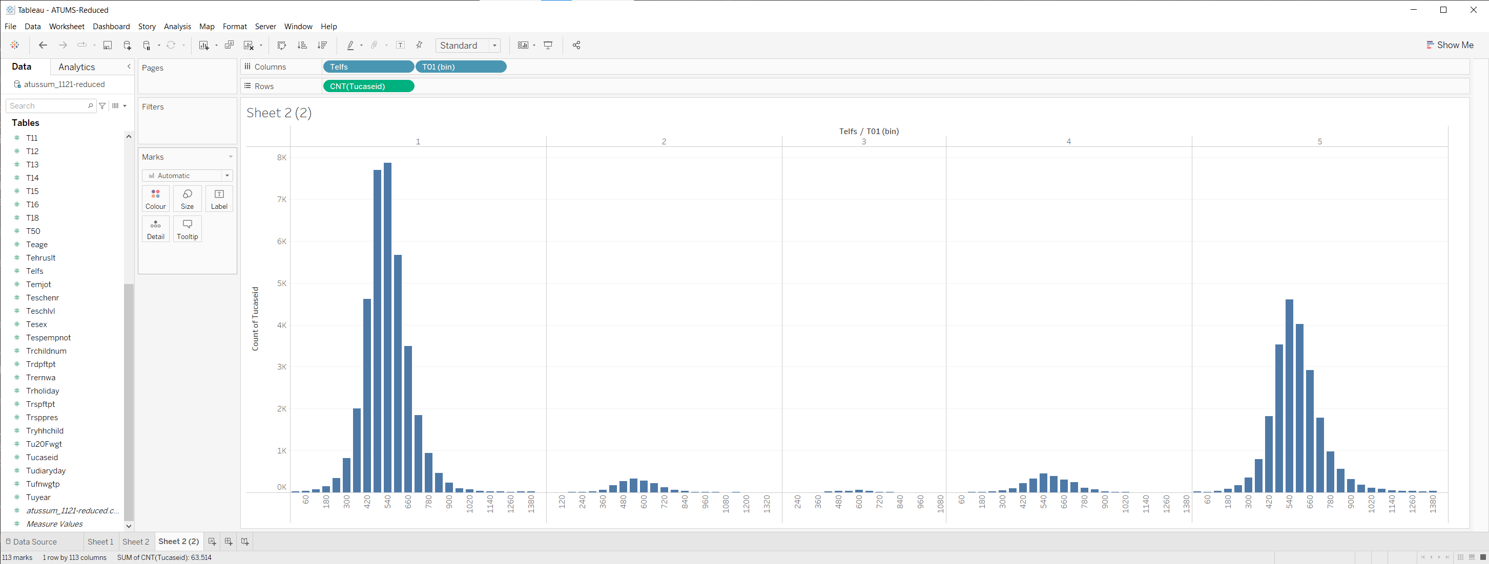
What can I do to quickly explore what categories go up when sleep goes down? With hundreds of categories, I’m not sure, so instead, I’ll work with the reduced data. (remembering that category 01 is more than sleep, but is dominated by it).
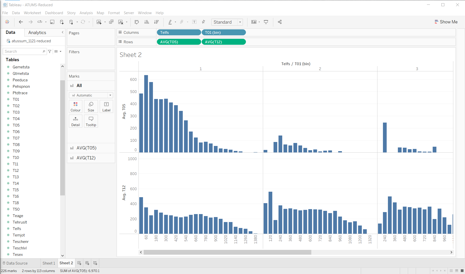
I’ll use the 11-21-reduced (fewer years, fewer categories) to make things easier. I’ll create bins by hour.
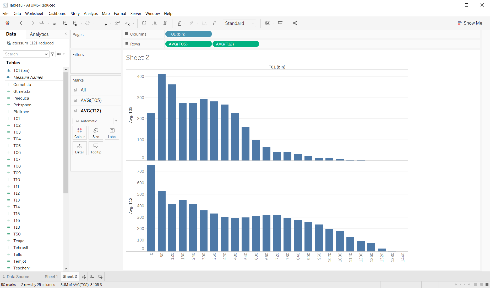
Looking at the average in each of the 18 categories, I see that no matter how much people “sleep” (spend time on category 1), they all have 1440 minutes in a day! (phew!)

Nothing is really jumping out at me… But it seems that the dark green (T05) goes up pretty quickly between 720 and 420 (for days of reasonable amount of sleep, the amount of T05 goes up as amount of sleep goes down). Of course, I need to look up to find that T05 is work. T12 is a pretty big thing as well (Socializing and Leisure).
So, maybe something that zooms in on these a bit…
Maybe I can see a story emerging here… I’ll need to look at some other variables, and filter out some of the weirdnesses (the people who didn’t sleep must be outliers - if you didn’t sleep on the diary day, it’s probably a weird day).
For example, if I separate out people who are working from those who aren’t (people who aren’t working might have some “work” because they are looking for jobs)
These are averages, so I should probably check that there are enough samples to be meaningful.
So, maybe from all this I might try seeing… is there a correlation between amount of sleep and amount of work? (note that I am doing a lot of filtering - only considering reasonable ranges, only employed people, only weekdays)
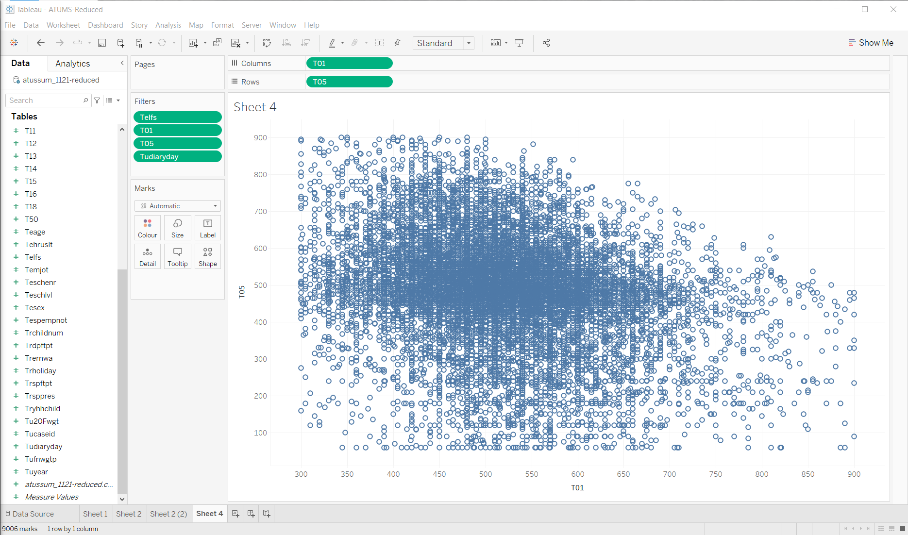
Not sure I’m seeing much in that… lots of people work approximately 8 hours in the day.
For employed people, on weekdays, more work, less leisure…
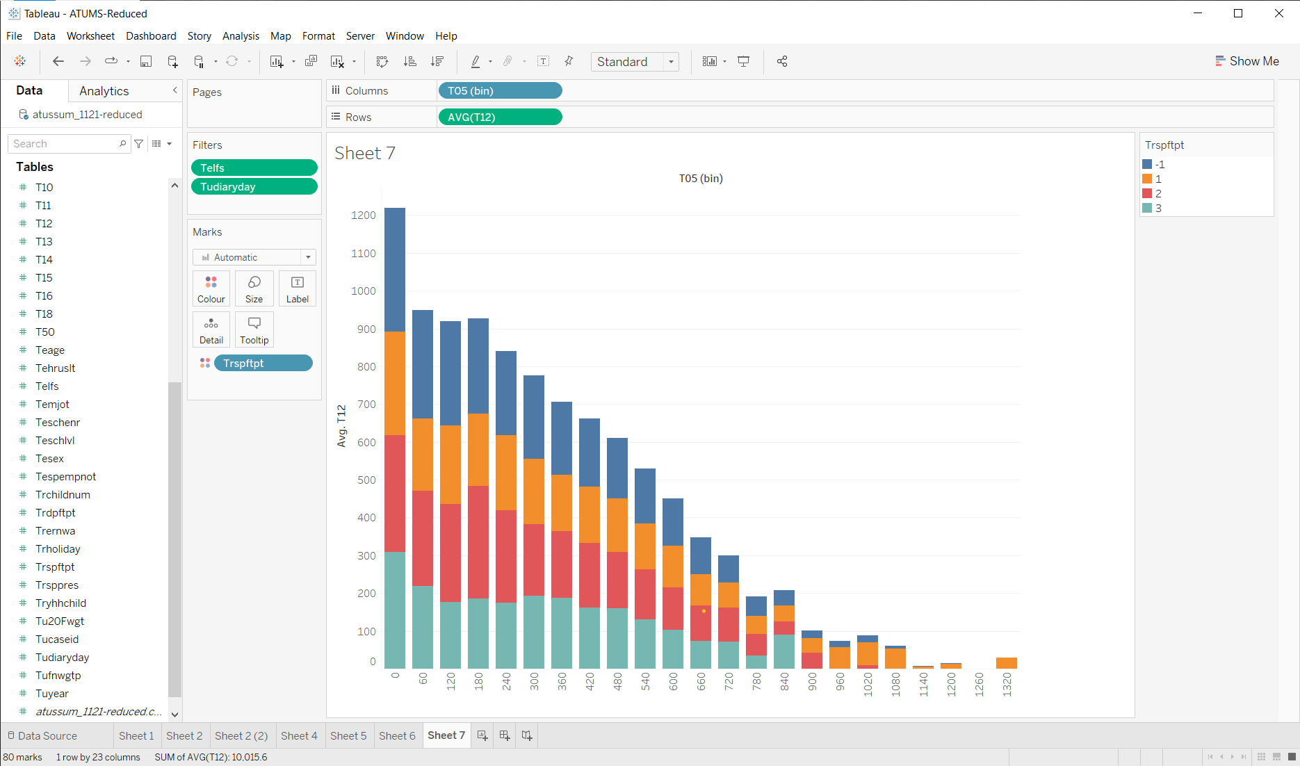
The coloring here is the full time vs. part time field. Not sure what it means - but it doesn’t seem to be a strong trend.
Because it’s easy
I can look for trends over time. Of employed people, did the amount of work/lesiure in a day change much? Is it different for males and females?

Number of kids affects amount of sleep?
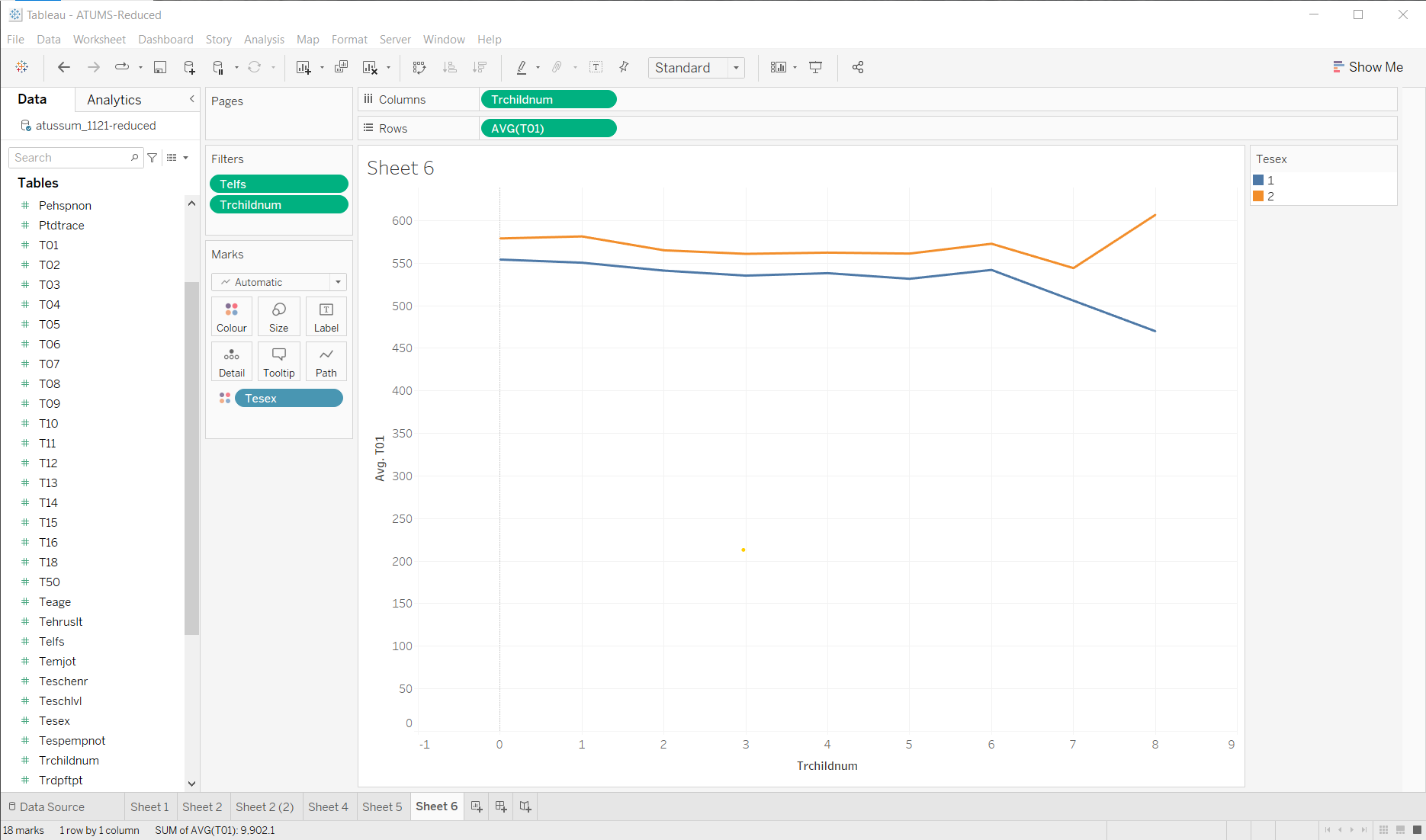
A different thread
OK, one more… since I want to show how different kinds of graphs are useful in EDA (even if they normally are not that useful for specific things), and to give an example of questions leading to refinemenst.
I’ll start with a specific question: Dane County, I suspect, has a high number of state employees. Does this have impact on how much people sleep?
Note: I need to do this with the CPS data (since it has location and job type).
To start, let me just see if there are enough people in Wisconsin. A quick graph of population by state (in the CPS file, this is a FIPS code) - this isn’t the actual state population, it is the number of samples (and, even then, it is based the CPS which has more than the time samples).
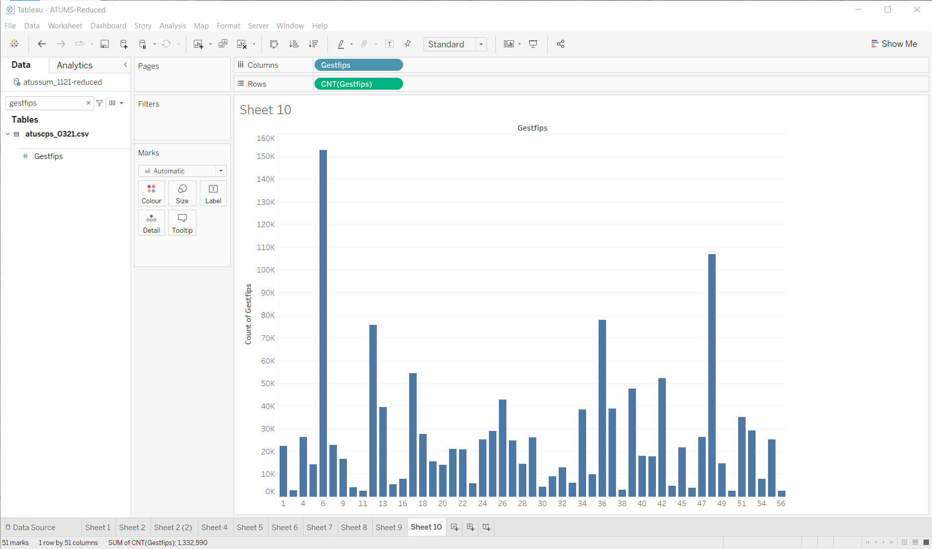
Maybe a better thing to count is the number of samples in the actual summary file…
Notice: the “shape” of the graph is pretty similar (so that’s good), except the numbers are much smaller (as expected). This might not be the most effective visualization for a specific question, but it quickly puts a lot in front of me so I can make quick decisions on what to do next.
One thing: I need to know what the FIPS codes mean. Why are their 56? (page 82 of the CPS document - there aren’t 56, some numbers are skipped). Wisconsin is 55.
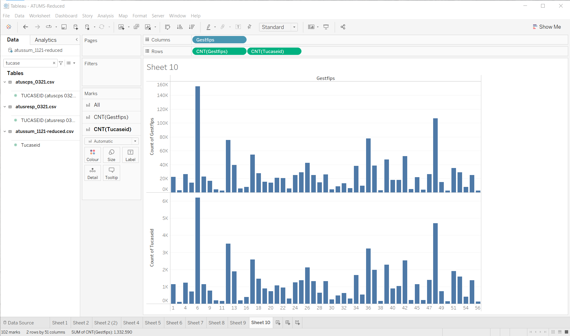
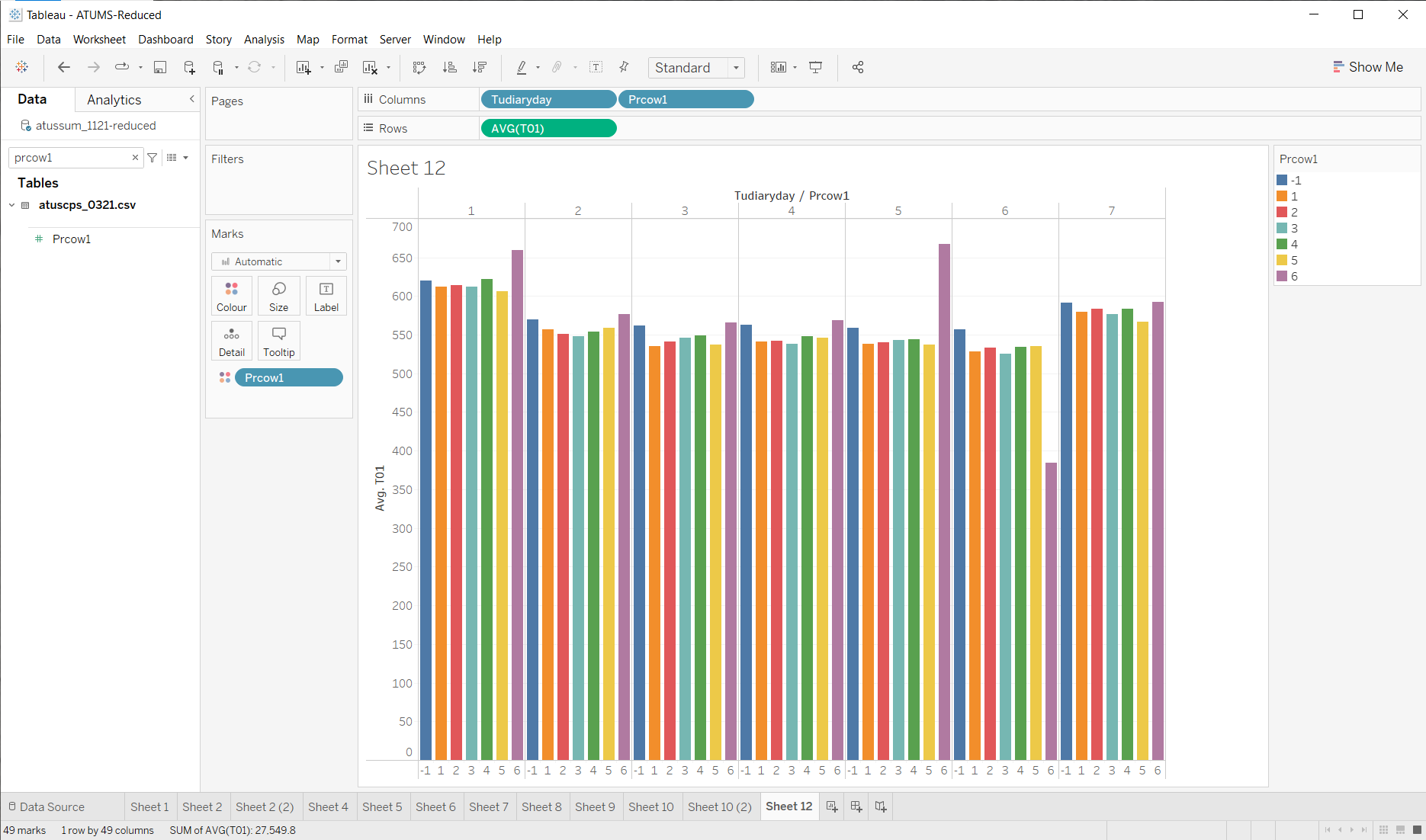
So, now lets look at the “class of worker code”… The fast thing is to just throw this to color those bars I have… (subversive lesson: part of exploring the data set is reading the documentation to learn what interesting variables mean).
Code 2 is state government employees (red) - there aren’t that many of them. Not sure there’s going to be enough if I were to drill into county.
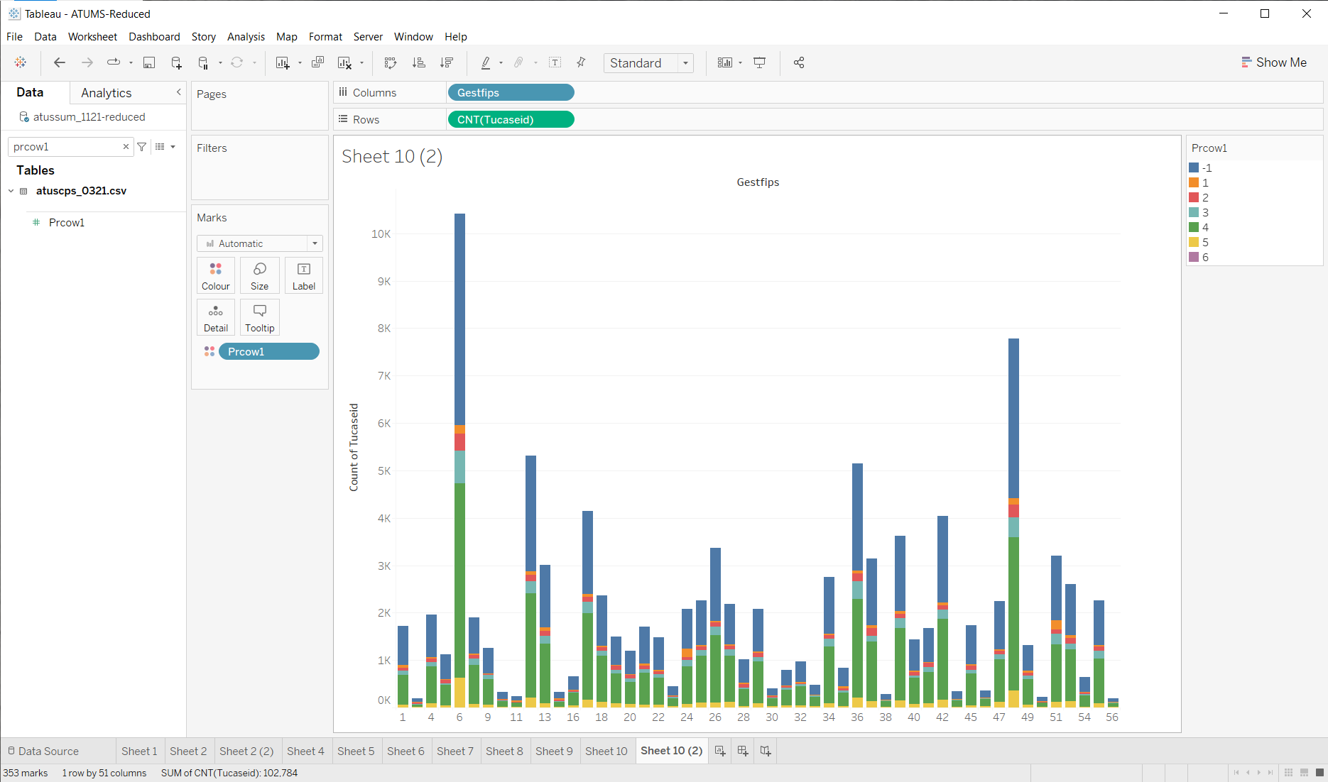
This picture shows a lot of stuff… it leads to lots of questions that might require better visualizations to explore. Like, I cannot really compare the proportion of worker types across states. This should be easy in tableau (a quick search taught me to use “Quick Table Calculation”), but for some reason, things don’t add up to 100%.

I think this has to do with the data join (it’s counting the total numbers of PRCOW1, not just the ones that are in the join), but I am not going to figure this out now… It gives me a rough sense, and some ideas of things I might want to look at more carefully later. (the joy of exploring, every answer leads to better questions)
But, back to the “does employer type affect sleep”.
Let’s start by looking at that across the whole data set…
Hmmm. Not too much difference. Let’s see what happens if we consider day of the week (the difference in job type might make more of a difference on workdays).

OK, not a great visualization - but I’m starting to see something. I wonder about self-employed people on Saturdays (the obvious outlier). Again, the visualization puts a lot of data in front of me, so I can decide what to do next. I could make a small change (since its easy in tableau) by re-ordering the variables and adding some colors to tell the bars apart…
Other than the outliers, its not obvious how much is here. I would probably need to look deeper to see if there is something to job type.
But… all of this is getting off track. I was originally asking about geography. Let’s get back to that.
First, I filter to just state code 55 (GESTFIPS). Then for county… need to search that documentation for what the right code is… (GTCO). Hmmm. Real quickly I see that not all counties are represented. What are they? There’s a web page for that (WI FIPS Codes). Dane county (25) is there. Let’s see if there are enough people to make sense looking at this…

Hmmm. Seems that most people don’t have a county code (00). Sure enough, the documentation says “Also, most counties are not identified. Values of 000 are assigned for cases whose county code is not identified.” Guess I won’t be looking at county-level data in wisconsin.
What did we learn?
I could keep going… looking at different things until I find something interesting. Then checking it to make sure it really is. But the point is, I’m quickly making simple visualizations that show lots of data so I can get a quick idea if there’s something to look at more carefully.
This was limited by my skill with Tableau. Lots of places I looked at averages when I probably would have preferred to look at distributions (box plots). Also, it might have gone faster had I put a little effort (for example, to rename the time use categories, or set default aggregations).
Going forward, there are lots of things to explore more carefully: different attributes, different categories, outliers (or focus on the “normal” cases), etc. Exploration gives me ideas on what to do next…