
3 - A Simple Example: 4 Design Moves on a Table
I will use a simple example (using a data table) to show how the basic concepts of visualization can be applied.
If you haven’t seen my 1 - What Is Visualization and How do We Do It? post, you might want to start there. I usually do this example in lecture, so you may have seen it before.
I like this example because it emphasizes how understanding the task (even if the task is hazy and only becomes clearer in the design process) allows us to make design choices that make things easier to see (see the 2 - What does this Visualization make Easy to See? for that concept). It also emphasizes the 4 different types of design choices.
Starting with the basic points from 1 - What Is Visualization and How do We Do It?:
The Task: I need to look at the grade distribution for my class and get a sense if it’s reasonable / fair. (more tasks may emerge as I look at the data)
The Data/Resources: I have a table of student names (not shown), scores and grades. It’s in an excel spreadsheet – so I’d prefer to keep things there. I don’t have very much development resources (this is often done at the grading deadline).
The Design: I have chosen to use a table, since it’s easy in excel. And it may be good enough (especially with design tweaks). In this example, I focus on improving the table, rather than trying something completely different. A side note: tables are remarkably effective visualizations.
The Details (including implementation): We’ll change a lot of the design details, but the implementation will be Excel (since that’s what I was using to do grading). A side effect of this: it shows that you can do useful visualization stuff with simple tools (this is all in Excel).
Note that my task is a bit hazy, it will became clearer as we progressed.
Design Aspects
I like to think of visualizations as being made up of four components:
- Data Transformations
- Layouts
- Encodings
- Interactions
I am going to describe this as a “game” in the sense of something where we have a “current state” and at each “turn” I get to choose a “move.” The moves are to pick one of the 4 design components and change it.
The initial design
I’ll start with an initial design – the first thing that comes to mind. Just look at the table in Excel the way the data comes to me. In some sense, this is the way the data comes to us:
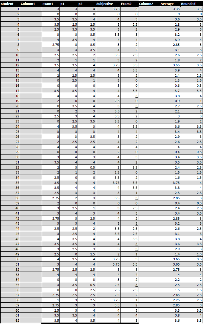
Here are the first few rows:
Note: you can click on the thumbnails to see the whole visualization. I do recommend that you look at them and get a sense of how they “work” (or not).
Exercise here: think about what this “visualization” is good at (what tasks is supports well), before we move on to making it better for some other task. And think about what the viewer might want to see (that isn’t easy to see).
This table has 57 rows (there were 62 students in the class - undergraduate classes used to be that small). The last column is the grade I am going to give them, which is created by rounding the “Average” column (which is why the grade column is called “Rounded”).
For my task, this table isn’t great – I want to know things like “Am I giving enough As? Are too many people failing? What’s the median?” So, I need to improve my design.
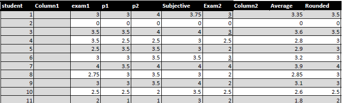
Move 1: Improve Layout
For my first design move, I’m going to choose to change the layout (the positions of the elements). Right now I’m using the position on the Y axis to tell me student number. This is useful if I need to find a specific student, but less good for seeing the grade distribution. So, I will change the layout: I’ll sort by the average.
While my task is hazy, I do know that many of my specific questions fall into the general category of “understand distribution.” Hopefully, when you look at the new table (click on the thumbnail), you will notice that some things are “easier to see”. There are a whole bunch of principles at play here (for example, using a “position encoding” to make a particular variable easier to interpret).
After applying this visualization, notice that some things are much easier to see / do. Notice how much faster you can count the number of As, or estimate the median score.
Exercise here: thing about what we have made easier to do by this design decision, and what we might have made harder. There are some things that are easier to do with the initial design.
Actually, I accidentally chopped off the bottom 5 students because they didn’t fit on the screen. That motivates the next change…
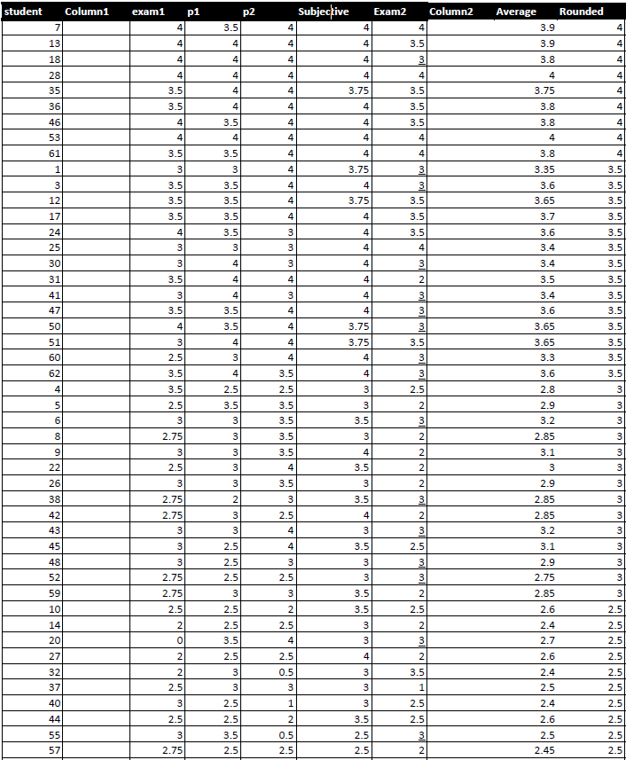
Move 2: Change Encoding
Technically, changing the layout is changing an encoding (we are encoding the value with the position, rather than the student number). However, layout is so special we often reserve the word “encoding” for other visual aspects of elements.
While the sorted table is better for understanding the distribution, it is still hard to assess the distribution in the thumbnail (or fitting the whole table to a small laptop screen). This would be worse in a larger class (where the table wouldn’t be readable if I shrank it to fit on my screen).
So, I’ll apply a color encoding – using excel’s color range feature – on the rounded grades.
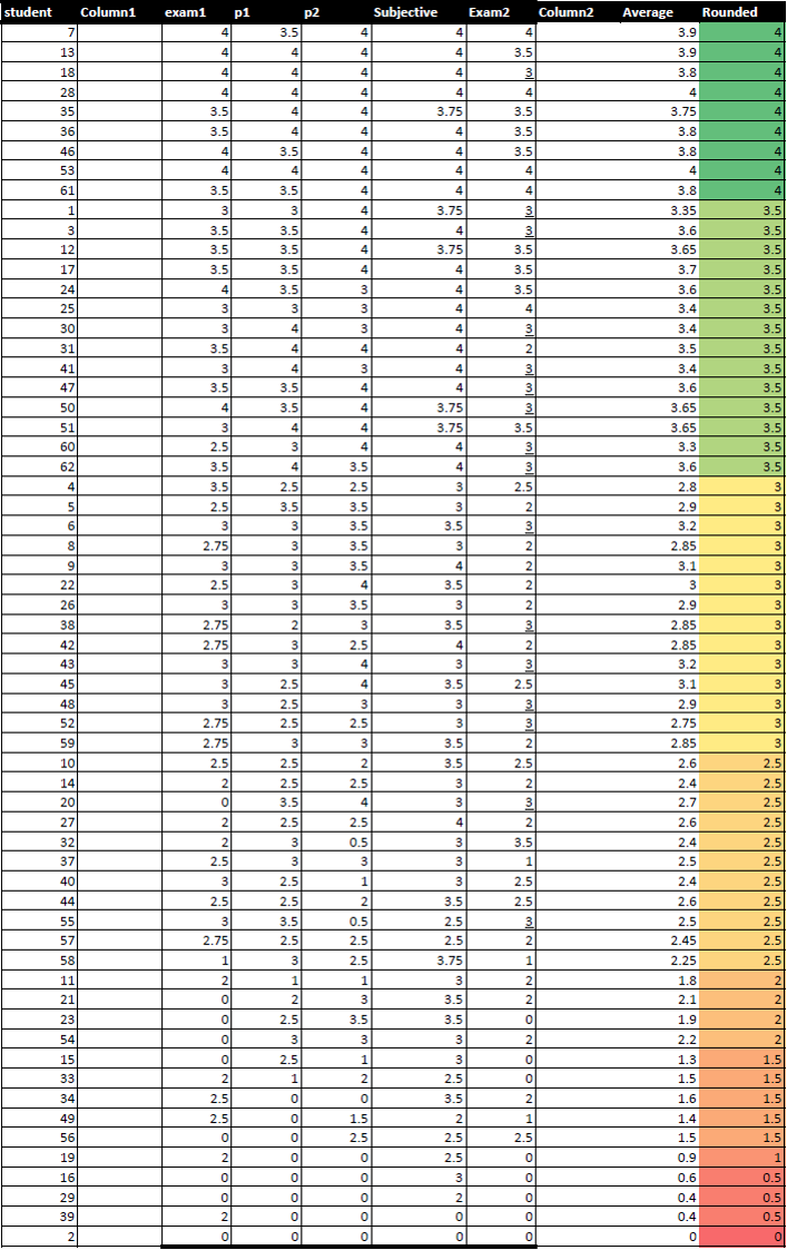
Now, I think I’m starting to win the game. I can really quickly see the proportion of each grade this distribution is giving – even in the thumbail! It’s pretty clear that there aren’t many As, but there aren’t many failures either.
But, it does raise a new question task: are there students who are being hurt by the rounding? This is somewhat easy to check, since I can look at people near the borders. But I can apply a visualization design move….
Move 3: Transform Data (derive)
I can make a new “derived” column that is the difference between the rounded grade and the average. This directly measures what rounding does to people. And to skip a step, I can color code it: I’ll use a red/blue diverging scale (you’ll learn about these later, but they are built into excel). That way, red means someone hurt by rounding, blue is someone helped.
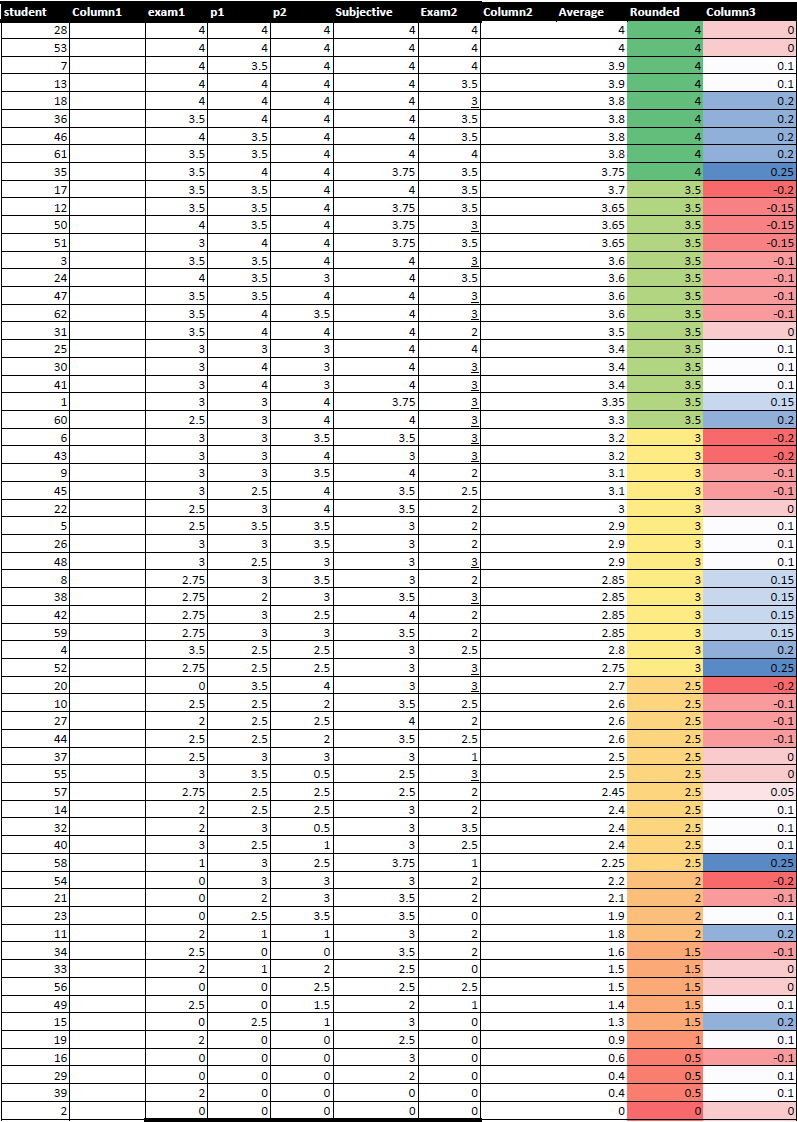
Now I think I’ve won this round of the visualization game. To do my task of getting a sense of who is most hurt by rounding, I can look for dark red – if I want to make it even easier, I can sort by that column! (use interaction)
And note: the reason I consider this “winning” is that I am able to do the tasks I need to do (get a sense of the grade distribution, see who is hurt by rounding). The visualization “game” is ultimately about tasks.
About that 4th “Move” type (interaction)
I am not talking about interaction here - partially, because I am showing you static visualizations (so it isn’t an option). But you might notice that my process was interactive: I was using the features of excel to change the visualization to interactively expose the information I wanted to see.
Lessons
Hopefully, you now have a sense of what the 4 design moves are. And you’ve seen how we can change our design choices to make a visualization be more effective for a task. Along the way, you may have gotten a sense of how understanding task helps. And how effective designs can be simple – and done with existing tools.
Note that the details of the implementation didn’t matter. I could have done this with a different spreadsheet program, or if I had more time, I could have written a Javascript program. In fact the details are really irrelevant: there’s no use telling you which buttons in Excel to push, since this was done with an old version of Excel (the features are still there – it’s just different to get at them).