
The Paris Apartment Problem: A Design Exercise
This is another attempt to extend in-class design exercise and adapt it for a “work at home” challenge.
We did the first part of the Challenge in class. But last year, both elements of the exercise was done online. I am adapting last year’s assignment.
The design exercise has two parts: one is to consider how to design glyphs to encode high-dimensional data about restaurants; the second considers how to address a very specific task that involves collections of high dimensional data.
Part 1 of this assignment was done in class. We talked about the use of glyphs for high dimensional visualization. And you hopefully got to see some examples. Part 2 of the assignment will also be turned in as Design Exercise 7: Paris Apartments (due Mon, Nov 8).
Learning goals (why do this now?):
- Explore glyph design to see how it can be used for the display of high-dimensional data, including understanding its limits.
- Experiment with visual encodings for glyphs, to see how much information can be placed on glyphs.
- To practice design for a realistic task with difficult data aspects.
- To have a practice design problem that we can use for examples in our discussion of interaction.
- To bring back memories of a Vis conference past.
Background
Why is this the Paris Apartment Problem when it is about restaurants?
The Vis conference in 2014 was in Paris. Back then, the University allowed us to use short term apartment rentals (e.g., AirBnB). And I had to pick one.
If you know me at all, you wouldn’t be surprised that a key consideration was to pick an apartment that was close to good food options. After all, this is Paris, and I am going to use every opportunity to eat well. Paris has many places to eat. Many of them are good - but I wanted to make sure there were lots of diverse and interesting options near where I stayed.
So, this brings up a challenge: how do I compare the restaurants around two apartments? Of course, to get to that question, we first need to have ways to look at lots of restaurants, make comparisons, and make comparisons between lists/sets of restaurants.
Restaurants
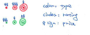
Imagine we have a data table of information about restaurants. Each row is a restaurant, and each column is some attribute we might have about a restaurant. Each restaurant has a name and a location - we’ll treat these two as special “attributes”. But we also have a bunch of other facts about each restaurant. For example:
- A type (French, Spanish, Steak, …)
- Price ($ - $$$$$)
- Star rating (* - *****)
- Different ratings (0-10) (there are several different restaurant rating systems, some of them on a 0-10 scale)
- Open Mondays (many restaurants in France are closed on Monday)
- Takes reservations online
- and others
So, a restaurant is a point in a high-dimensional space. Most of these dimensions are not interval/numeric. Actually, none of them are interval - although some are numeric. Some are ordered (price, rating), some are binary (open mondays, takes reservations online), some have large sets (type), etc.
In reality, this assignment isn’t about restaurants. It’s about high-dimensional (or mid-dimensional) data where the dimensions are not numeric. For these kinds of data, the choices for design are different than for multiple numeric dimensions - where standard techniques such as parallel coordinates, scatterplot matrices, and dimensionality reduction can be used.
Part 1: Glyphs
We did part 1 in class. A description is here to refresh your memory. Note that glyphs do not need to be part of your solution for part 2.
If it helps, here are a few example designs from previous years.
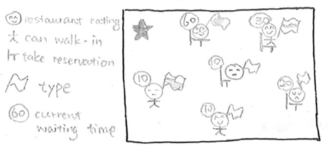
Part 2: Solving the Task
In Part 2, we’ll try to solve the task of comparing two apartments. More specifically, the task is to enable comparison of the set of restaurants in the “neighborhood” (region close by) around two points.
A baseline design is to show two maps (juxtaposed). One for each point (apartment). The point would be centered in each. Glyphs for restaurants would be placed on the maps.
Come up with two alternative designs for this problem. You cannot use glyphs on a map - this is the baseline that you should compare against.
Give a sketch of your design, enough of a description so the reader can understand how it works, and some rationale for why you made it. The Canvas Quiz to turn it in will let you turn in two things for each design: a file (e.g. PDF) and a type-in box. Generally, we expect people to turn in a PDF or image of their sketch, and put the rationale in the type-in. But, if you prefer to put the rationale into the PDF, that’s fine too (say “rationale in PDF”).
Turn in your designs as part of Design Exercise 7: Paris Apartments (due Mon, Nov 8). The form has 4 questions: two are file uploads, two are type in boxes. One each for each design.
We will discuss the results - either online, or in class.