
DC2 Option 1: Sub-Grouper
This is a possible problem to work on for Design Challenge 2: A Visualization Project (Hard Vis Problems): it is choice 1, subgroup structure viewing.
Background: The Problem of Subgroup Comparison
Brief: When you have a large population of items, you might be able to break things into subgroups in many different ways. If you have lots of different possible ways to form subgroups, it might not be easy to see which ones form interesting divisions. The problem: how do we identify “interesting” ways of grouping?
Example: Consider the time usage data. We have a large population (a collection of people), and for each one, we have some measurement (amount of time spent on an activity, I’ll use sleep as an example). Warning all examples are made up - it is not based on data.
We could treat the population as a whole - and find what the average amount of time spent on sleep.
But we could also divide the population up based on the “metadata” (other things we know about each individual). For example: if we knew which region of the country each sample (person) was in, we could compare between the regions. Do people in the North East (on average) get more sleep than average, or when compared to those in the South West? Or… we could pick a different variable to divide the population by. Do people over the age of 65 get more sleep? Do people with college degrees get more or less?
(put aside for a moment the question that to really answer these questions we need to do an appropriate statistical test).
Things get even more complicated if we consider combinations of variables to divide by. We could consider people in the North East who are over 65. Or people in the North East who are over 65 without college degrees. The number of possible groups explodes quickly. Things grow exponentially with the number of variables.
With so many possible groups, how do we find the “interesting” comparisons to make?
Of course, “interesting” might not even be a comparison… To continue with the example, the time usage data has a series of observations. So the “interesting” thing might be in a specific subgroup there is an interesting pattern (college educated 65 year olds in the north east had a very consistent and rapid decline in the amount of sleep they got over the multi-year period).
There is another catch in this: as we start to make the groups more focused, they get smaller. At some point, the groups get too small to be interesting. If there is just one person in a group, its harder to say much about it. So, really with a group there are (at least) two quantities: the values (e.g., amount of sleep), and the number of items in the group. The data might be simple (hours of sleep), or complex (e.g., hours of sleep for each year in the survey, or hours spent on many tasks).
The combinatorics get worse when we consider that for each variable, we might have different ways of forming groups. So far, we’ve spoken of grouping by specific values of variables. We either group all regions together, or pick a specific one (North East). But we could make groups out of combinations (North East and South East). If the variable is ordinal, we could split at any point (e.g., we could divide by ages as “above or below 65” or “less than 20, between 20-60, above 60”). The possibilities are seemingly endless…
The problem that I want to focus on is the multitude of subgroups. There is an exponential explosion of possibilities. How do you find the patterns across them? This is a kind of scalability.
This problem comes up a lot in “fair” data science: if a group is under-represented, your analysis might not represent them well. For example, if you are learning a classifier some subgroups might be mis-represented.
Sub Problem 1: Distributions across groups
To make things a little easier, we can focus on the “simple” version of the problem
- Each variable is categorical with a few categories
- For each variable, we define groups for each category (and “all” - since we might not want to specialize on that variable)
- We consider the number of items in each group (ignoring the “data” for a moment)
Our goal is to “look at the distribution” (yes, we need to define the task better). The data is basically a histogram (each group has a count).
If there is only 1 variable, we have lots of standard solutions. A bar chart to show a 1D histogram is common, but we might want a part whole design (stacked bars, a pie chart, even a treemap). For 2 variables, we might choose a matrix view - encoding the number in each cell, maybe using color. Note that in both of these cases, ordering matters a lot: depending on how you order the categories, different patterns might emerge. If the variables are ordinal, that makes the ordering easier.
But with 3 variables? And then what happens if you have 4,5,6… or more?
As for tasks… A first example (1A) one might be to look for “gaps” in the data: are their subgroups that were missed. It is possible that you get equal numbers of people from each region, equal numbers of old and young people, but somehow have a skew where you missed getting old people from the North East.
Two baseline designs:
- You could give a bar chart for each “dimension” (variable). Minor extension: you could make a matrix for every pair of variables.
- You could list all subgroups and give the number in each (either as a table, or a bar chart)
Of course, your job is to come up with other tasks, and to come up with other designs. These might be static visual designs, or interactive designs. But we’ll discuss what you will do for this assignment later.
Sub Problem 2: A Dependent Variable
Now, let’s add a measurement to each item. So, continuing with the time usage example, this would be the number of hours of sleep.
The problem here is to look at how this variable varies across subgroups. The complication is that some subgroups might not have any items in them, or may have too few to be meaningful. But, we might want the viewer to be able to see this and decide.
The “value” of each group is really a distribution. If the value is numerical and interval, it can make sense to take the average. But you might want to have a richer summarization (make a box plot).
Example task: (2A) find subgroups of sufficient size whose averages (or distributions) are much different than the overall population. For example, we might want to look for subgroups whose distributions are bi-modal.
Baseline designs: for averages, we could use the baselines from Sub Problem 1, but show value instead of count. We would need some way to indicate “not enough data” (that wouldn’t be confused with a zero value). If we wanted to show a distribution, we could use the list of subgroups, and show a boxplot for each.
Sub Problem 3: All Dependent Variables
In the last problem, we distinguished a “measured” variable from the category defining variables. But, any variable could be considered a “dependent” variable. For example, up until now, we considered region, age, and education level as all being about the samples. But, we could have easily made any of them be what is considered: is the distribution of ages in the North East different? is the distribution of education levels unusual for the older people in the northeast?
Even the “dependent” variable could be flipped… We could ask “where do people get more than 7 hours of sleep”? Or does the distribution of education levels vary across regions for people who get more than 7 hours of sleep.
Basically, any variable might be used to define groups. And once we have a set of groups, any variable might be an interesting measure to compare between groups.
Sub Problem 4: Exploration vs. Examination, Context
Some of the previous examples asked very specific questions. These probably could be framed as a query and a statistical test. There is a specific group in mind, and a specific question about a specific measure.
But, sometimes we don’t have the specific questions in mind. We are exploring to find out what the correct questions to ask are. This often happens when you first get a data set: you need to look at it various different ways to see what kinds of potentially interesting patterns there are.
Visualization tends to be good for such exploration, since you can see many things at once. But even if you have a specific question, visualization can still be useful. For example, it can provide context. To give an example of this, if we see something in a specific group, we might also want to know how it compares over “neighboring” groups. If we see that old people in the northeast who have higher education levels (a specific group) get more sleep on average, we might want to see that this is different than those who live in a different region, or different age groups within the region. Or we might see that this is just part of the more general trend that educated people get more sleep. (again, I’m not saying this is true - I’m just making up examples)
Were our multiple dimensions all spatial, the notion of “closeness” is simple. But with groups, each defined by many dimensions, the definition of close becomes more complicated. If you identify a group that is “interesting”, the context of “nearby” groups may be necessary to know if the observation applies to that group, or to a set of groups “around” the group.
I believe that visualization is particularly good for looking at subgroup structures in data because (1) when you’re exploring, it can basically summarize a wide variety of questions, without having to even know what those questions are ahead of time and (2) provide context “around” any specific answer, even if the context is a handwavy concept.
Of course, this requires effective designs that demonstrate that these can be done. I don’t have such designs. But I do have a class full of smart graduate students who have learned a bunch about visualization that might be able to come up with answers.
A Concrete Example
We do have time usage data from the American Time Usage Survey (ATUS) and the American Heritage Time Use Study (ATHUS) to try this with. You can get data yourself at https://timeuse.ipums.org/, but we will grab datasets for the class and do some initial wrangling to make it easier to work with. This provides a good example to start with. However, the goal is to create designs that could be used to explore similar data sets.
The defining thing about the data sets is that they have a large number of variables that could be used to form meaningful subgroups. Time usage was the motivating example, so we will ask everyone to start with that. We will provide another data set later.
One motivation for this assignment is the New York Times Article The Pandemic Changed How We Spent Our Time. This article picked a few subgroups and showed how their time usage changed. For example, there is a chart showing that different age groups had different changes across categories:
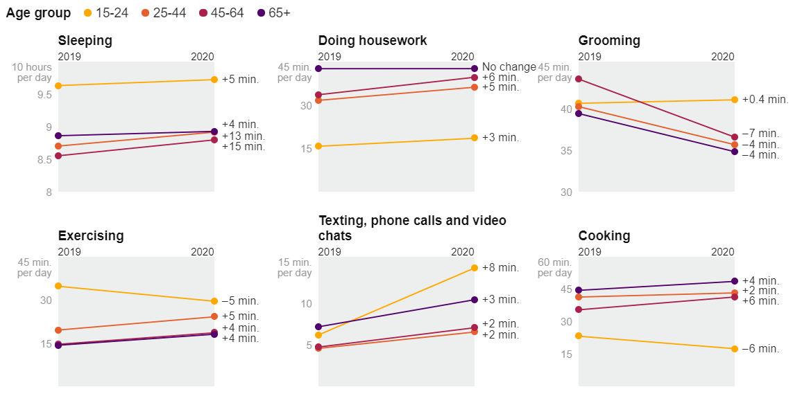
Which makes me ask more questions. When I see that young people play a lot more games, I wonder, is this true across gender and economics? (is the phenomenon just teenage boys from affluent families?):

Or amount of work by ethnic group and education level.

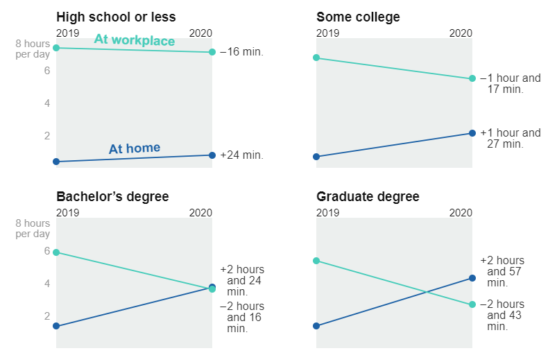
Which doesn’t help me understand any confounds in the variables.
It also doesn’t show distributions. For example, I’d imagine that the changes for people with graduate degrees would be bi-modal. I suspect that are some for whom work from home is easy (e.g., Computer Scientists), and others who might have had to work outside the home more(e.g., Medical Professionals staffing hospitals).
The NY Times designs shown here focus on comparing changes for small sets of groups. I include them to show the overall problem. These designs were meant to make specific points in the article.
But imagine… we want to write an article like this and want to look for the interesting contrasts to show; we want to identify more specific examples of interesting differences; or we want to provide more context “around” each of these individual data points. Or even, we want to support users who start asking more questions once they see the data.
The NY Times examples focus on the changes - but we could easily imagine similar charts made for a single year (how do different groups spent their time), or for a set of years (see the trends 2011-2019, which might provide more context for the 2019-2020 changes).
The Specific Challenge
Your challenge is to design a tool that helps a user explore a data set where there is potential sub-group structure. Your tool should help with the range of tasks one might do with this data. This includes identifying interesting subgroups, comparing between different subgroups, and showing these comparisons with sufficient context so they can be interpreted.
The 4 subproblems above are meant to help your thinking about the problem. You could focus on just the group size issues (problem 1), or you could consider a richer set of tasks that includes making the comparisons between groups once they are identified. If you choose a smaller or simpler set of tasks, we would expect that other aspects of the project will be made more ambitious.
Some Things To Read
There are systems designed to deal with the machine learning problem of trying to have fair training sets, or to make sure that the results of classifiers are fair (you don’t different biases for some subgroups).
Ángel Alexander Cabrera, Will Epperson, Fred Hohman, Minsuk Kahng, Jamie Morgenstern, and Duen Horng Chau. 2019. FAIRVIS: Visual Analytics for Discovering Intersectional Bias in Machine Learning. In 2019 IEEE Conference on Visual Analytics Science and Technology (VAST), 46–56. DOI: https://doi.org/10.1109/VAST47406.2019.8986948 - The first paper that comes to mind about this problem. There are many more.
FairRankVis: A Visual Analytics Framework for Exploring Algorithmic Fairness in Graph Mining Models - a system published at Vis this year. Less focused on the fair distribution in subgroups problem, but good for pointers to other literature.
Sorelle A. Friedler, Carlos Scheidegger, Suresh Venkatasubramanian, Sonam Choudhary, Evan P. Hamilton, and Derek Roth. 2019. A Comparative Study of Fairness-enhancing Interventions in Machine Learning. In Proceedings of the Conference on Fairness, Accountability, and Transparency (FAT* ’19), ACM, New York, NY, USA, 329–338. DOI: https://doi.org/10.1145/3287560.3287589 - A good paper for introducing the problem. It also provides example data sets.
Our Boxer System deals with this problem, but doesn’t really get to the complex exponential explosion. The interactions and designs might inspire your thinking
Here are some historical systems that address related problems and might inspire your thinking about the problem:
Hints and Data
Finding data sets is part of the assignment. A big hint though, the DC1 data sets may serve as good starting points.
One thing to do: try looking at sample data sets to manually identify subgroups - how can you identify holes or outlier subsets.
Generating modified data sets so that you have something to look for is a reasonable strategy - especially for testing. For example, you might take the Time Usage Data and remove all of the college educated people over 65 in the North East. Then you could make sure that your tools help you find that “hole” - and the biases it causes.
For Phase 1 at least, there are reasonable baselines for 1 and 2 dimensions. So be sure to consider higher dimensional intersections (which will probably mean data with holes).
Some specifics for Project Phases
See the main project description for an overall discussion of the Phases. But, some specific things for this problem:
Phase 1: When you identify a data set, you will want to find one with enough variables that there is the potential for lots of groups. And reasons why looking a subgroups are interesting. Hopefully, you can look to see there are interesting intersections of groups so that you will have something to see when you start to visualize. We will provide “enhanced” versions of some of the DC1 data sets that have even more data (and data holes).
Phase 2: For this problem, good task analysis is important. There aren’t (obvious established) baselines to compare to - so having a plan for how you will assess how well your designs address the tasks.
Later Phases: showing success on “real” examples is important. If you’ve built a tool, you will want to have some examples that show why you think your approach would be effective. If your implementation cannot handle “real data” (for example, if it is a design sketch), you should support that interesting things in real data would be easily visible.