Design School Exercises
In class, we will try to work a bit on our skills as “designers” (in the sense of graphic design). Design skills are useful beyond visualization - you will probably need to make presentation slides, posters, web pages, business cards (OK, maybe that’s archaic), … So I wanted to take some time in class so we can work on our skills (yes - me too).
I used to call this “Design School in a Day” - except that it isn’t just a day (it will be a day of class, and a week of “homework”), and it’s hard to glorify this as a “school”.
This could be considered Design Exercise 13 - but since it’s weird, it will be its own thing. It just plain doesn’t fit in with the usual rhythm of the class, which is (somewhat) OK, since it’s Thanksgiving. Rather than turning it in as a normal design exercise (like a quiz), you will turn it in like two seek-and-finds (this way you will get to see some of the things others do).
We will have a lecture/class activity on design on Monday, November 25.
In addition to that, there are 3 parts…
Readings 13: Graphic Design - this is a normal weekly reading, except that part of it is for you to define your own thing to read. There are two parts: (1) chapters from the Non-Designer’s Design Book (which will be a bit redundant with lecture) and (2) something of your own choice.
Design Exercise 13A: Design School Good Example (due Wed, Dec 04) - this is is kindof like a normal seek and find. You need to find something that you think is a good example of graphic design, and describe how it successfully applies the principles from the Non-Designer’s Design Book (and, optionally, the other thing you read). You need to discuss at least 2 of the principles (so pick something that exhibits at least two of the principles). I’m asking you to turn this in using the normal seek-and-find mechanism. We will also ask you to give a link to the thing that you read (beyond the Non-Designer’s Design Book).
Design Exercise 13B: Design School Bad Example Re-Design (due Wed, Dec 04) - this is a less usual seek and find. First, you must find something that you think is a bad example of graphic design, at least in part by not adhering to the principles from the book. And then you need to re-design it! Create an “improved” version where you apply the CARP principles. Explain how you used at least two of the principles in your re-design. Note: your submission needs to have two images in it - before and after.
Some hints…
These are group discussions (like seek and finds) - although, responding to others is optional. (it is recommended, but optional)
For the re-design part, it is helpful to pick something simple (like a business card or flyer or poster or a sign) that you can re-create easily. In the past, most students used something like PowerPoint to create their re-design, but you are welcome to use anything you like (including drawing by hand). We’ll see lots of examples in class.
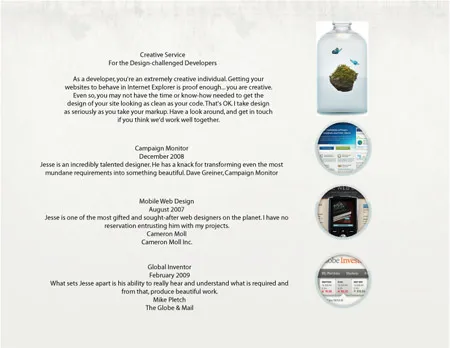
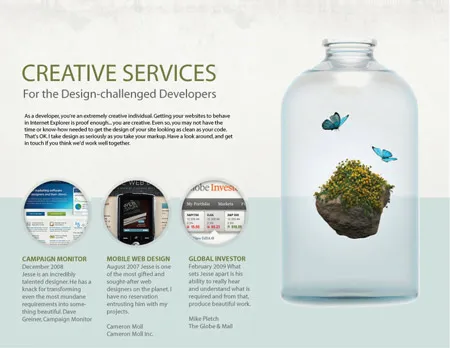
Here is an example I found from a student somewhere else:
Redesign before.
Taken from the web page Editing with CARP Design Principles by Ken. Redesign result.
Taken from the web page Editing with CARP Design Principles by Ken.
